When you look at the stuff we use to connect with the digital world – phones, tablets, earbuds – it’s kind of funny how they all end up looking the same. Even if the tech inside gets better every year, on the outside, it’s usually glass, metal frames, a few well-placed cameras, and this whole minimalist vibe. If you spot any real differences, they’re tucked inside as specs and features, not splashed across the surface. That’s why we created a technical gadget able to, also, play with visuals: the phone case.
A little piece of plastic or leather that has become an unexpected canvas – a fusion of design, fashion, and graphics, that, unlike the phone itself, you can switch up your case whenever you feel like it. Some folks go subtle, others treat the back of their device like a gallery, an artistic expression of theirselves and of the designer who entered the conversation. And, also, this is where ESR and Craig & Karl’s collaboration comes in. The designer duo – that split its time between London and New York – bring its loud, joyful style in the production of the international company, and, then, straight to your pocket.
ESR x Craig & Karl – Higlights:
A graphic language between pop and digital culture
The first thing to notice it’s the boldness of the collection: big letters, geometric patterns, smiley faces and cartoon shapes are all mashed together in a riot of color – yellow, pink, bright blue, red, green. Craig & Karl aren’t into the usual polished look that tech brands love, because, like in every collaboration, they pull inspiration from all over – old computer graphics, video games, sticker art, emojis – and squeeze it together in a way that feels more like a collage than a neat, repeating pattern. And that is why this work with the playful and stylish aesthetic of ESR.
That’s kind of their signature move. Craig Redman and Karl Maier jump between graphic design, illustration, installation, toss in playful shapes and colors, dial them up and down, repeat them, make them clash. They keep things simple on the surface, but if you look closer, it’s all carefully orchestrated. Over the years, they’ve worked with huge brands and museums, taking their punchy style from paper to products to giant murals.

The phone case as a personal canvas
The interesting part of the operation is to procede in a different direction, putting authorial work on a phone case and totally changing how you experience the art, carrying it around every day and making a personal expression, transforming illustrations in a part of your routine, popping up wherever you take your device.
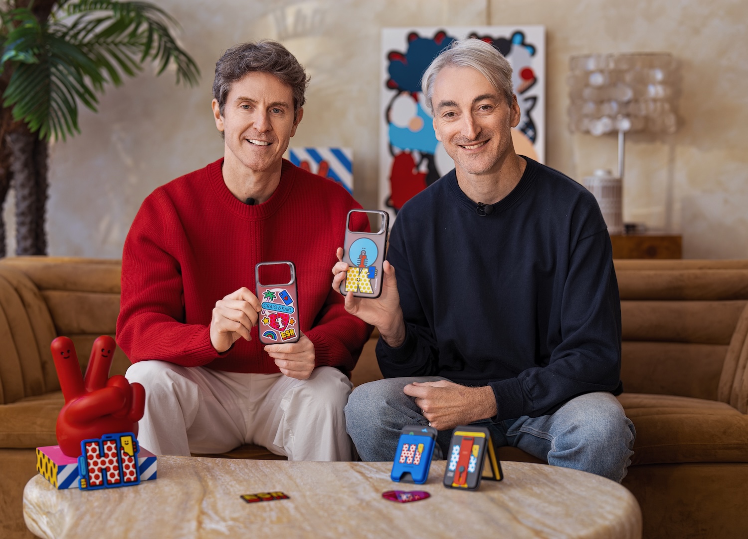
In the perfect style of Craig & Karl, they mix up charms and random references in a messy, pop way, defining some of the elements like a sticker collections – the ones you find covering skateboards, laptops, or suitcases. People stick them without worrying if they match – images, words, random references, all side by side. Their cases layer quirky symbols and characters in a way that feels spontaneous, but still adds up to an unmistakable look.
Digital culture shows up too – pixelated graphics, simple cartoon faces, emoji-like icons. It’s the visual language we’ve picked up from computers, gaming, and social media over the years, and that the design studio don’t just drop these in for nostalgia, but mix them with their own style, updating the codes for today, creating a perfect fit for an object that lives between the real and the digital worlds.
Where function meets visual identity
For ESR, teaming up with Craig & Karl isn’t really about changing what a phone case does. ESR is known for making dependable accessories: tough cases, handy chargers, magnetic bits – stuff that works and lasts. But here, they’re letting the graphics spread out onto matching accessories, so the style isn’t stuck on just one item, and the outside take center stage in the field of technology.
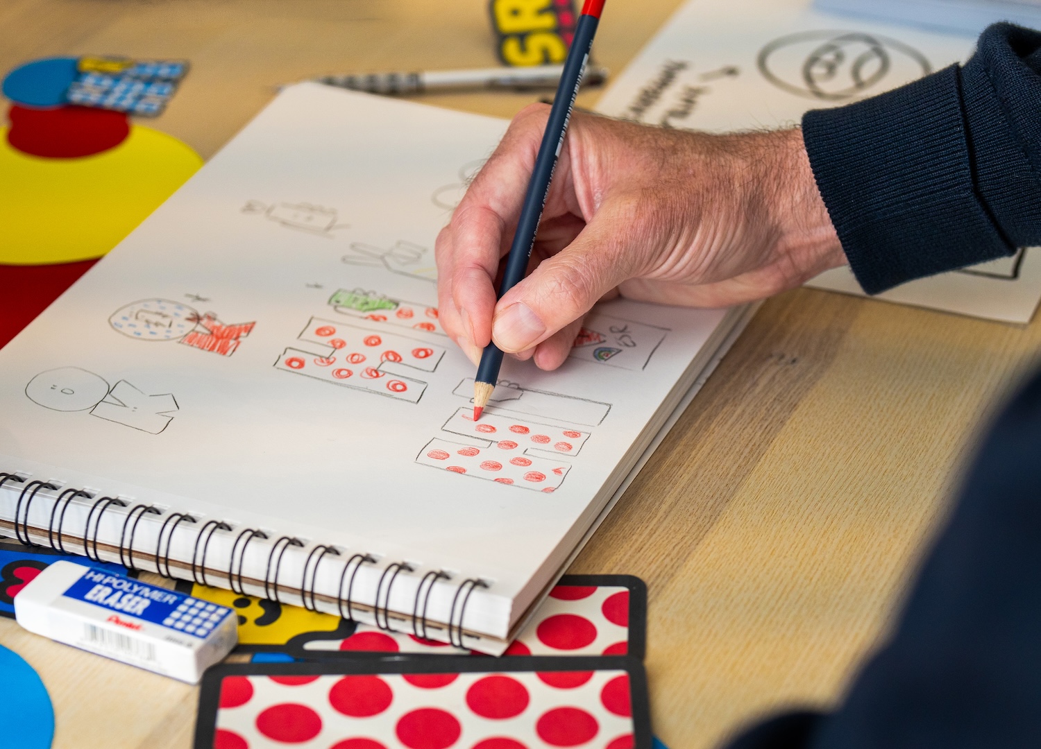
This project isn’t trying to reinvent the phone case. Instead, it’s about seeing how something familiar can look and feel different just by using a new graphic style. On one side, you have ESR, focused on making tech accessories practical for everyday life. On the other, Craig & Karl brings their knack for bold images, color, and eye-catching references that show up everywhere from galleries to packaging. Blend those two mindsets, and you get a phone case that still does its job – protects your phone – but actually stands out in a sea of lookalikes.
Phones keep getting more and more alike. That’s made the line between how something works and how it looks way more interesting. You don’t have to invent a whole new object to make it feel personal. Just playing with the visuals – giving the surface some character – can do the trick. This collaboration runs with this, fusing digital culture, pop art, and playful illustration into cases meant for everyday life. The idea is simple, but the result? A regular phone case with a fresh layer of personality, turning a practical object into a little canvas for self-expression.

Ludovica Proietti
Ludovica Proietti, journalist, design historian and curator, teaches in universities and curates events, always exploring projects with fresh, unconventional perspectives.