The refined minimalism of Apartment DL in São Paulo
A 120m² apartment in São Paulo, Brazil, was given a refurbishment by StudioLIM to reveal the minimalistic interior design of Apartment DL.
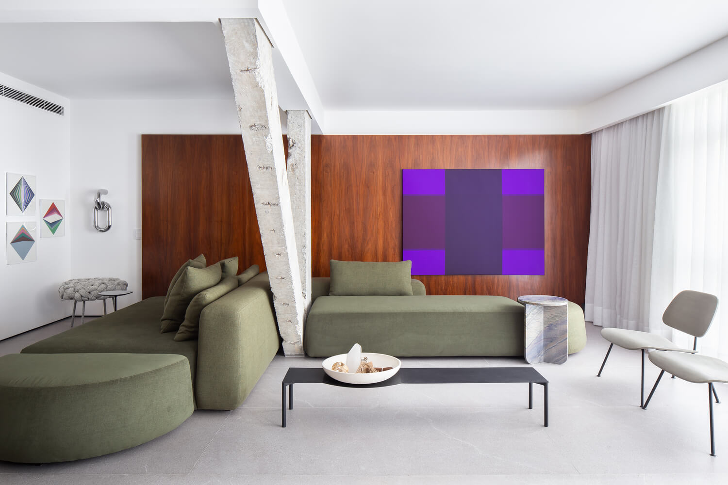
In São Paulo, architects StudioLIM renovated Apartment DL to transform it into an open, airy, and timeless space that can be personalised with unique furniture for years to come. It includes simplicity in every aspect of the design including material choice, lighting design, and effortless transition from one room to the next
The original interior design felt disconnected and didn’t possess the modernity that the clients sought after. So StudioLIM came up with a plan to transform the apartment into a space that’s suitable for the needs of contemporary living.
Gallery
Open full width
Open full width
The minds behind Apartment DL – StudioLIM
Brazilian architectural and interior designers, StudioLIM designed Apartment DL to be a minimalistic and contemporary home. Their portfolio of work showcases their speciality in creating strategically planned, highly detailed, simplistic interiors. StudioLIM is a relatively new design studio in Brazil who pride themselves on creating modern living spaces that include the Brazilian charm. Clean lines and highly detailed materials work in harmony to create their sophisticated interior designs across Brazil.

Materials & Techniques – Pillars and wooden panelling
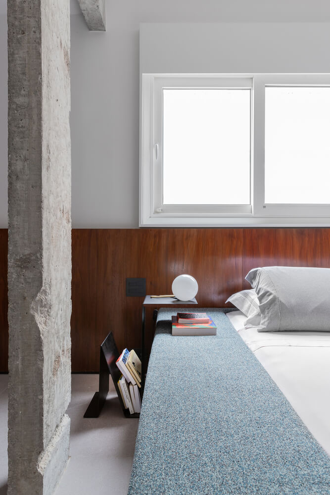
At the start of the project when a wall was removed between the original second bedroom and the living room, a V-pillar was discovered that paved the way for the interior design of the whole apartment. Several pillars were uncovered throughout the apartment which provided continuity of shapes and proportions. StudioLIM then worked to create an interior design that unified the room and the pillars without making them fight for individual attention.
The interior design mainly used a palette of white walls, grey concrete, black granite, and wood which was used in each room for a sense of connection between the spaces.

In the kitchen this colour palette is evident. The large black granite kitchen island creates a clear divide between the surrounding open-plan living spaces, which joins a large wall coated in wooden panels. The wooden panelling was used for the door and the door surrounding leading to the main bathroom. It was also used to create hidden shelving, to hide a window in the old bedroom (which overlooks a neighbour’s property), and for the headboard in the master bedroom. The wooden tones add warmth to the white and grey details, resulting in more of a comforting home atmosphere.

Style & Aesthetics – Modern minimalism
The brief of the project was to create an open apartment that flowed effortlessly from one room to the next. The layout of the apartment was adapted from the original design to increase the flow of natural light within the space. Several walls were removed to unite the spaces to create a timeless aesthetic that the client could personalise. The apartment was afforded with high ceilings which helped to increase the flow of natural light.
StudioLIM integrated lighting into hidden panels, cohesive with the minimalistic aesthetic in the rest of the interior design. The result of the lighting design was one that had no visible lighting points, but at night the lighting bounces off the architectural design.

Furnished with the clients “no fads, no labels” personality
The neutral and minimalistic base of the interior design enabled the client to fill the space with furniture that reflected their personality. The client was a designer and collector of unique furniture items. Their taste was eclectic and had no defined style, without fads or labels.

Design Memento – Simplicity and refinement
StudioLIM achieved a beautifully refined interior design for this renovation project. The Brazilian apartment was refreshed with the introduction of a more open and flowing interior design that was given a wash of contemporary refinement. The gentle colour scheme allowed the client to personalise the space with their own furnishings without having a dramatic clash of styles. This method results in a timeless design that can be continuously be restyled with new furniture whenever the client desires.

The writer’s comment – “A highly sophisticated blank canvas”
StudioLIM achieved a highly detailed blank canvas for the client to then develop using their own unique collection of furniture. The studio carefully considered how they could make the interior design as minimalistic as possible, which is evident in the hidden shelving units and the hidden lighting.


