Why are surfaces important for contemporary shopping experiences?
The doors open, we walk in and suddenly we merge into another world. But it is not the beginning of a fairy tale, it is just a shopping experience meant to lead any customer to experience a brand’s identity in the most complete and immediate way

Welcome to a XXI° century store. Continue to read if you want to know how surface design participates in the narrative plot through project and technology: we asked Lea Ceramiche to tell us everything about it.
Let’s start with an award winning mall in New Jersey
New Jersey, the metropolitan area of New York City, is the residence of the millions of people who gravitate around the Manhattan area. The Middle Class neighborhood, with the social extremes of any densely populated area, hosts hundreds of malls, the US commercial synonym for the universal concept of market.
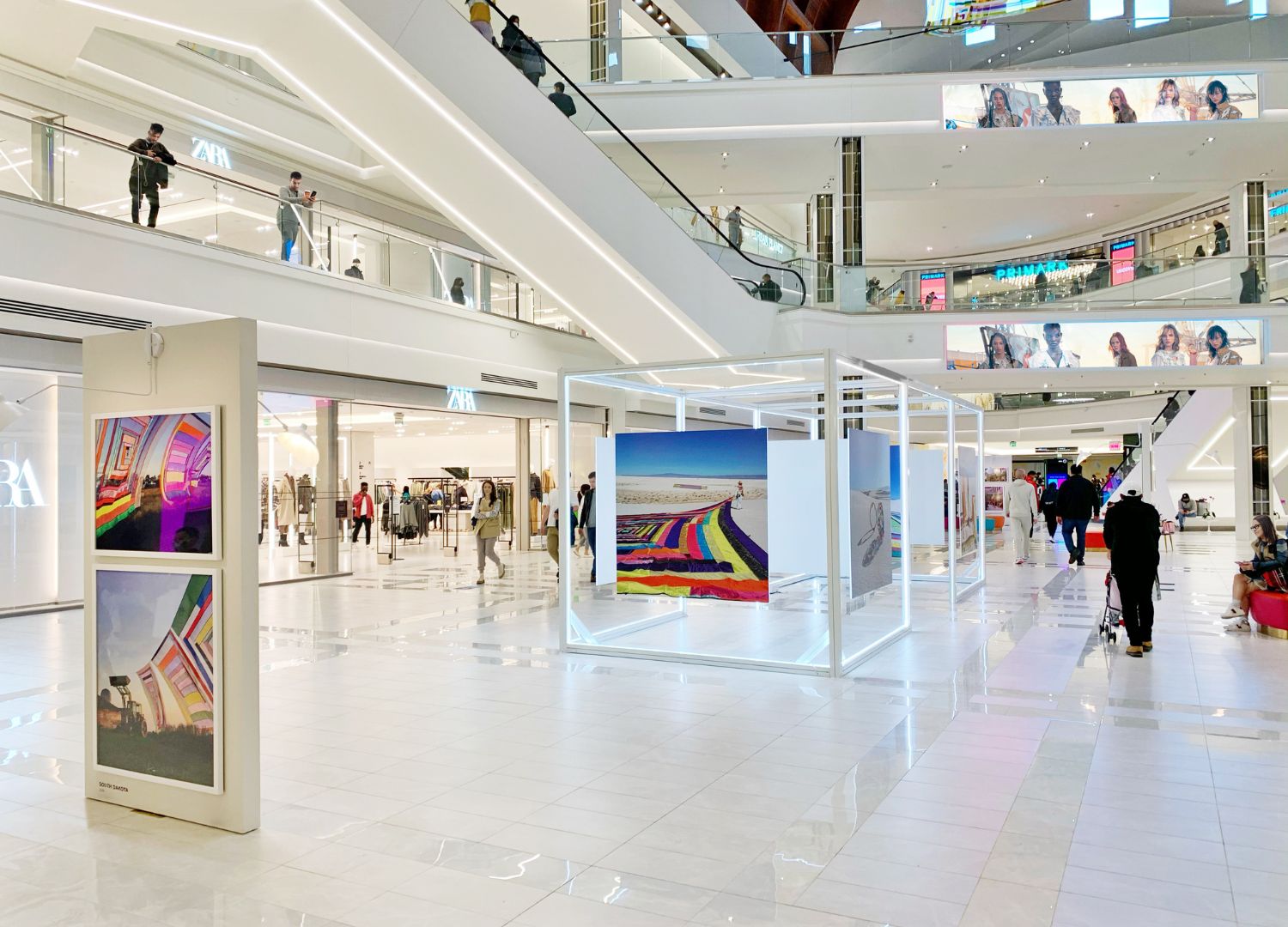
Its formula involves huge dimensions, two or more levels and a high concentration of stores, flagship stores and mainstream brands. American Dream is a good example: a 3.2 million-square-meter facility that combines shopping, entertainment and family attractions.

In this elegant, structured environment with stores, boutiques and a restaurant, enhanced by leisure experiences including a water park, the GH+A design firm opted for the large 100 x 300 cm format slabs from the Slimtech 5Plus Absolute collection for the project.
5.5-mm-thick laminated porcelain stoneware embellishes the structure’s columns with Total Black shades in the bright gloss version and Total White shades in the intense matt version for a striking aesthetic effect, creating impressive alternating surfaces.

Sustainability is to be found in a selected production chain
Impressive showing off of materials to create a disseminated sense of luxury and high end architecture is quite the rule for these commercial spaces architecture. But American Dream won last year the 2022 Ceramics of Italy Tile Competition for the Commercial Category. It is the Oscar of the North American surface sector and it was granted to GH+A design also for choosing a highly sustainable and high tech Lea Ceramiche product so as to lessen the impact of the building and to enhance its spaces.
Commercial spaces have been more and more designed not to burden the environment with non needed quantities of CO2. The material suppliers’ production chain is one of the smartest ways to check in for real and certificated green choices.

An organic based skincare brand’s first store in Hong Kong
Sustainability issues are on the main menu of architects and designers, as it is demonstrated that 80% of the overall carbon footprint may be checked during the design and building process. This is even truer when talking about brands willfully choosing to stay on the green side of commerce, like Beautysaur Organics, a skin care and beauty brand.
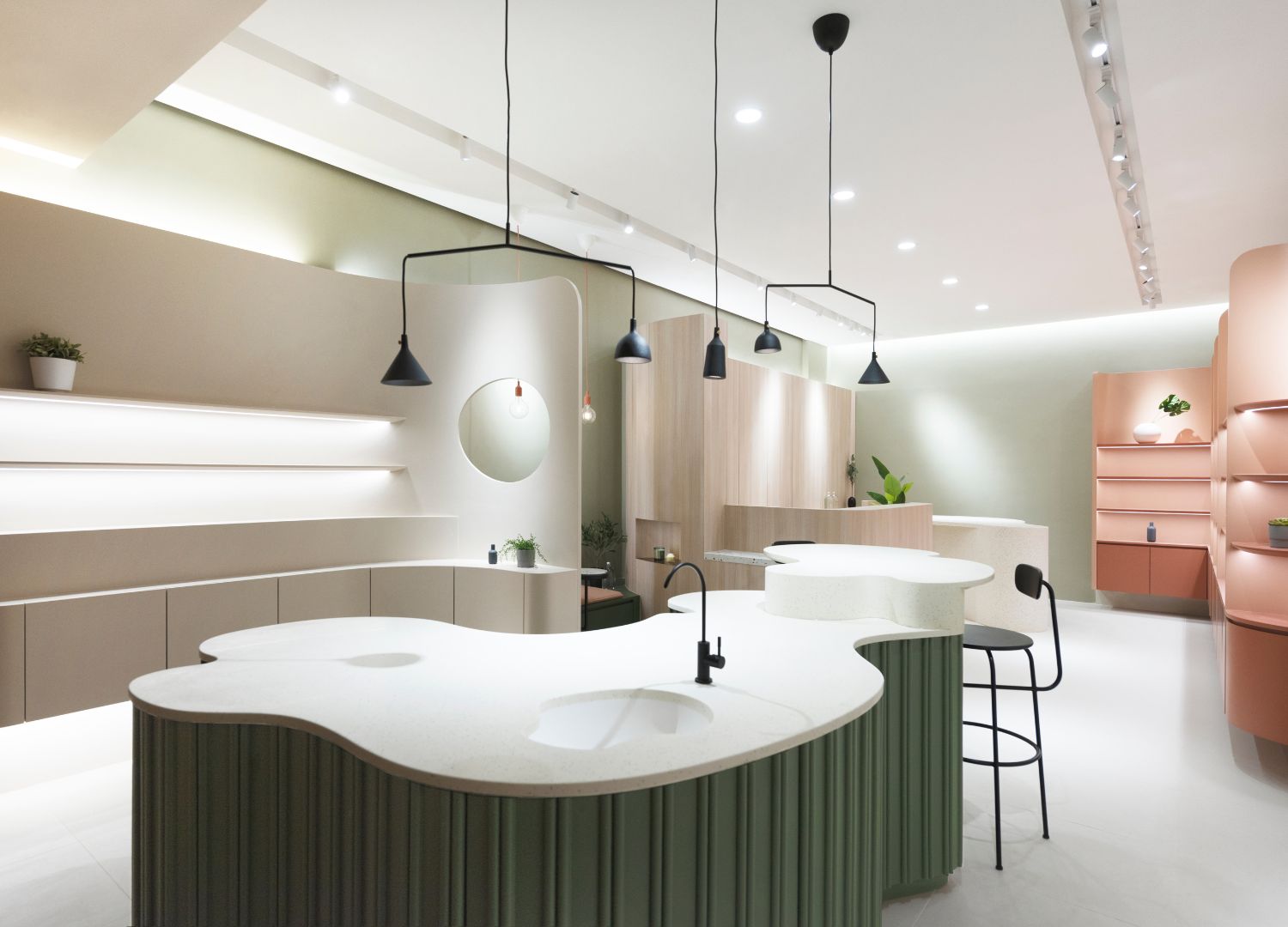
After initially being an online shop based on organic fermented ingredient products, Beautysaur Organics wanted to fully develop its potential through the physical experience of a dedicated commercial space. Bean Buro Studio designed the Hong Kong’s Tsim Sha Tsui district store envisioning a careful research that is reflected in the choice of materials, the eclectic arrangement of furniture elements, and the combination and perfect balance of architectural forms with soft and welcoming materials and colors. Significant color transitions define the different work areas and, together with the precise sequence of furniture designs, lend character to the project.

Neutral and solid white surfaces to enhance a colorful interior
Metropolis by Lea Ceramiche was chosen for the floor covering, concrete-effect porcelain stoneware in the subtle Tokyo White shade. “The milk white of the floor emphasizes, by contrast, the color of the pink furniture and the presence of a green-coloured table with an organic design. The minimalist style of the concrete and the use of soft and uniform colors for the walls provide a feeling of harmony and comfort”, Lea Ceramiche explains.
The wood used for the furniture alternates with the white of the ceramic with an extremely natural texture; uniform colors that are only interrupted by a few custom-made display elements and their sinuous and curvilinear shapes.

Surfaces expressing a design centered brand identity
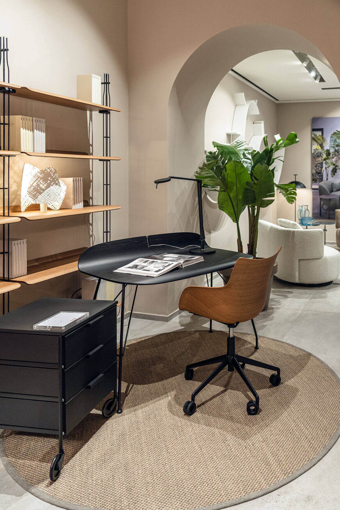
A new flagship store in Genoa, Italy, is the 2023 Kartell new commercial venue in a frame of intense work to deepen its physical presence on the market. Once again surfaces play an important role in defining the brand’s identity as one of the most exciting and cutting edge design brands in the world.
The flagship store designed by architect Ferruccio Laviani, the brand’s art director for many years, is located in the town’s understated and rational environments, softened by granite arches and columns. The overall project allows visitors to enjoy the Kartell experience in an immersive way, allowing them to experience first hand the beauty and quality of the renowned brand.

Ferruccio Laviani: “A covering consistent to Kartell’s products”
Designer Ferruccio Laviani says: “Kartell is always looking for new ways of expression, not only through products but also through stores. Its commercial concept is constantly evolving to align itself with current trends and the needs of the present.
This is why we chose Concreto by Lea Ceramiche, a collection designed by Fabio Novembre. It is a covering which is consistent with the contemporaneity of the Kartell product, and it is also easy and versatile in terms of formats and finishes.”

Surfaces to create the European identity of a South American brand
La Martina is a signature brand of Argentina lifestyle producing sportswear and equipment for polo, the national sport (after football, of course). In Buenos Aires La Martina’s flagship store is inspired by country architecture and pieces of furniture coming from ancient masons. A style that wouldn’t fit in Milan fashion and design district Brera, where the brand recently inaugurated its first European store.
Designer Fabio Novembre, who’s been in charge of the refurbishment project, states that the aim of his work was to transliterate La Martina’s identity in a cosmopolitan space, where the brand’s values are integrated in a historical building with a discretely elegant allure.

The light design focused on giving a new accent to the façade details, while the interiors are the perfect set for a contemporary shop experience enhancing the colours and the materials of La Martina. Moreover, a part of the store is dedicated to a bistrot inspired by Argentinian cooking. Lea Ceramiche was chosen for the floor surfaces.
Bio Select is a collection mimicking different essences of wood, in this case, Oak Natural and Walnut Cinnamon. For the restaurant Fabio Novembre opted for Concreto in the Extra Light shade, a slab combining the visual inspiration of concrete and exceptional technical performances.


