Legible London: The effective wayfinding system that creates ‘readable’ cities
DesignWanted invited Tim Fendley, Founder & Creative Director at Applied, to understand the logic, application, and design of the successful wayfinding system, Legible London.
Legible London represents the most comprehensive approach to implementing a wayfinding system in a global city. The project, conceived by international design practice Applied, has been developed into a wide-reaching pedestrian system and walking identity for London that incorporates signage, printed maps for commuters, businesses, visitors and shoppers, downloadable and digital maps, a number of smartphone apps, and integrated public transport information.
Legible London has set the benchmark for how city-wide wayfinding projects should be developed and implemented, and Applied has continued to pioneer this system-based approach to making complex environments legible in cities across the world.

London and walking
Residents of London make around 18 million walking journeys per day. Whether it is a walk to work, walk to a bus or train station, or just a leisurely stroll, these journeys account for 36 percent of all daily trips in the city.
To understand these journeys, Applied set out a vision for a common solution to wayfinding, outlining the principles of a pedestrian signage system that encourages walking, takes into account the viewpoints of all stakeholders, makes London easier to understand for pedestrians, and ultimately delivers the benefits that increased walking brings.

Navigating a medieval city is tough
In London, the problem of disorientation can be acute. People find many areas of the city hard to understand, and this induces considerable stress. The realization of being ‘lost’ is a negative feeling, sometimes bringing on panic, a sense of impending disaster. This may seem to be problematic only for the tourist, or for someone visiting an area of the capital for the first time; those who know the place, after all, can find their way around no matter how obtusely the environment presents itself. But this underestimates the multiple effects of poor legibility of the urban form and street environment.
It can be just as problematic for someone who knows the area as for a stranger. The time and effort required can still be considerable and require concentration. If you are spending your time looking for landmarks, thinking about where to go next, checking you have not missed your turn, then your time is unproductive, leaving little scope for reflection, observation, and taking interest in what is around you –for being ‘involved with’ the place rather than just traveling through. This is still a problem for millions every day, and for nearly every city.

Getting something started is the hardest part
By the early 2000s walking was actually reducing in London. The Mayor, supported by the Green Party, set an ambitious goal to make London the most walkable city in the world. Briefs circulated to revise guidance in order to support walking. Applied, led by Tim Fendley, an information design expert, had just designed Bristol Legible City. Their insight was that the underlying problem was a lack of coordination across the city.
In central London there were 36 different pedestrian systems that didn’t work together. More guidance would not create a system that everyone could identify and rely on so Applied re-wrote the brief and proposed the need for a ‘walking system’ that all organisations could be a part of. Applied then gave the idea a name: Legible London.
Three years later, after five studies, an exhibition, book, and lobbying nearly every organisation that could be involved, a prototype around Bond Street station was commissioned.

Deeper observations uncover confusion
The Applied team had the opportunity to research movement flow and people’s perceptions. Transport planning is dominated by investment in hard infrastructure. Perception and ease of use are often forgotten and can yet be highly effective. Legible London is a piece of soft infrastructure. Early research highlighted how much tube stations anchor people’s knowledge of the city and how their perception of distance is warped at the same time. At the time, 44.5% of people walking around were using the tube map to navigate.
Many Londoners know how close Leicester Square tube is to Covent Garden, and how often the tube station is overcrowded. A walking tube study by Applied showed that nine out of ten stations around Covent Garden were quicker to walk to than to travel underground. Overall, 55% of journeys between tube stations in central London were quicker to walk. This accounted for 7% of tube traffic on a system that was operating at and above capacity.

Looking at how the public was being directed there was confusion everywhere. There was no coordination of destinations and local systems would stop at their edges. The use of scale, for example, included every possible method of describing distance: meters, kilometers, yards, fractions of miles, minutes, even hours. Information on the street was in a myriad of colours and typefaces, with not one appearance taking precedence. The result was that the 36 systems were only recognized and used 3.7% of the time. A similar study in Madrid showed that no-one at all used the outdated pedestrian system.
In one instance, a couple shopping in London for the day, were exasperated that they had spent two hours trying to find Covent Garden and they ended up giving up the hunt. They were on Regent Street and were astonished to find that their destination was less than 15 minutes away. The route would traverse a number of nodes and could be explained in a manner that would be memorable and therefore doable: ‘head for Piccadilly Circus then Leicester Square and keep going, you can’t miss it’. This laid the foundation for how one system could connect London’s parts in a way that fits with how people structure places in their minds.

How it was tackled
Creating a solution would require the study of human psychology delving into how people naturally navigate, recall routes, and understand neighborhoods. It would require a detailed knowledge of the streetscape, flow, character, and how this can be described.
And it would lead to the design of a system that could unite the agendas of many boroughs, business improvement districts, landowners, the Mayor and the transport authorities. If coordination of information was the problem, it would have to be tackled differently, and better than ever before.

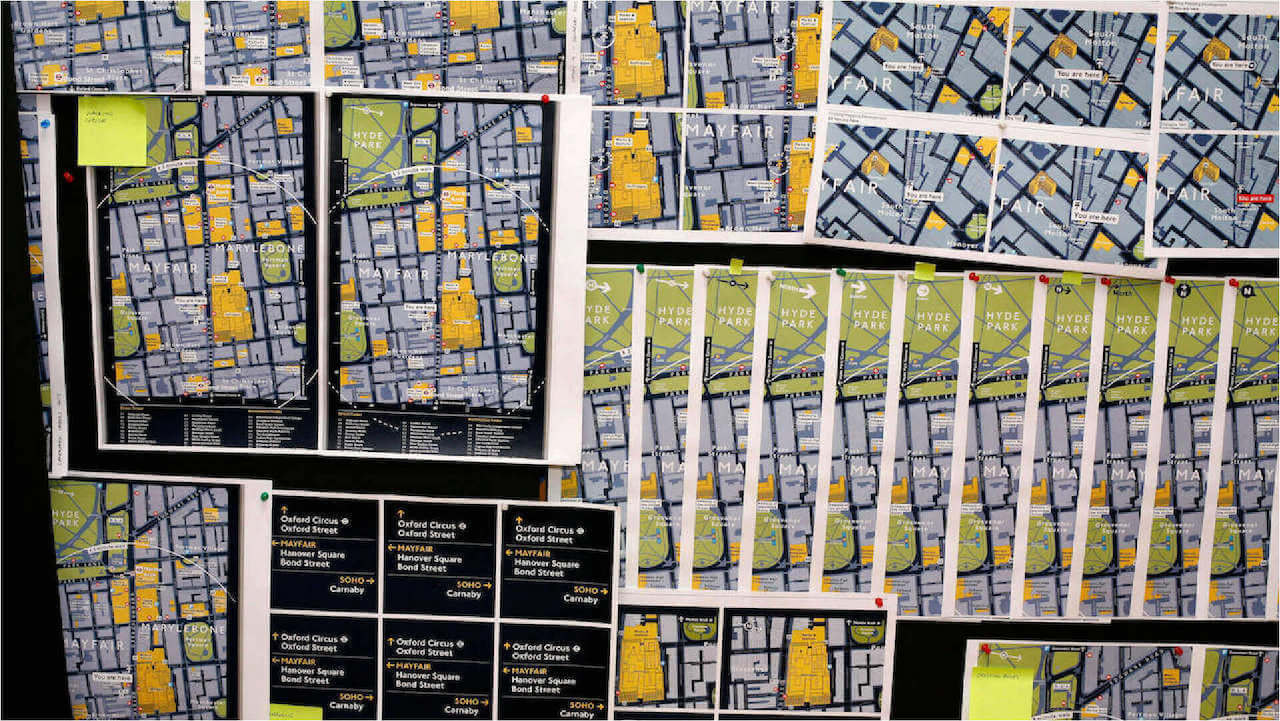
Legible London, what’s unique
Legible London was designed to be visually engaging. It was purposefully crafted and engineered from London’s artifacts. London’s readily recognizable typeface married with a colour scheme that was devised to capture a sense of the city and feel a part of the transport system. The objective was to encourage walking and alleviate uncertainty. The strategy was to teach everyone London as fast as possible, and give them the ability to learn areas and how they connect; give them the freedom to roam, and the confidence to get lost.
From the study of behavioral science, real learning only occurs in adults when people really concentrate, this requires their engagement with a purpose. The design team went to great lengths to design beautiful maps that would draw in the viewer and have the ability to impart geographic knowledge like good typography, if it did its job well, it would become an invisible assistant.
This thinking was blended with a highly functional information architecture. It had to perform. During early research the significance of London’s villages and landmarks to the structure of the city was clear. Soho, Mayfair and Clerkenwell were distinct, known and useful. What was also clear was that these area names were not formally recognized, or agreed upon. At best, they are defined by estate agents. The Applied team saw this an opportunity to understand the city by its villages and zonal structure punctuated by landmarks. An application of the observations of Kevin Lynch in his seminal book, The image of the City.
The result is a hierarchy of information, from the area name, directions to nearby areas, and mapping that define the villages. The team realised two map scales were required. One, a 15-minute walk shows what is possible and enables more walking to tube stations, 10-15 are identified within the 15-minute circle. The other, a 5-minute walk of your local neighbourhood. The maps were oriented the way the sign was facing.
Map reading is a skill and research has shown just how hard it is to decipher a North-up map if you are not an experienced map reader. We devised and tested the designs to only answer four simple questions. These were repeatedly mentioned in the research: where am I? Where is it? How do I get there? and what else is around here? Prototypes were heavily tested to make sure these questions were being answered

Good design is effective and pulls organisations together
Legible London continues to grow in the capital with estimates that it is viewed and used over one billion times per year. The system has been extensively tested and reviewed and has a more proven impact than any other system.
- 5% measurable increase in walking
- 60% decrease in people feeling lost
- 16% time-saving improvement for pedestrian journeys
- 66% increase in user knowledge of local area context
It has become the design standard which has since been adopted globally, by local government and transport authorities, private companies, landowners, business improvement districts, and stakeholders with an interest in providing a better experience for city travelers. There are over 50 copies in cities throughout the world.
Working with many organizations, each with their different agendas, can be fraught and often lead to a lowest common denominator solution: a compromise that everyone can agree on. Legible London is an example of a high-common denominator solution where the design of the system was led by the objective, science and best-practice. The experience to create it was not a compromise, but a search to achieve effectiveness. It captured the imagination of nearly every organization that now plays a part in running it.
Applied have gone on to devise systems for many other cities, Rio de Janeiro, Seattle, New York, and currently Madrid and Paris, as well as complex buildings, National Gallery and the MET NYC, and campuses for UBC, Princeton and Google.


