“If you make them smile you got them”: the ingredients of best-sellers
Internationally renowned American architect Michael Graves was a very talented and iconoclastic man.
With his work – think Portland Building, Humana Building in Louisville and Team Disney Building – he embodied the essence of the Post-Modernist disruptive spirit which he also taught, as Professor Emeritus of Architecture, at Princeton.
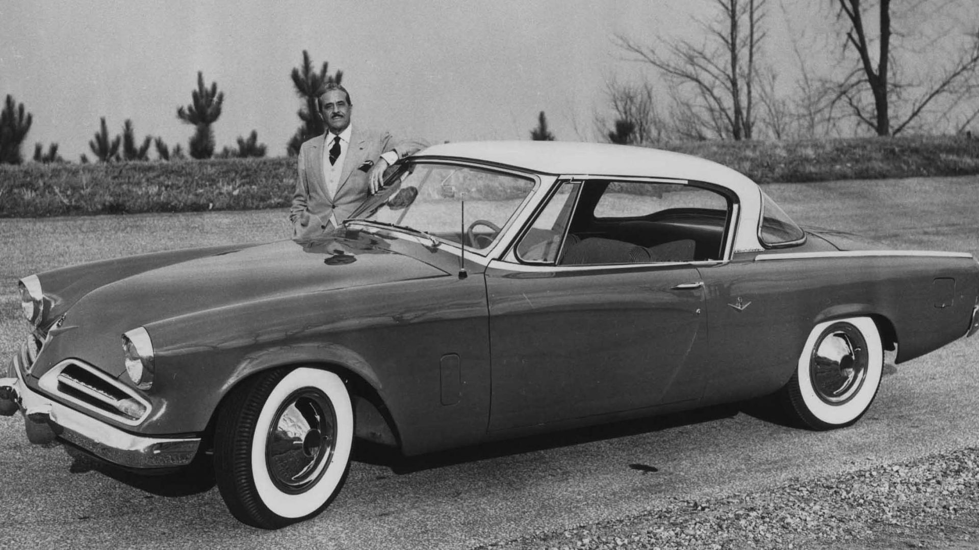
He was also one of the most successful designers of best and long seller products for many international companies, like Alessi.
Despite operating in a totally different time-frame, economic setting and aesthetic outlook, looking at Michael Graves’ approach to design – he clearly stated that it should be “for all” – can still teach us a lot about how to envisage a product that sells well yet is not silly, too fashionable or merely a stunt.

Remember we all were children
Childhood memories: everybody keeps an innocent mind somewhere. Letting it emerge is always a rewarding experience, because it makes us feel at home.
So recognizable details and palettes, historical references and playful shapes and structures are always welcome in design.
Beside mastering the technical details, the production process and materials technology, Michael Graves used to say to his students, as a designer you need to think about the relation between humans and objects.
When entrepreneur Alberto Alessi and Michael Graves met, the Italian brand was in full design boost mode.
The third generation of Alessi wanted to enter the world of design using the Radical transition to pop aesthetic.
The first attempt was Tea&Coffee Piazza in 1983, a collection of tea and coffee sets designed by international architects.
Commercially speaking Grave’s one was the most successful even if the product was set in the very high end of the price range. Why?
Because it was joyful and full of childhood memories: fairy tales, princess castles, speaking teapots and walking cups, coupled with colorful details.
Light blue was HIS color, created an irresistible domestic landscape. And it made everybody happy.
“Must be good for an 8 years old and a Ceo”
If addressing the child within is rule number one, number two is a mere variation on the theme.
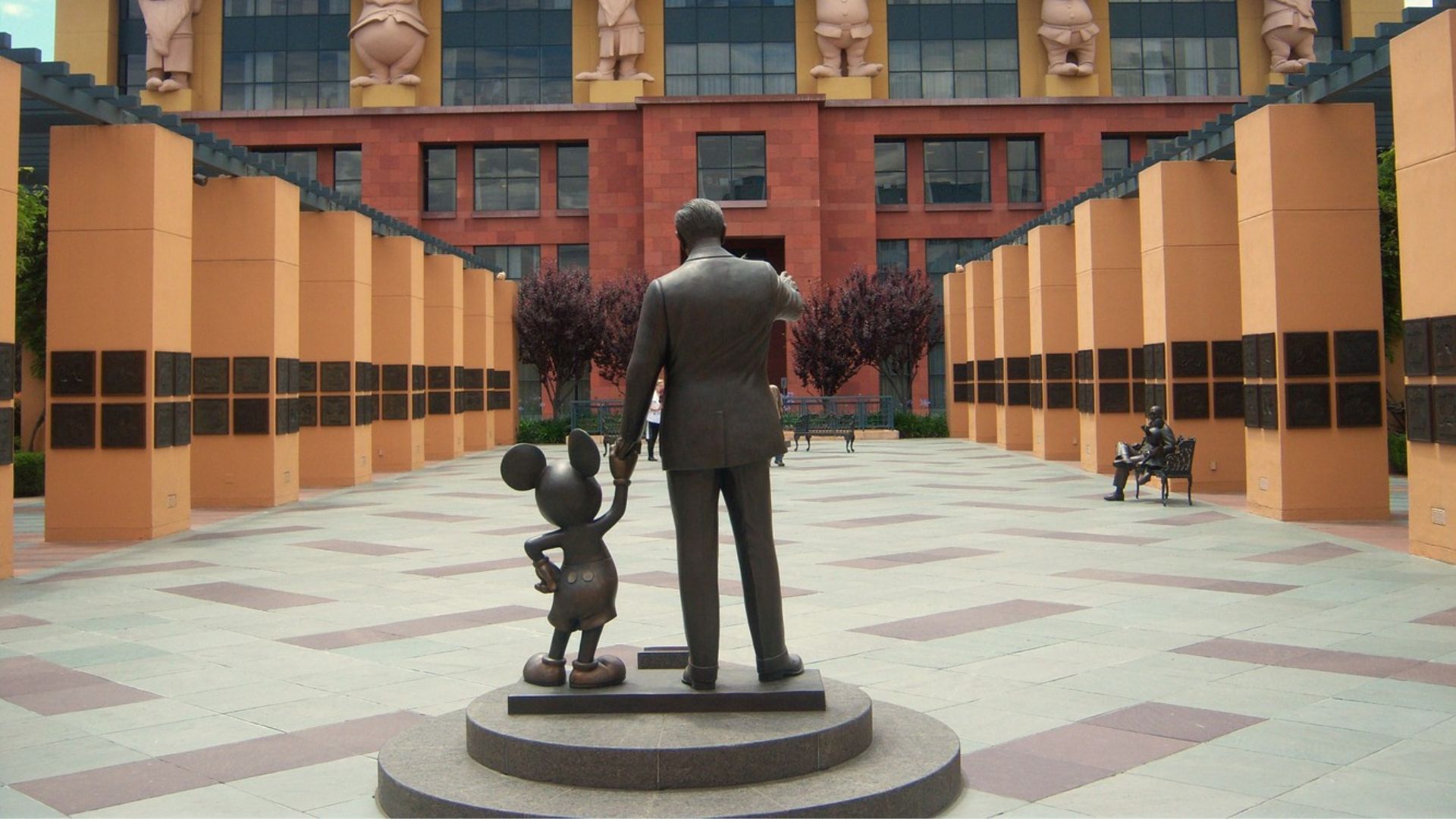
“It must be good for an eight years old AND for a business man,” Michael Graves famously said about the Walt Disney World Dolphin Hotel in Florida, with its iconic cartoon’s style ballrooms and fiabesque interiors.

Graves wanted architecture to be loved and, most of all, understood. It is one of Graves’ themes: to fully represent a society and its ordinary language, looking for beauty and meaning everywhere.
Think about the Disney Team Building and about the seven Snowhite’s dwarfs acting as cariatides on its facade.
The whole architecture is transfused with the magic of the Disney universe, which Graves translated in a temple-like classical structure, hence stimulating adults’ brains into a recognition of historical, grandiose patterns.
In order not to make all this too imposing, he used colors to establish an informal relation between visitors and architecture.
Surely a contemporary empire is more friendly when it’s delivered like a child pastel drawing in 3D…
Too cheesy? To our eyes today, maybe. But the Grave’s projects never neglected any aesthetic code.
Even the most kitch visual inspiration could be part of his scenario if it coud be transformed into valuable aesthetics to tap into peoples’ hearts.
No pop was too pop to become popular architecture.

“Make them smile and you got them”
Irony, along with the ability to engage the child mind, is another key ingredient of best selling products. It concerns the talent to make people smile, to ease the ordinary world with a smart joke on forms and functions.
Surprise is the first activator of laughter, says Freud. So, as a designer, always think about how to build irony around forms, functions, names, materials.
A very valuable process that turns objects into stories and vehicles of long term relationships. Michael Graves designed the 9093 kettle for Alessi in 1985. The product was immediately nicknamed “Uccellino” – little bird – after its iconic bird-like whistle.
The didascalic superposition of form and function was unexpected and surprising.
The metal pattern functioning as a decoration on the kettle stainless steel surface gave it the trendy punk hint of the moment.
And, finally, Graves decided once again to use colors: his signature light blue of the handle and the red for the whistle to signal the temperature of the two components.
From this concept a full series of products was born, changing completely the idea of what design was about and brought Alessi to a huge, global success.
Guido Venturini designed the Firebird, a sextoy-like hoven lighter.
Then came the Pinocchio funnel – with its long nose as spout – the Merdolino wc brush mimicking a vase plant.
People discovered that design can be playful, light hearted, even silly-looking: but mostly, when it’s good design, it can make you smile without stopping to be clever, useful and functional.

If it cost too much, give up on details
The last teaching coming from Micheal Graves’ story is related to the mass production of good design.
Working for a very popular brand requires cost-effectiveness: and that can be achieved by giving up on some precious detailing while retaining a good quality design.
The real occasion to put Michael Graves’ democratic ideals into a real product system occurred through a partnership with Target which started in 1997 and lasted for 15 years.
The convenience stores chain started to distribute a Michael Graves’ homeware collection.
It was a bit of a naughty affair since out of the 2000 items many were clearly inspired by the signature items previously designed for Alessi.
Graves and Target downshifted the production quality standard to make products accessible.
They decided to abandon the hand made finishings and the artisanal manufacturing to industrialize the production process and make it a mass market operation.
Result: a billion dollars in sales.
Was it good design?
As long as functions and aesthetic research were there, and products were built to be cherished (hence to last) yes.
Although today more restringent issues related to sustainability should be taken into consideration, another valuable lesson from the late American maestro.
About the author

Freelance design journalist. Co-curator at Designatlarge.it. Columnist at Interni. Professor at NABA Milan.
Linkedin