The new Google Brussels by PUUR: an interior in five layers
Google teamed up with the Belgian interior design firm PUUR to renovate their office in Brussels

PUUR designed a multi-layered interior in which workplaces, various meeting rooms, a café, a lounge, a kitchen, a restaurant, and a fully equipped gym were all able to coexist in a mature and harmonious whole.
The starting point was to create an interior in which, even after several visits, there is always something new to discover. You can’t fully absorb the interior all at once. The different layers interact, reinforcing each other and creating a fascinating whole, with a lot of different kinds of activity and a multitude of colours and materials coming together.
Gallery
Open full width
Open full width
There are five distinguishable layers to the project
Starting from the context, the designers have integrated the adjoining park in the design. For the structure, the building was stripped to its essence where sustainable and traditional Belgian materials were used in a surprising way.
Within the design, there are special interventions that include a brick wall, the use of an open staircase as a display element, and a reclaimed wooden floor. To finalize the beautiful design, a graphic layer that plays with contradictions was added.
The layered structure of the design has led to a balanced whole: an inspiring working environment in which Googlers can get the best out of themselves.

Context: integrating the adjoining park in the design
Google Brussels is located in a modern office building that was built ten years ago by Jaspers-Eyers Architects. The building has a neutral appearance and overlooks the green heart of the European district: Leopold Park.
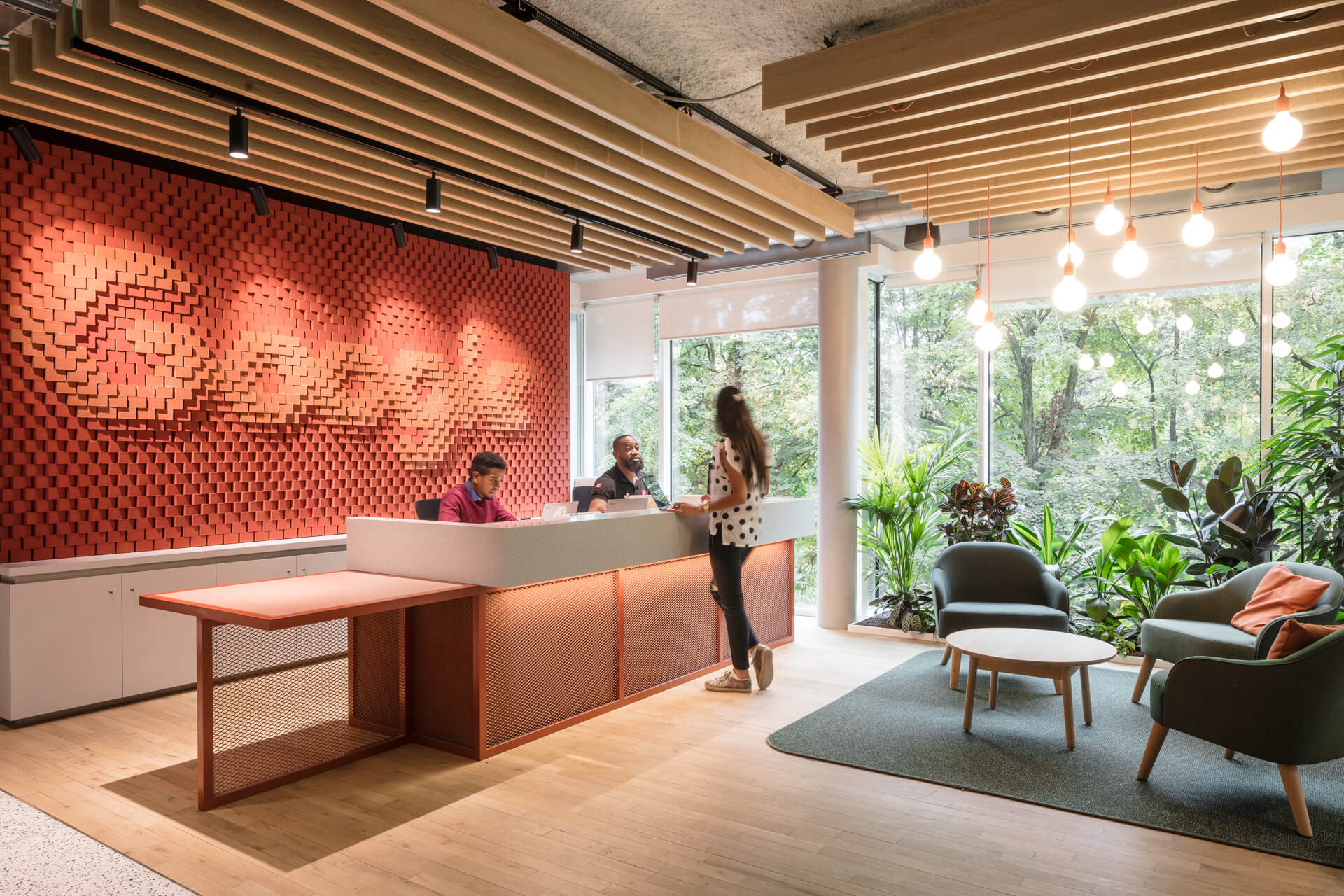
PUUR has integrated the park as much as possible in the design, in order to use as much of the light and the greenery as possible. The original reception desk blocked the view of the park and took away a lot of light.
The new reception desk was therefore subjected to a ninety-degree turn, which gives the sense of always being connected to the park, a feeling that is reinforced by the green that ‘sticks’ to the inside of the glass façade and blurs the boundary between inside and outside.

Structure: stripping the building to its essence
The existing office was completely stripped to reveal the structure of the building and thus its essence. Ceilings, system walls, artificial layouts, and the cladding on supporting structures were all removed. Only the raised floor, which is necessary for data cabling, was retained.
One consequence of this intervention was that the technology came into view, but the interior designers thought this was a good fit for a company that radiates innovation.
The floor plan of the Brussels building has a T shape, with the horizontal section on the park side and the vertical part, where the workplaces are located, in the more enclosed, inner area of the building block.
Double fire resistant doors previously separated the front and rear parts of the storey floors. By replacing them with glass doors and completely opening up the cores, PUUR created a single entity and ensured that the front and back of the building flow smoothly into each other via the main circulation.
Are you passionate about interior design? Check out our article C2 Cafe & Bar by Various Associates

Materials: using sustainable and traditional Belgian materials in a surprising way
Bricks, terrazzo & corrugated iron: These traditional, almost everyday materials can be found in almost every old Belgian house. PUUR was looking for innovative ways to integrate these materials in the Google office.
For example, a terrazzo floor marks the main circulation on the different floors and the worktops in the coffee zones are also made of this material. Corrugated slabs were used as partitions or supporting structures and bricks were incorporated into the wall behind the reception desk.

Cathedral glass
Another special feature is the use of cathedral glass, which still occurs in many old Belgian buildings. The walls of the meeting rooms were made in this ‘cloudy’ form of glass, creating a certain degree of privacy.
“It’s like looking through water: you can see that someone is walking by, or holding a meeting, but not who it is“, says interior architect Jan Geysen of PUUR.
Special interventions
Brick wall
“The wall behind the reception desk on the third floor clearly shows what Google stands for“, says Jan Geysen. “We took red-coloured bricks, an everyday Belgian material, and on the basis of digital data, we glued them together with a robot to create a Google logo. The result is astonishing and symbolizes the drive to continuously innovate and improve that is so clearly in Google’s DNA.”

Staircase
The original staircase connecting the second and third floors was replaced by a new staircase constructed of tubular profiles in white lacquered steel.
The staircase consists of three spiral stairs, has a direction of rotation that connects to the main circulation and offers a beautiful view over the park. The staircase was conceived as a ‘display element’ in which Google can exhibit innovations. The underlying aim of this is to make the virtual real: whoever goes up the stairs also runs through a search engine.

Wooden floor
In the spaces directly adjacent to the park, which include the café and the restaurant, a wooden floor provided by Rotor in Brussels was given a second life.
The floor, which came from a warehouse where forklift trucks drove around, was disassembled plank by plank, and then re-laid in the Google office, before being sanded and treated.
Graphical layer in collaboration with the branding office TODAY
As for the material layer, Belgian culture was also the starting point for the graphic layer, which PUUR developed together with the design agency TODAY.

“Belgium is actually all sorts of things. A country of contrasts“, says Geysen. “In a city like Brussels, for example, the grandeur of historic buildings effortlessly alternates with modern architectural delights and ambitiously high-standard solutions.
We translated these differences into the signage by choosing multiple fonts and making combinations with different materials, such as wood, plexiglass and stickers.”
What do you know about nautical interior design? Check out Pininfarina receives American Architecture Award for its Yachthouse


