Branding a pandemic: a minimalistic ‘return to work’ signage for COVID-19
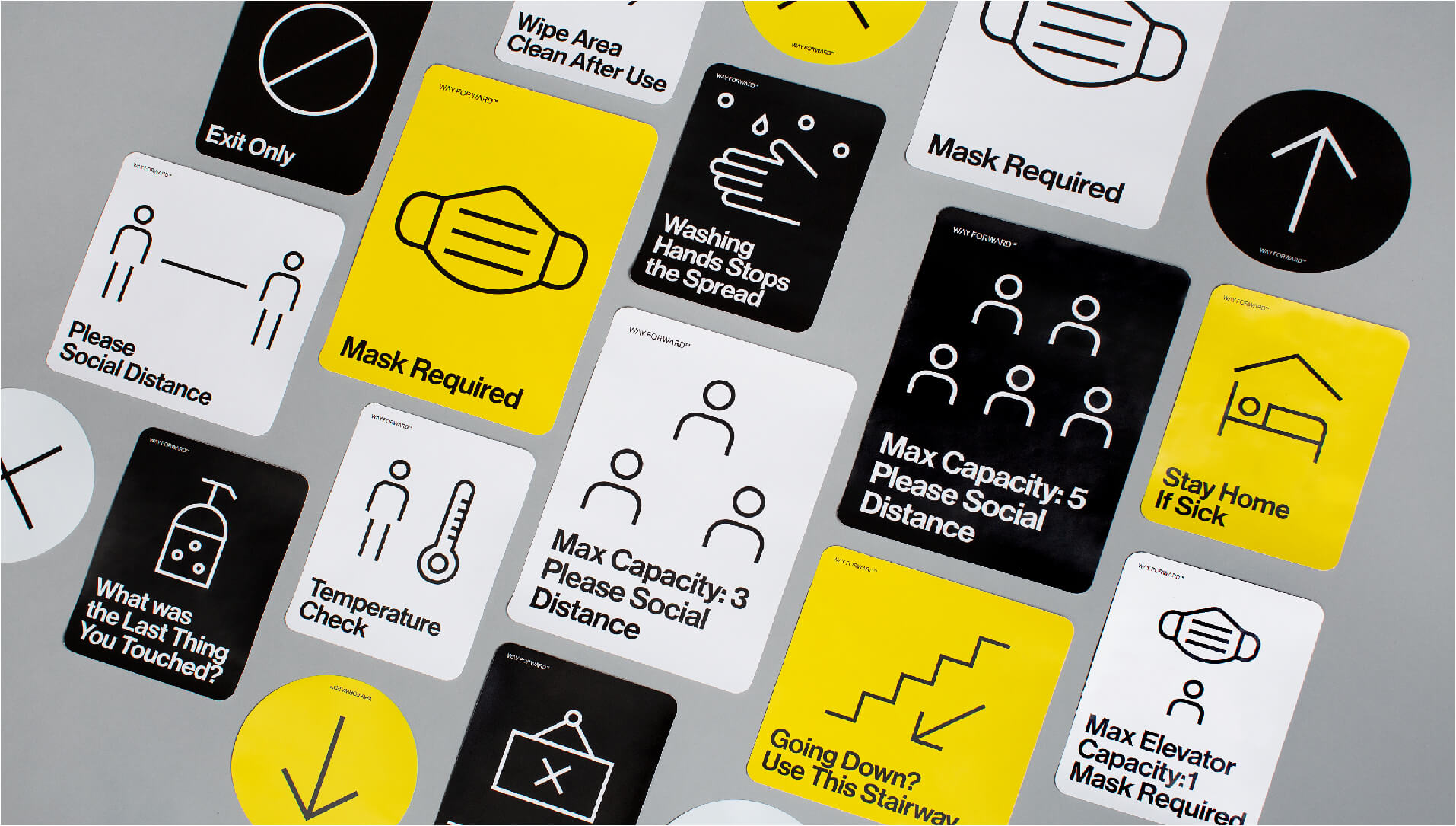
Base Design has partnered with Nashville-based architecture firm Hastings to create signage focused on the immediacy of coronavirus information.

Together, they have created Way Forward Signage Co., a platform with the objective of developing a Covid-19 signage that focuses on health and well-being in order for businesses to reopen safely. A simple and easy to understand visuals that help customers and consumers stay safe during the pandemic.
The coronavirus pandemic has highlighted now more than ever the importance of health and safety guidelines and as we look toward an eventual return to physical working spaces, artists and designers are thinking of new ways to help the public navigate the pandemic.
Gallery
Open full width
Open full width
The minds behind COVID-19 signage – Hastings and Base Design
Base Design describes itself as a communications, audiovisual, copywriting and publishing firm. Established in 1993, it has studios in 4 cities: Brussels, Belgium, New York, and Geneva, working with clients all over the world. Promoting clarity and common sense, Base Design is known for producing and developing ingeniously simple brands like deezer, Art Brussels and Milk.
Founded in 1985 with the belief of giving back to the community, Nashville-based architecture firm Hastings is made up of over 85 architects, interior designers, and planners. Their work includes some of downtown Nashville’s most iconic contemporary buildings like the 1201 Demonbreun project, the Bellevue Public Library, the Thompson Nashville hotel, and the renovation and expansion of the historic Ryman Auditorium.

Materials and techniques – Branding a pandemic
In order to create a series of clear messages, Base Design has applied its usual approach to branding, championing simplicity to create well-designed signage. Aligned by their uniformity, it’s symbolic of branding’s main objective: to convey a company’s core values – in this case, the importance of accurate health and safety recommendations. At the core of branding is a need to maintain a consistent and dependable flow of content, ensuring that the audience can understand the messaging properly.
Here, those messages make up a directive to the public that could help stop the spread of coronavirus. It’s an approach affirming the importance of branding and visual communication in order to convey crucial messages and drive social behaviour.

Style & Aesthetics – Minimalist graphics and simple colour schemes
Featuring simple graphics and even simpler colour schemes, the signage achieves its goal of being easy to understand with a minimalistic style and a barely their aesthetic. A Helvetica-style font and rudimentary icons without detail offer unthreatening illustrations of an otherwise intimidating subject matter. With rounded line drawings on white, yellow and black backgrounds, the design is similar to pedestrian signage or even Cards Against Humanity, in the sense that simplicity makes it so effective.

The final range includes packages for workplaces of different sizes, featuring offices and retail spaces like corridors, break rooms, and bathrooms. It also includes various instructions like ‘Temperature Check’ and ‘Stay Home If Sick’.
Workplaces in a COVID-19 era – New Habits, New Protocol
As we return to work, school, and other familiar spaces that have taken on new protocol, behaviours are changing. There is a necessary adjustment to unlearn old habits and graphics are playing an integral part in this transition, providing a cost-effective way of relaying new information.
This project actually came up when David Bailey, the principal of Hastings, realised a need for new signage to navigate people through new safety precautions in his own office.

Based on research from the Centers for Disease Control, Hastings had already brought nurses into the office for temperature and health checks and thought of ways to redirect foot traffic in order to keep employees safe. He quickly realised however, further precautions to ensure this new way of doing things was coherent and consistent.
Design memento – The importance of signage
Realizing that signs could help by way of introducing new protocol, Hastings is an exemplar of workplaces in the COVID-19 era and the importance of signage. In the workplace visual prompting that lets people know where to go has always been important, but with the coronavirus pandemic turning how people gather into a matter of public health, it’s critical now more than ever.

Covid-19 Signage: strong, simple & successful
Whilst federal governments and other official bodies fail to offer clear instruction, there is an obvious need for employers to relay information that encourages employees to wear a mask and observe social distancing.
In the case of Base Design’s project with Hastings, it attempts to do so in a way more impactful than an 8.5 x 11 piece of paper ran through an inkjet printer. The result is strong, simple and successful, responding to urgent needs for accessible information in light of the pandemic.


