The paradox of clarity: why data design is our most treacherous medium
From MoMA to Refik Anadol and OMA/AMO, major cultural institutions are revealing how visual clarity can lie and why data design’s next frontier is curation, transparency, and power literacy.
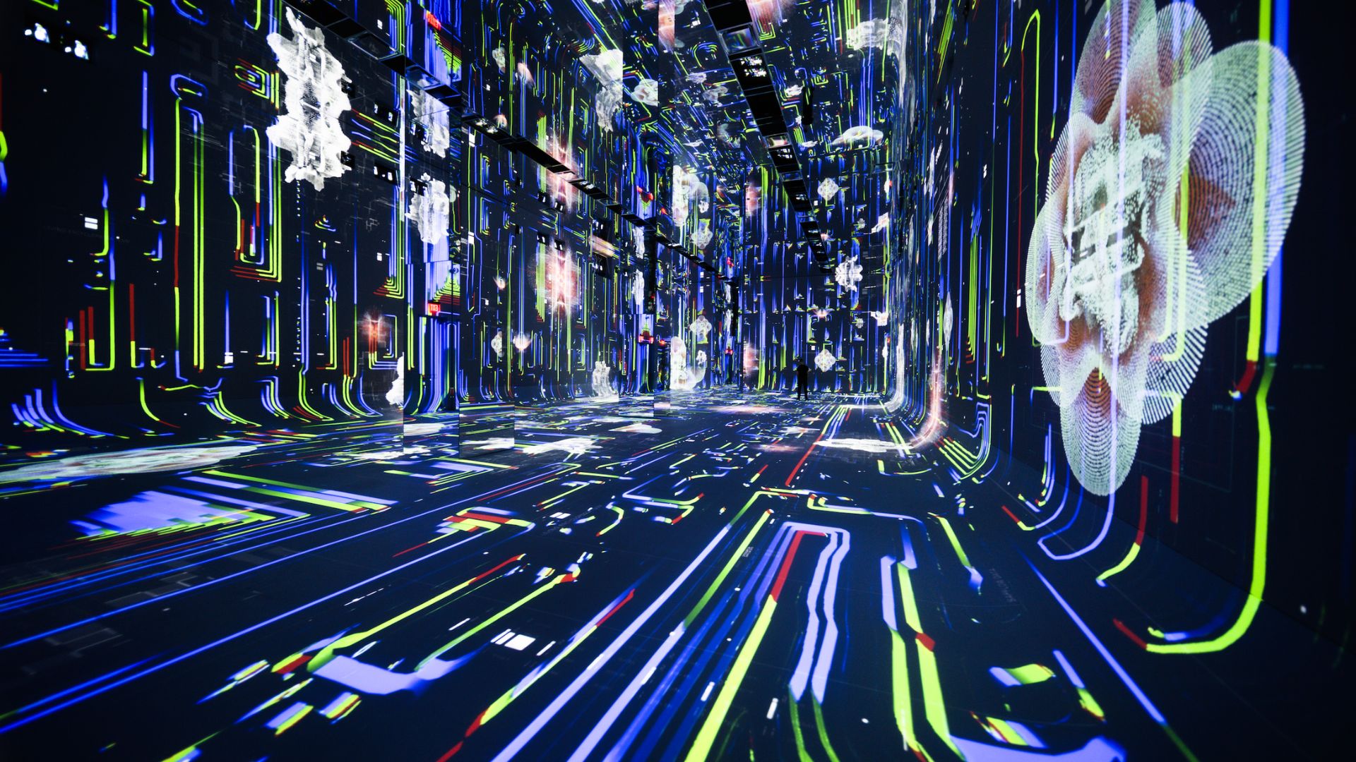
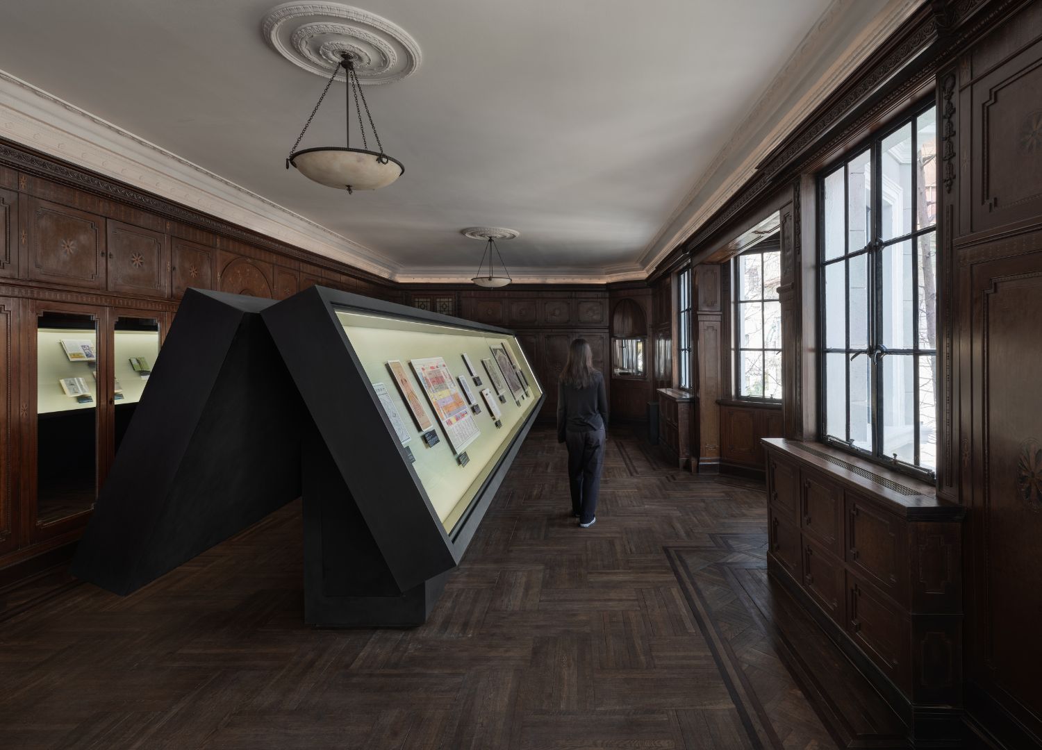
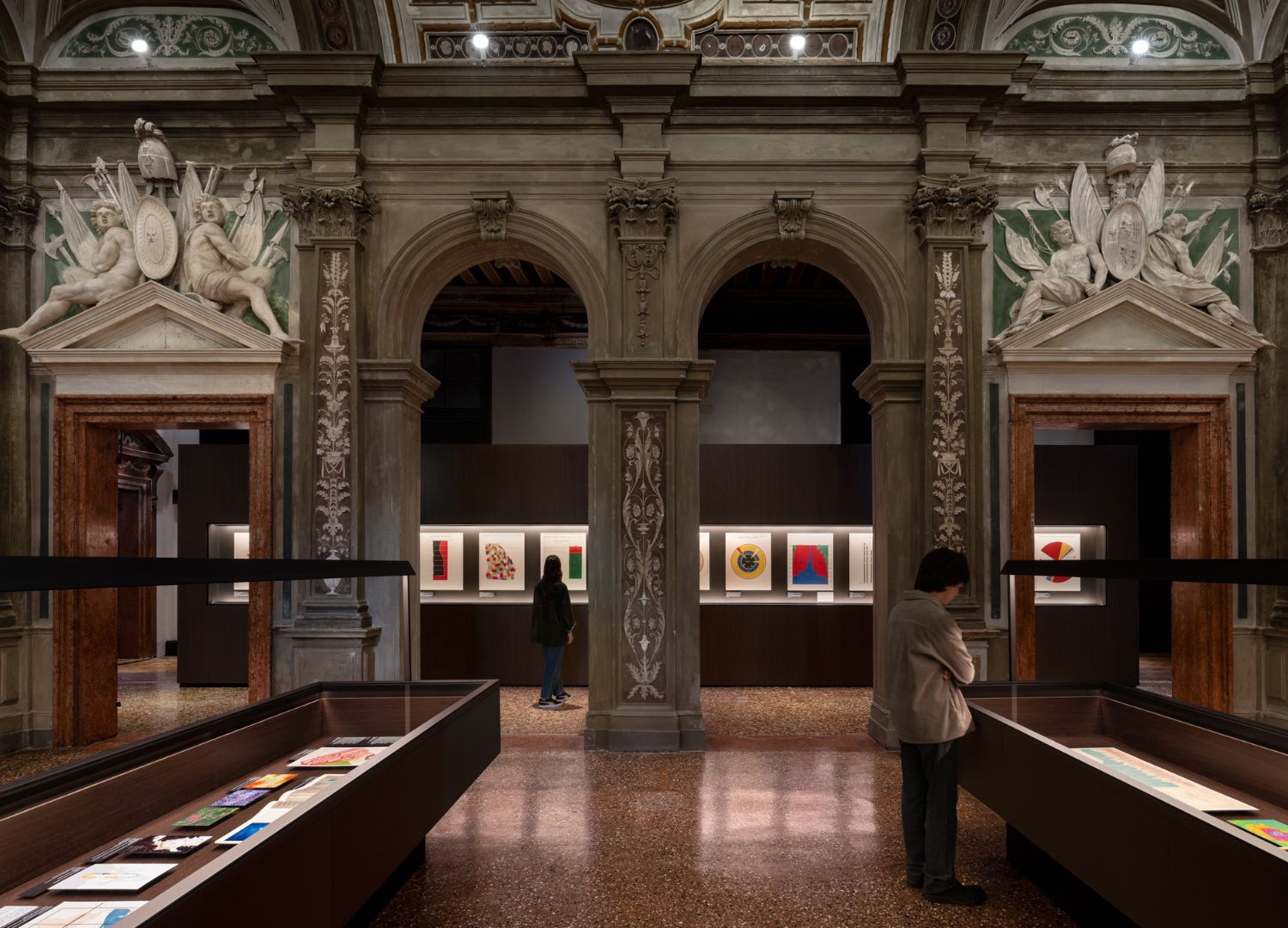
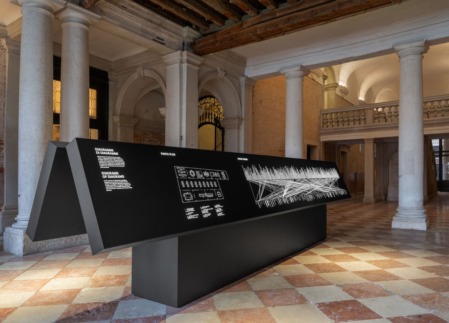
Data is having a cultural moment as the design world is reckoning with the ubiquitous material of our age. On September 27th, the Museum of Modern Art in New York opens Full Disclosure: The Edge of Information Design, curated by Paola Antonelli with Jules Bernstein and Forrest Pelsue. Last June, in Los Angeles, Refik Anadol unveiled Dataland, an AI museum using data to construct personalized, immersive realities. Meanwhile, OMA/AMO’s Diagrams recently closed an expanded run in Shanghai after debuting at Fondazione Prada in Venice during the Architecture Biennale: the exhibition showed data as a tool for thinking as well as an instrument of power, to be handled with care.
These initiatives present three distinct approaches to data, respectively used as a critical discipline of translation, as an immersive aesthetic medium, and as a political instrument. But beneath the apparent divergences lies a shared thesis: the primary challenge of contemporary data representation is no longer access to information, but the deep cognitive and ethical traps that visual clarity conceals. Will tackling this challenge bring about new visual languages and narratives?
Gallery
Open full width




Open full width
Why data design is our most treacherous medium:
The illusion of abundance
Extracting stories from raw metrics is far from new: it has been practiced since William Playfair plotted the first bar chart in 1786. What has changed is the volume of data available and, with it, a dangerous paradox. “We are surrounded by more information than ever before, yet abundance does not necessarily produce understanding» says Paola Antonelli. «It can produce the opposite: distraction, opacity, a false sense that because everything is tracked, everything is understood”.
Giulio Margheri, curator and architect at OMA/AMO who analysed centuries of visual materials for Diagrams (a project by OMA/AMO and Fondazione Prada), reached the same conclusion: “Having more information available helps with a level of precision, but it doesn’t mean you can produce better diagrams than the ones made before”, he explains. “Precision must not be mistaken for truth”.
This distinction explains why OMA/AMO insisted on using the word ‘diagram’ over ‘infographic’. “The word infographic is tied to passing on information, while the diagram is a tool for processing knowledge“, explains Margheri. Hence, it also shapes thinking and an idea of the world, making it as clear as possible.
The danger of visual authority
But almost paradoxically, the most insidious risk in data representation is clarity itself.
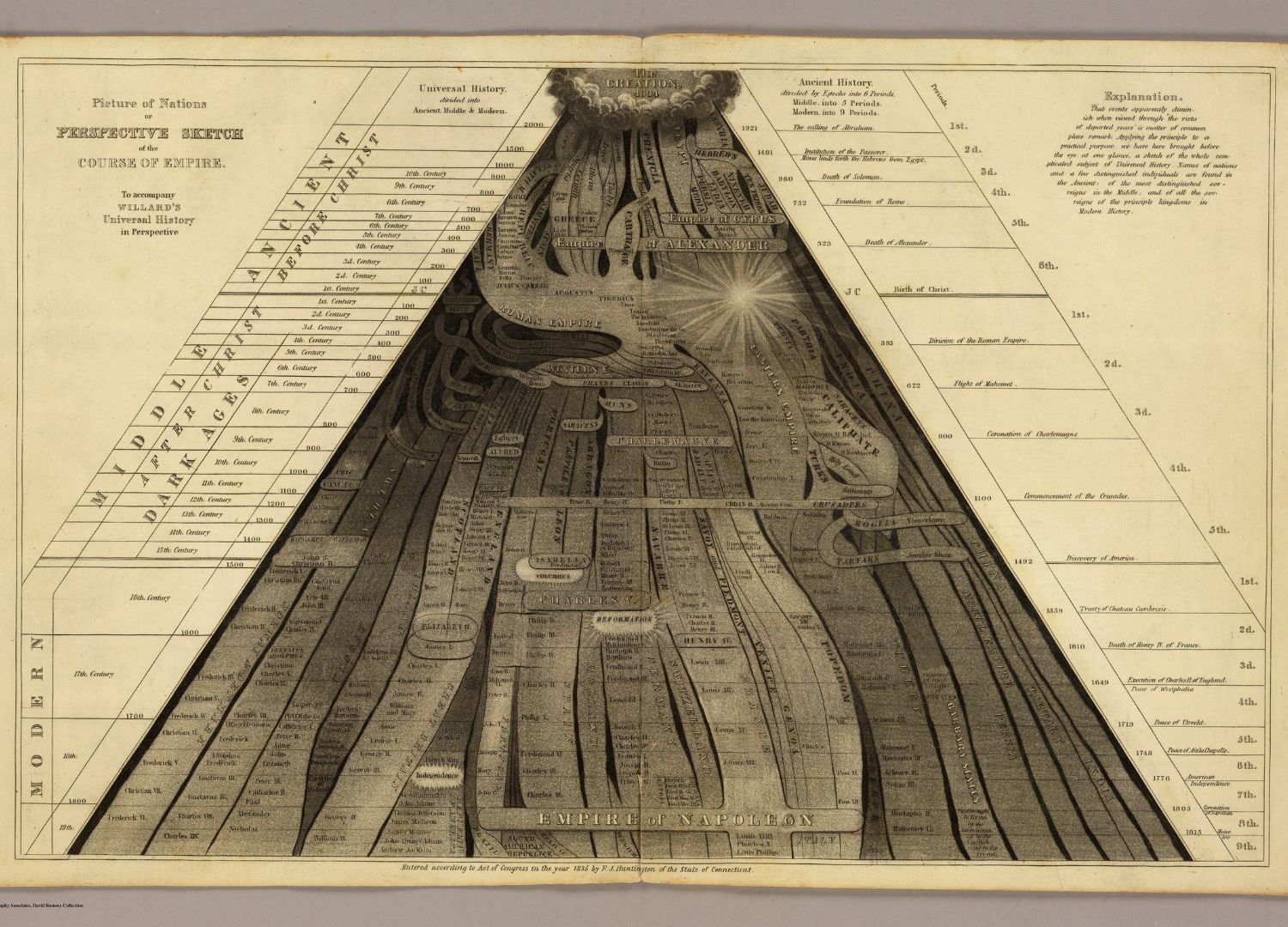
As Margheri points out, “a diagram always carries this aura of precision and truth. It’s a finished object, one that follows certain parameters, so you start from the assumption the information is correct”. But, beyond its beauty and precision, a chart can easily contain speculative or flawed information. An issue that Antonelli also acknowledged and faced in the MoMA exhibition: “A sleek map easily creates the illusion that a territory has been fully described while it isn’t”.

In Diagrams, this danger was demonstrated through Cesare Lombroso’s 19th-century charts of the human iris, presented at the time as scientific evidence of criminal traits, but later proven worthless and used as a basis for racial biases. “Lombroso’s diagrams are exactly the case of something that was completely wrong speculation, proven wrong, and yet looks beyond question”.
Design thus seems to be the instrument to perpetrate deception.
And it is so, if it’s used a-critically, merely a tool. But those working on data visualization should always keep in mind that because visual forms carry instant credibility, responsibility falls on how data is treated both upstream and downstream. “Upstream, by questioning how data is harvested, structured, and selected; downstream, by shaping how it is rendered, communicated, and interpreted”, explains Antonelli. “Information designers animate data to make invisible systems legible, accountable, and actionable. Design translates data into understanding”.
It comes as no surprise that similar concerns were also part of the cultural agenda of Refik Anadol when he conceived Dataland. Indeed, Anadol is convinced that immersive spaces remain key as tools for public education: “We worked hard to demystify and explain algorithms and how data carries the biases, political structures, and sometimes the exploitative practices of its collectors”.
To make the invisible mechanics of data physically tangible, Dataland trains its open-source AI on transparent, permission-based datasets, while translating live biometric and environmental data into multi-sensory environments of light, sound, and scent, allowing visitors to directly experience and interrogate how machine intelligence processes information. “I see it as our responsibility as artists and technologists is to demystify these complex systems for the public”, says Anadol.
Demystifying the power mechanics
This disclosure about where data comes from, how it’s sourced, and how it’s used is key, according to Antonelli. “Design should not simply create awareness about the value of data: we already assign enormous value to it. The more urgent task is to create awareness about its power”.
Without the tools to read or question how metrics are gathered and visual models constructed, the public is rendered passive. And in a time in which AI has become ubiquitous, data dictates institutional decisions, resource distribution, and individual opportunities; this is clearly a social issue, one that design can tackle, according to Antonelli. “Design has an important role in developing what we might call data literacy”, she says. “Not necessarily through compelling charts and illuminating statistics, but by giving people the confidence to interrogate data. When people cannot read or question how data is collected and presented, they lose agency. Design has a social responsibility to demystify these invisible systems”.
The shift from spectacle to restraint
Will this responsibility towards the creation of a new data literacy be translated into new ways of representing data, new visual languages and approaches? In other words, what’s next after something as huge and powerful as Dataland?
Not more of the same, attempts Giulio Margheri, who, as massive immersive data spectacles become ubiquitous, expects a cultural counter-reaction. “A pullback like architecture experienced when the glossy perfection of 3D super-renders gave way to a renewed interest in collage and hand drawing”, he says. “Something similar could happen with data. A way of working that’s much less loaded with infinite quantities, much more selective about what you take. It’s almost exactly what’s happening now with prompting. You have to learn to find your way through the noise and extract only what you need”.
A mirror to society
These considerations are interesting because ultimately how a culture chooses to visualize its data reveals the inner nature of that culture. So looking at the way we use them now and how we could use them in the future is a way to look at who we are and where we are heading.
Margheri illustrates this with a stark historical pairing featured in Diagrams: an end of 19th century Chinese Taoist illustration of the body sitting alongside Fritz Kahn’s 1926 Der Mensch als Industriepalast. The Taoist rendering visualizes the spine as a mountain range and organs as mythological figures; Kahn’s diagram depicts the human body as an industrial factory of mechanical, interchangeable parts.
“They’re only 30 years apart”, Margheri says, “but with a completely different imagination of what a body is. Which says a lot about how the visual language and the metaphors we use for diagrams – even when they are purely informative – is the product of the society and its values”.
Hence, read side by side, today’s approaches – Anadol’s immersive scenarios, OMA/AMO’s diagrams and critical outlook, and MoMA’s historical, artistic and social framing – form a collective portrait of a society possessing unprecedented volumes of data and searching for new ways to translate it.
One of which could turn out not to be made of even glossier renders or denser metrics but of a visual vocabulary defined by curation over abundance, structural transparency over deceptive clarity, and active interrogation over passive consumption.
About the author

Journalist, DesignAtLarge founder, internimagazine.it curator, scientific committee of the Compasso d’Oro Award member, Circular Design professor at NABA Milan.
Instagram