Dieter Rams: ten commandments for good design, applied today
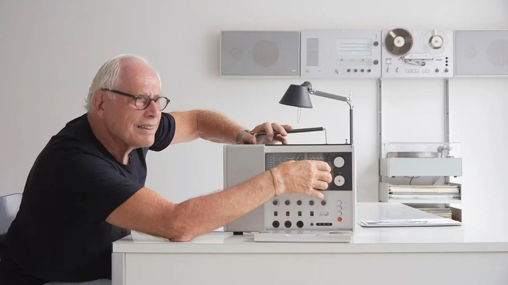
In the Eighties, when he was in the hypothetical middle of his life, Dieter Rams sat at his desk and wrote on a white sheet of paper a question: is my design good design?
It’s not an easy question, even if you are the iconic head of design of Braun (when the German electronics giant was as cool as Apple and leading the way in technology and design).
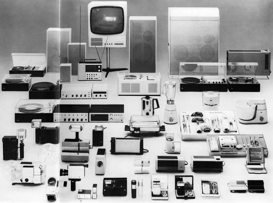
It is hard to know what pushed Dieter Rams to question himself, but his answer was a big insight in what is design is and how it should be used.
The result of this thinking were ten design commandments, ten principles of good design
that, especially today – when creating meaningful products rather than flooding the world with stuff is fundamental – can teach us so much.
Because they are not only pragmatic rules: they have an ethical standpoint too.
According to Dieter Ram’s 10 principles, good design is:
- innovative
- makes the product useful
- aesthetically attractive
- helps to make the product understandable
- not intrusive
- honest
- lasts in time
- in the details
- takes care of environment
- invisible
Ram’s Manifesto is incontrovertible. It is a strict lesson willfully cutting off any egoic demonstration of useless excess of style and formalism. It is the bottom line of his experience and his practice shows that it works.
But let’s see how his 10 principles for good design can be interpreted and used in today’s scenario.
Innovative, makes the product useful, aesthetically attractive
Rams was a dedicated worker: he would spend weeks looking for the right positioning of a push button.
It is an attitude quite similar to the obsessive perfectionism which made Steve Jobs so famous for his tyranny when it came to products and their usability and aesthetics. But Ram’s one springs out from an ethical point of view: the awareness about the role design should play in new technology products.
One of the first Ram’s projects is a new type of radio-phonograph for Braun: it was a typical post war German project (it is dated 1954) that translated technology into a domestic scenario. It was a brand new typology which needed to be first of all understandable and easy to use. Rams opted for a simple formal language surging from the internal composition of the parts of the apparel.
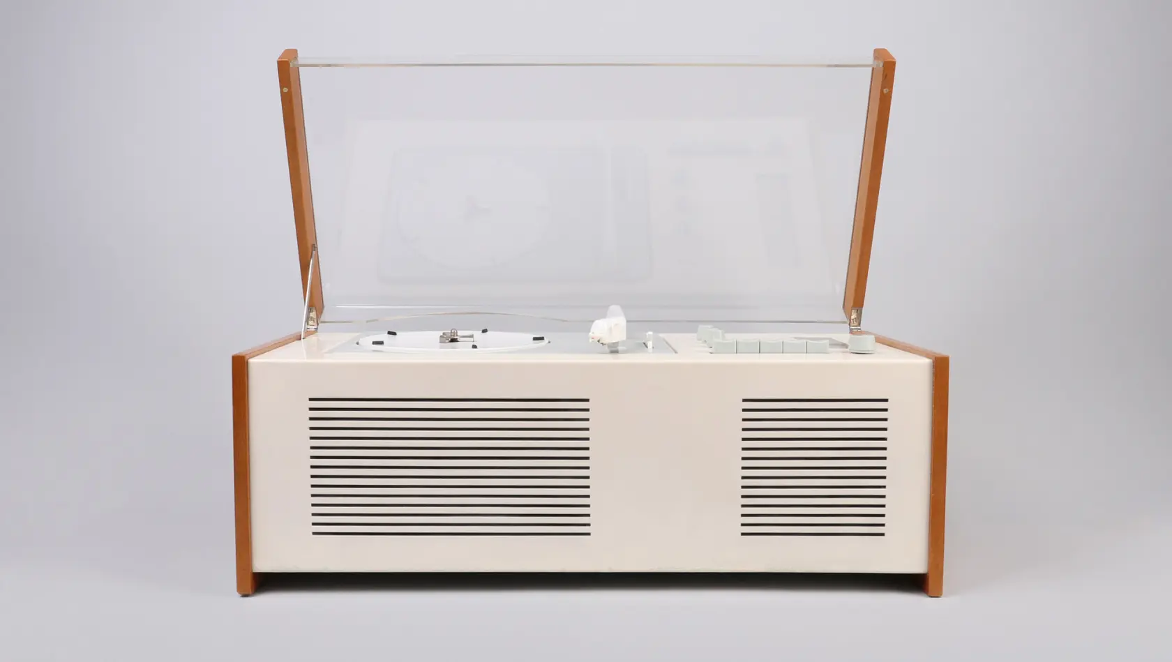
The radio-phonograph SK 4 is made to fit in the domestic scenario, to be used by normal people who should not (and would not) get involved in its technicity.
His experience with dozens of Braun’s products made him understand that
it is always better to reengineer and redesign than to start anew.
His aim was to make technology tools look and work better.
[ Read also: How to design something new (without inventing anything) ]
The formal code is simple, almost immaterial. But
he chose to put warm details in every project
like a leather handle for the TP1 radio-phonograph, the curved edge of the Core 77 Electric Shaver, a pastel colour for the PC3SV Radio.
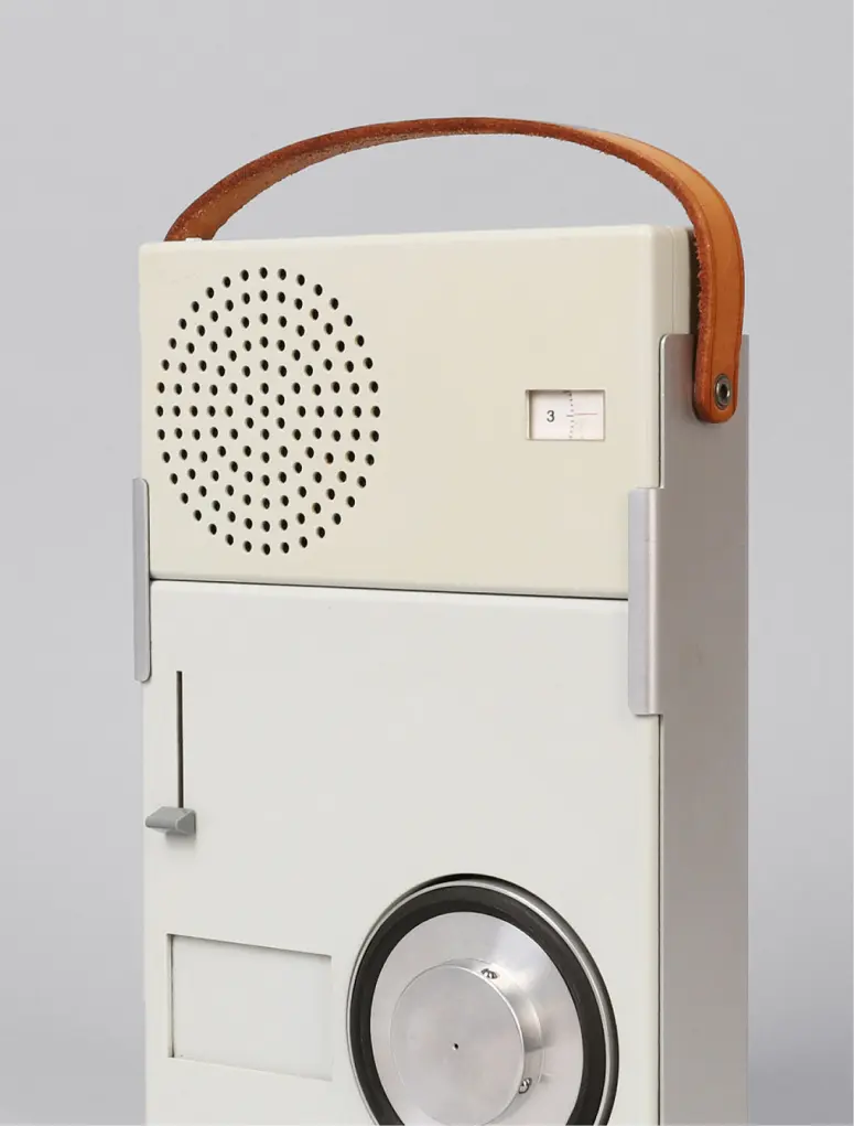
He always sacrificed what is important but not imperative, so as to simplify the composition of the object.
He was the person who integrated the on/off command into the volume control: a choice that people argued but that finally led to innovation, usability and an enhanced aesthetic.
Understandable products, non intrusive and honest design
Ram’s motto was: weniger, aber besser. This simple statement is often translated with Less is more, but it is an incorrect interpretation. The sentence actually means:
less, but better.
Following this rule, Rams gave meaning to the idea that you have to start from the inside of the product, to proceed then towards its formal aspects.
This is how the speaker grid of the T3 Braun radio becomes an exquisite geometrical pattern that doesn’t efface the intuitive use of it but enhances a self explanatory function.
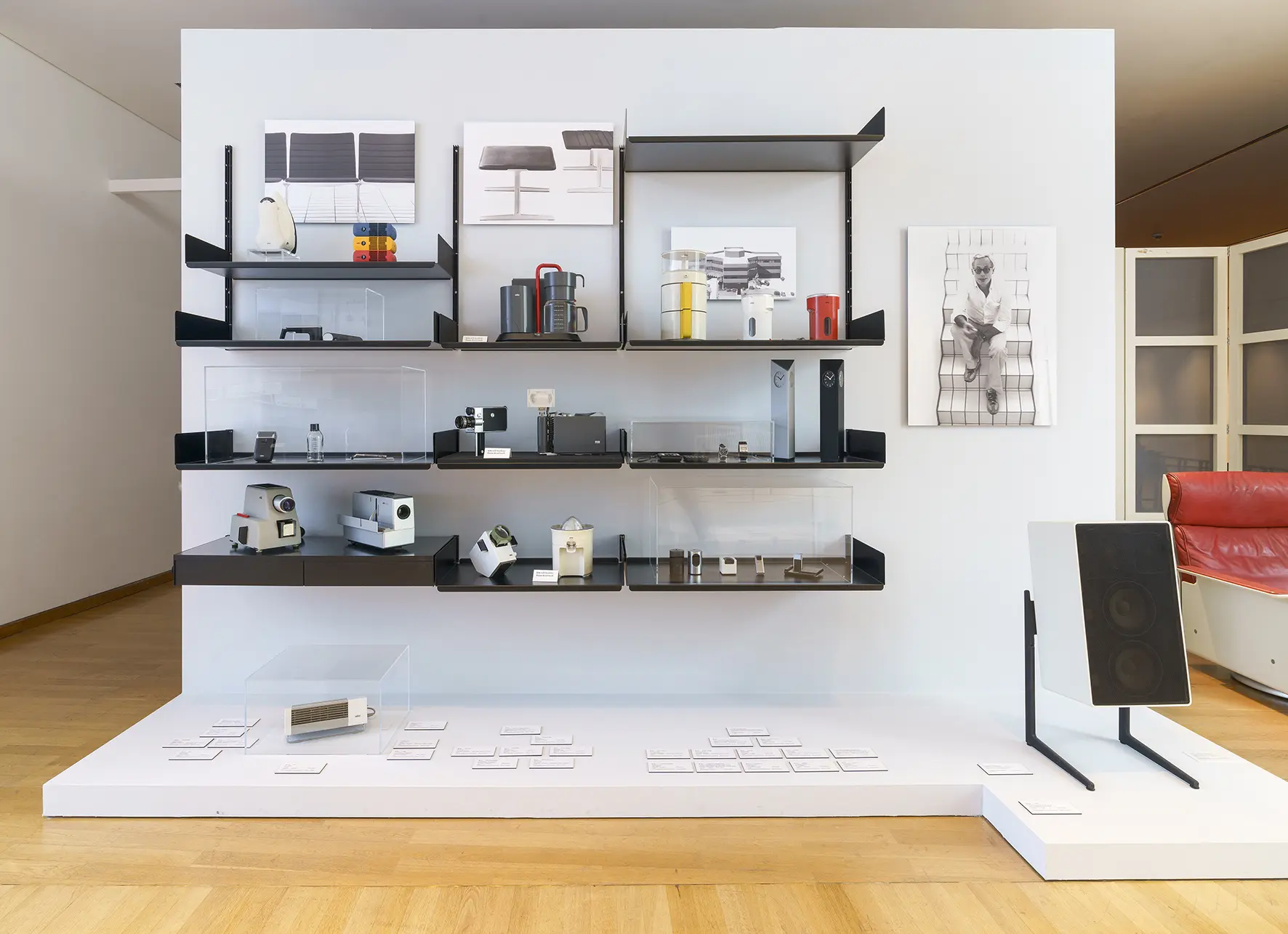
We should speak about intuitive products although it is more honest to underline the dedicated work design does for people.
Design is a service, not a personal interpretation or a style exercise.
Cluttered tools, like cluttered homes and lives, make us appreciate more and more simplicity and honesty.
But in the Eighties, during the Radical design outburst, the work of Dieter Rams was somehow shadowed by the urgence of criticize a rational approach to products. A needed and prevedible revolution, that unfortunately gave way to the surge of a light-hearted massive production of colorful and short-lived products.
Design lasts in time, is in the details and takes care of the environment
Sustainability wasn’t an issue in the years of Rams’ massive productivity. Nonetheless in his 10 principles of good design he considered the longevity of his works and in many ways repeated that a product should last.
That’s why
he always went for classic and discrete formal choices.
In his perspective design is subordinated to humans: people need to be at ease with objects so that they may have a strong and long lasting relation with them.
God is in details, but also happiness and wellbeing. Design dignifies people’s life.
How do these guidelines translate into products?
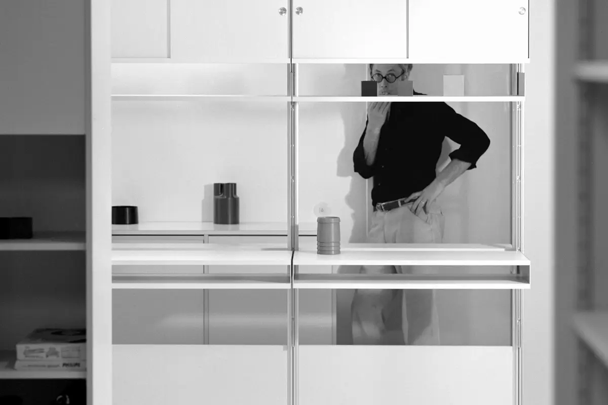
Let’s have a look at Vitsoe’s 606 Shelving System. Easier said than done, because it is not something that attracts any attention.
Modesty is its best quality: it fits every kind of space thanks to adjustable struts, it may be composed according to people and space needs and it tends to disappear once it is mounted. Actually the main formal detail is made by what you decide to put on the shelves. And it’s undestroyable: you can live with it for generations.
When Apple was born, its massive success was mainly due to the instinctive interest Steve Jobs had for design and its capability to scale a design approach in a big industrial venture. Apple’s interfaces were studied not only to be user friendly, but human friendly.
In Job’s design choices there was a lot of Dieter Rams, since
he wanted to turn technology into a pleasurable experience of functional and sensorial beauty.
Jonathan Ive, head of design at Apple during its uproaring in the technology market, looked back to the first tech revolution. He stumbled upon Braun and Dieter Rams works. Iconic, classic, long lasting, simple. And moreover recognizable: the way was already open to share a formal language with future users of unknown devices.
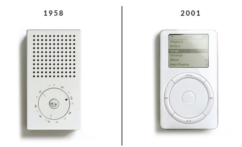
The Braun T3 radio was a strong inspiration for the iPod.
As for many other Apple products: the chromatic scale (neutral chromatism), the materials (plastic, aluminum) , the geometric forms and the curved shapes. The formal literacy was already there and was Ram’s one: it was just the time to scale it to a new evolutionary step.
Design must be invisible
Time for an ego check. And for questioning what is an object to us today.
We are experiencing the immaterial value of technology and design is really becoming more and more an issue of a broader ideal of service.
Design, in its meaning of a stylish and fashionable work, has no big sense if it is not able to
open new ways for sustainability, longevity and a non anthropocentric attitude.
Dieter Rams’ commandment about invisibility is wise, because humans need to step back and do a pragmatic and realistic job of service to the predicaments of the future.

