Stacking cubes in Japan: ultra-minimal homes by Form Kimura
Form Kimura has designed a series of residential properties that all explore the juxtaposition of light and dark through traditional Japanese architectural design, shifting ceiling heights and contrasting materials.
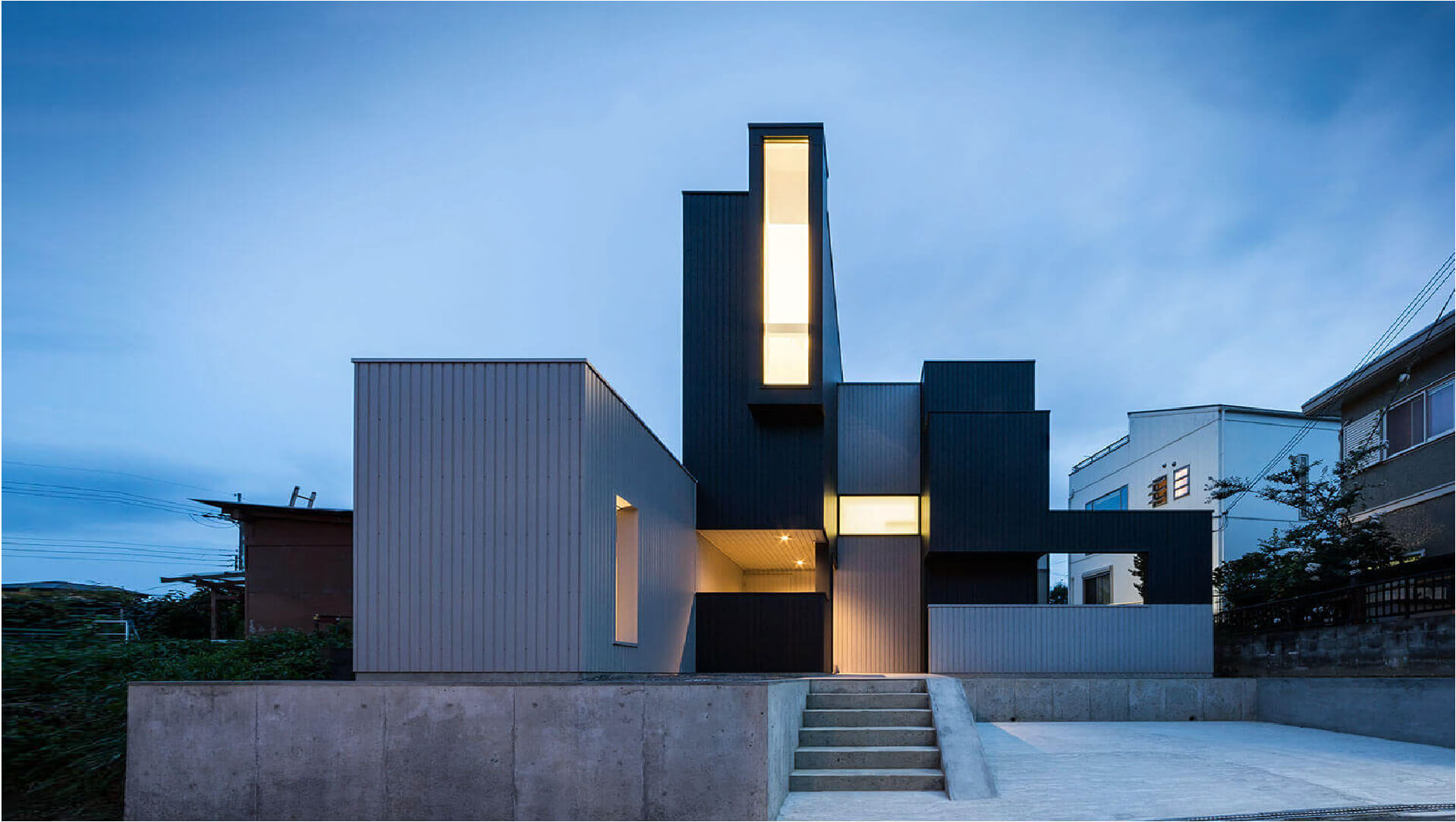
Focusing on four projects by Form Kimura – Slender House, Scape House, Frame House, and Framing House – we analyze the works of the Japanese architecture practice to explore how stacked cuboids of mixed materials create impressive residential properties in Japan
The practice is familiar with creating modern architectural designs that possess a dignified presence within cluttered townscapes.

The minds behind Form Kimura – Kouichi Kimura
Kouichi Kimura, the founder of Form Kimura Architects, is a Japanese architect who focuses on minimalism and the juxtaposition of light and dark tones.
Kouichi Kimura was born in Kusatsu City in Japan in 1960. In 1991 he founded Form Kimura Architects. The practice mainly works on residential properties that are characterized by sliced blocks that form a rectilinear architectural aesthetic. In the designs, a sense of openness and privacy is achieved by layering wall elements, volumes, and spaces that play with light and shadows.

Materials & Techniques – Concrete blocks, corrugated metal cladding, and black cuboids
Slender House, Scape House, Frame House, and Framing House, all use the same combination of materials that subtly highlight the different blocks that come together to form each property. Considering the exposed nature of the sites, each property was configured in a way that enabled the blocks to frame views outside while minimizing views in, thanks to carefully positioned glazing.
The dynamic boxed-shaped volumes provide a rhythmic layout that’s designed to express the variety in interior spaces as a series of protrusions and extensions from the walls and the roof. In each property, the architect has made the entrance into one of the main features that typically flows as a linear passage through the entirety of the ground floor to the back of the properties. While the boxes are separate from one another, by different external materials, internally they are beautifully connected with framed openings that allow a continuous sightline between each space.

Style & Aesthetics – Dark and light juxtaposition
The external facades of these buildings are typically black and grey. Black render, black or grey corrugated metal and naturally grey-toned concrete. However, internally the architect has chosen a light palette. The interior walls are all finished in a simple coat of white paint, with the occasional accent wall coated in wood.
Form Kimura plays with the light and dark tones to highlight the internal and external spaces and the exploration of light and shadow. The interior design is very minimal in all the projects to create a sense of linkage and distance between each room.
Kimura’s designs typically have an interplay between traditional Japanese functionalism, such as the open-plan rooms and functional divisions of space, utilizing a minimal material palette to achieve a clean and sophisticated finish.

Form Kimura utilises strategically placed glazing to make use of natural light and shadows
Each design features carefully paced glazing that floods the internal spaces with natural light to help accentuate the light-colored internal environment that Kimura likes for his architectural designs. Although the glazing is designed to achieve maximum light ingress, it’s also designed for maximum privacy from the neighboring properties close by.

Design memento – Versatile spaces that incorporate light and scenery
Kouichi Kimura’s designs all provide linkage between the exterior and interior spaces. The linkages were identified to realize a living space that expands towards the outside, in terms of visual and sensory aspects.
The natural scenery and light that are taken inside the properties make the interior design everchanging. The scenic views that are captured by the large windows are reflected internally from mirror to mirror that change throughout the day.

The writer’s comment – A dynamic arrangement of monotone cuboids
The monotone exterior of Slender House, Scape House, Frame House, and Framing House are highly engaging and heightened by the traditional houses that are tightly gathered around Kimura’s designs. The block structure of the properties and minimalistic aesthetic stand proudly among the surrounding architecture.
I particularly like how the exterior and interior have been strategically designed to showcase the contrast between light and dark. The interior, although it maintains the minimalistic aesthetic, is inviting with tonnes of light, while the exterior comes across quite cold and stark.


