Absorb in shadows of JUUN.J – first flagship store by WGNB
Structure inspired by traditional houses of South Korea displays a creative combination of shapes, lights, and shadows.
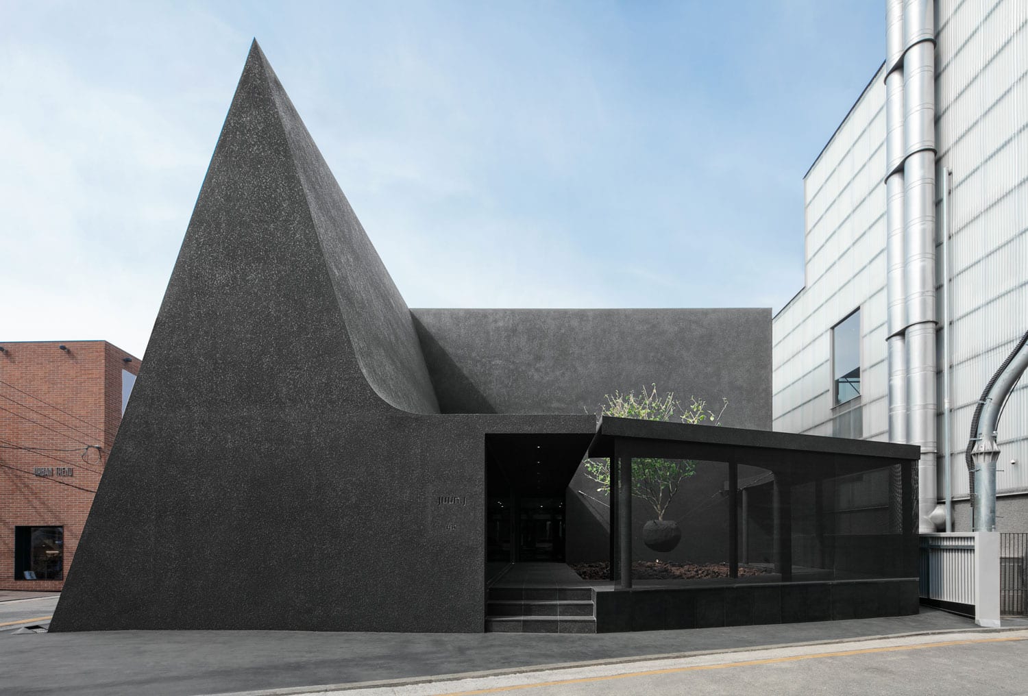
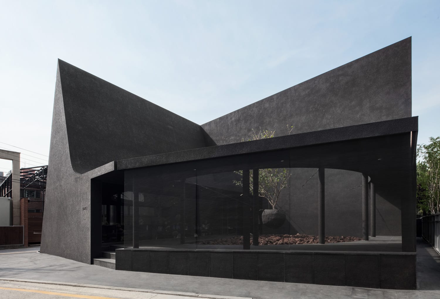
The all-black, contemporary shaped store of fashion brand JUUN.J, is the first flagship store designed by WGNB architects in Seoul, Korea. The bold choice of black color features a dark environment that represents the characteristics of the brand perfectly.
Seoul is the largest metropolis city of South Korea, beautifully surrounded by mountains and hilly landscape. This city has been immensely grown in terms of design and architecture, gaining a prestigious title of ‘world design capital’ in the year 2010. It is no wonder that Seoul is the 9th most visited city in the world.

Black is a symbol and the most important factor for brand JUUN.J
The architects adopted the theme of ‘dark matter’ specifically regarding the brand and keeping in mind the opportunities of black color which can be played with light and shadows.
Two of the most intriguing, eye-catching sights that strike the viewers of this store are the integration of basic geometrical shapes and the deep charcoal black color.
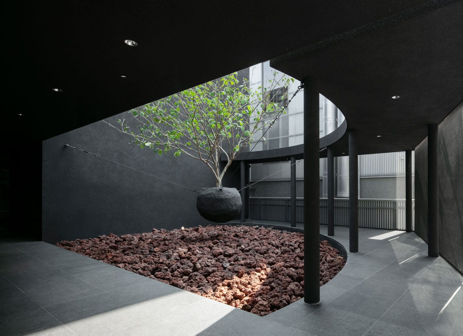
The moment you enter the store, you are welcomed in a courtyard garden with a floating tree suspended above volcanic rocks.

The steep triangle roof on the east side and a contrasting natural light garden on the west side creates a dramatic balance on the overall look of the composition.
Not only that but the store continues to create curiosities, which was a vital feeling to generate amongst visitors regarding the brand.
If we look at the traditional house structure in the East, large roof files are fixed in a way that basically the whole structure is absorbed within a deep and wide shade generated by the awning.

The darkness below the awning is shadow formed by the light coming from a ribbon window on one side reflecting slightly with the black within the space.
The space of the cafe generates various darknesses due to natural light dramatically penetrating from the ceiling and the courtyard which makes the visitors feel natural light is coming as a result of reflection on the garden.
They can see the garden from within the space and find another shadow as a tree is floating in the garden.

All spaces except the white part for women’s wear on the first floor are composed of varied densities of darkness. In an attempt to turn black in interiors, the designers organized the space by either hanging plenty of objects or separating them and generating shadows.


