Logos are the face of communication: here is DesignWanted’s new one!
Not only. They are a a crucial part of any company’s brand, making a significant impact on public perception
Logos can be separated into two categories, logotypes and logomarks. A logotype is essentially a stylized version of the company’s name such as Google or Coca-Cola in which caligraphy alone becomes an extremely important branding aspect.
A logomark, by contrast, is an icon or symbol, usually very simplistic, that can be recognized immediately by the public such as the logomark of Nike or Apple, which are inseparable from the brand. Some companies use both logotypes and logomarks to gain versatility.
What is the story of DesignWanted and its logo? It all started in 2015 with the mission of telling incredible design stories and spread the word about remarkable design, technology and architecture and the people behind, in an organized platform.
The new logo of DesignWanted was conceived and developed by Valerio Cometti + V12 Design a multidisciplinary design firm based in Milan, established in 2005 by its founder Valerio Cometti.
V12 Design operates on a global scale working with small companies and large corporations to offer a wide range of services, always combining an extensive knowledge of design and engineering: from graphic design and brand identity to product design, service design and deep design thinking.
Throughout the years, V12 Design worked with many prestigious clients across different sectors, such as Ferrari, La Cimbali, Riva 1920, Ferrero, Mondadori, Brionvega, Bikkembergs, Bialetti, Mediaset, POLI.design and many others.
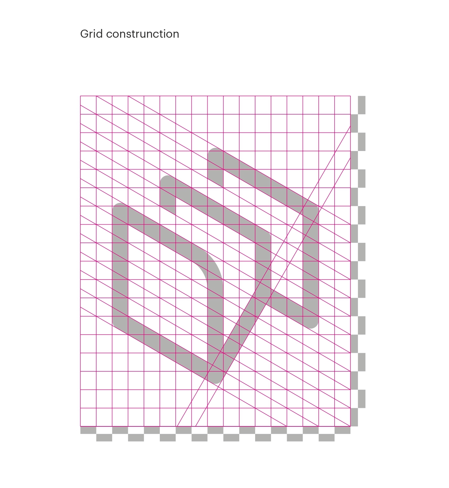
Composed of one symbol representing the union from letter D and W for DesignWanted, the logotype acts as a reference to traditional file folder archives, the DesignWanted logo is a digital interpretation of the classical information organizer.
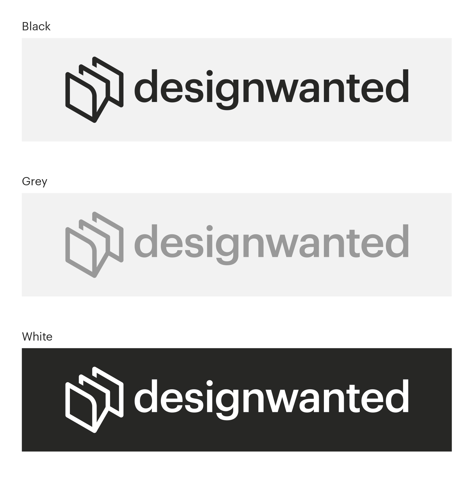
The new logo anticipates the restyling of our website and a reshaping of our brand identity. For us, the used font, Graphik in medium version, is mainly oriented to strong communication and authority.
Graphik is a sans-serif typeface designed by Christian Schwartz and released through Commercial Type in 2009. The design of Graphik was inspired by the lesser-known grotesques and geometric sans-serifs of the twentieth century.
The new DesignWanted logotype is based in three main colors: black, grey and white to meet the needs of the web and print media while giving the whole project an aura of seriousness.
Graphik font is used for the DesignWanted text logo and on all communication systems such as business cards, letterpress, etc.
Do you love visual design? Explore our section on illustration, graphic, logos, packaging, web, branding, communication, identity, animation, CGI and more.