Service Innovation in Space Design
How to build an immersive and interactive lab space experience in a post-Covid era
What is service design? How do we define service innovation in lab space? How do we build an immersive and interactive lab space in a post-Covid era? In this article, I discuss how we provide meaningful service offerings that are embodied in space, shifting the people-space relationship from engaging to empowering through multiple service design touchpoints.
I want to emphasize the article was written during the critical moment between the post-Covid era and the new normal lifestyle. Therefore, we were curious to observe and discuss people’s behavioral changes in space in the post-Covid era.
Do we still want to have a lifestyle just before COVID-19? What has happened to our work environment hit by the pandemic? Do we still need to stay at the office for 8 hours of work per day or do we have more flexibility and options at work? And how does it reflect on our office or lab space and its service design?
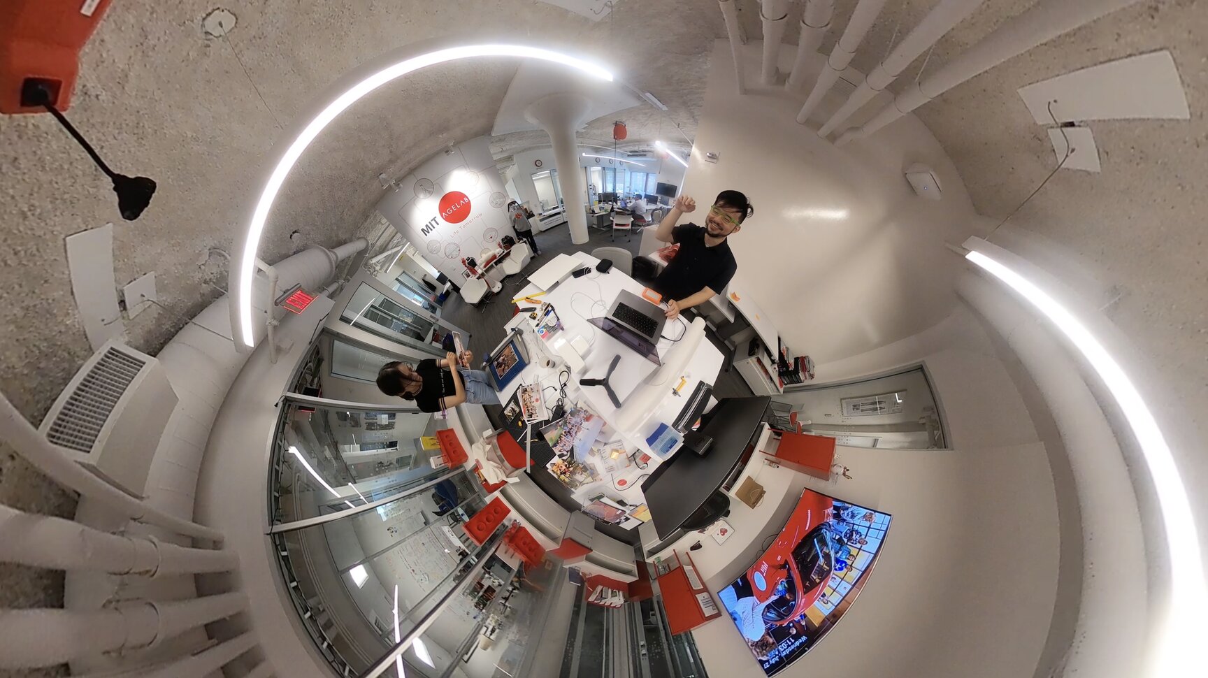
One of the most life-relevant examples I illustrate in the article is the MIT AgeLab space renovation project in which we sought to understand the considerations that the team has adjusted to because of the transformations caused by the pandemic in terms of space design, service innovation, and even culture.
How do we put users’ participation and their needs at the heart of the service design and development?
Since everything is returning to the “new normal,” especially on college campuses, more courses have shifted from virtual participation to hybrid and then more lecturers now are required to be in-person.
In the context of the “new normal of a post-Covid era,” I will share the following three stories with three key learning points from my lab renovation experiences and provide suggestions to designers and also for future explorations and studies.

Example 1: MIT AgeLab participatory walking hallway
Key takeaway 1: Transform from fixed space to a space for co-creation
An office or lab space is the place people spend most of their time during working hours, presumably 8 hours on average. People work, discuss, and might have great office lunches as at Google.
Especially in the post-pandemic era, people care more about their working environment and the options they should have, which forces a lab or office leadership team to consider carefully how to design an inspiring space to make people be not only creative, open-minded, and collaborative, but also themselves at their natural best.
We hypothesized that the most intuitive and effective approach is to involve people who use the space to explain the things, services, and experiences they like or dislike, and then we can probe deeper with questions based on their responses.

Prior to the lab space renovation this year, we did rounds of informal internal interviews with lab research scientists, research associates, post-docs, and research assistants to gather their honest feedback and ideas about future lab space.
One thing that impressed me is that people not only care about their own working experience at MIT AgeLab, but most also mentioned the experience of lab sponsors, collaborators, visiting researchers, and students.
Thus, the discussion we had with the team inspired us to transform one of the lab hallway spaces into an interactive walking area with monthly changing themes, questions, and activities to gather people’s ideas and thoughts in the space (Figure 2).
People write down their responses via Post-its and Sharpies or simply draw on the modular posters we attached to the foam core board on the wall. And then, the designated team will digitalize the content and share it with lab communities in a monthly newsletter. The execution of an interactive hallway idea is relatively low cost, fast renovation, with feasible results, but the outcome is influential and significant.
Since the intention is to provide a canvas to allow people to contribute ideas freely and feel they can “own” the place and make their voice heard and make change collectively. Simple modifying in the part of lab space can make the user experience more transparent, engaging, and collaboratively.
Example 2: IDEO office space prototyping
Key takeaway 2: Space is a medium to project lab culture and service
As we know, space is a visible and invisible “object,” environment, vibe, or feeling. It’s a context-driven term. When I worked at IDEO as an industrial designer, we updated and renovated IDEO office space often (Figure 3). Office space is not merely a space for displaying or decoration; the space itself is an embodiment of the company, organization, or lab’s culture.
Any visible and tangible things we, as a company or lab, want to present to employees, clients, and visitors embody the values we believe in, the lifestyle we have, and the culture we cultivate. Having this concept at heart affects my perception of space design connecting to service innovation and culture.

On Stanford University d.School’s website, the d.School design team collaborated with Scott Doorley and Scott Witthoft to publish the book: Make Space: How to Set the Stage for Creative Collaboration (Figure 4).
It is great reference to see how they bring “maker” culture through the space they designed. They discussed how to transform many normal items in life such as classroom tables and chairs by adding wheels to make them mobile to adapt to different types of space configurations and purposes. The modularity and mobility have smartly shaped the area into a flexible, creative makerspace. From this book, you can also find out the importance of how space can inform the organizational culture and imply service design.
IDEO’s office space is like a makerspace, which leaves people an impression that the space is a work-in-progress that will constantly evolve, just as the design process does. Moving forward, I tried to prototype the idea of “space as service” with the MIT AgeLab team. We specifically wanted to have a main visual wall in the center where everyone enters the lab space, and they won’t miss it.
First, we crowdsourced photos from people working in MIT AgeLab. Everyone gave us three photos that were memorable, meaningful, or interesting to them. We collected all these great stories and printed them out in various sizes to lay them out on a big table. The space design team, including myself, brainstormed three to five keywords to categorize these visual assets for the space.
How can we choose a suitable yet provocative visual that can leave visitors, sponsors, and students with a great impression that can represent our lab culture authentically?
In the end, the team handpicked photos across five categories: people, research, life, publishing, and process. We care about people, life, and MIT AgeLab communities. We are a research-focused lab, so there are some images around research projects and our publishing. Of course, everyone in the lab cares about final outcomes, but we also want to celebrate the beauty of the research and design process and the spark of innovation.
This also reminds us of the lab leadership’s need to create and protect a lab culture as a safe space to allow people to experiment with their crazy ideas and think creatively as Simon Sinek, an author of the book Start With Why and inspirational speaker, mentioned.

The lab photo wall is not difficult to execute. In fact, it’s easy to scale the ideas to other labs (Figure 5). The magic part is the resonance to see the connection between people and photos picked by the people. The moment we finished the photo wall, people walked up to it and started to share the stories in their photos with others.
“I did this great project collaborating with Dr. Lisa.”
“We had a memorial field trip in Spain to test our AGNES empathy suit with our clients.”
“This is a hilarious moment…”
These simultaneous conversations brought people together. It naturally formed a positive vibe in the main area of the lab space. When people stand in front of this wall, everyone has different stories to share, since we all have different backgrounds, roles, and responsibilities. It also gives us a diverse and authentic lab tour experience for our sponsors, clients, and other visitors.
Since then, the lab photo wall has become a critical service touchpoint of the lab tour experience. This is a great success for the lab employees and our visitors. And I think it’s a convincing example to show how space design informs lab culture and service innovation.

Example 3: MIT AgeLab blog
Key takeaway 3: Digital space connects to communities and extends the limitations of physical space
When we think of space design, we need to consider not only a physical environment, but also digital space. Online and in-person experiences will complement the user journey by seamlessly interconnecting service touchpoints. Both sides can create mutual benefits to influence the overall experience and operational design.
In digital space, people tend to consider adding fancy AR or VR devices to the space or use many QR codes to make people scan navigate the content on their phones. These ideas can be scalable and effective, but I want to think of the digital space as a layer of community building and explore a meaningful expansion of physical space through digital service touchpoints.
Before COVID-19 happened, MIT AgeLab had already prepared to redesign its website. I am lucky to be part of the core team. We worked closely with website developers and discussed the new position of the site considering new looks, feels, and brand identities.

Beyond the aesthetics, we brainstormed on the engagement section. How could we increase users’ online interaction through digital touchpoints while enhancing people’s physical experience and connections with lab space?
This is not an easy question to answer, because we need to consider people’s behavior, website maintenance, business model, and overall perception of MIT AgeLab digital space. Having gone through rounds of ideation under the constraints of time, resources, and the scope of the project, we came up with an idea to prototype our new design. The new website established a blog designed for everyone to contribute to on interesting topics (Figure 6.).
Prior to the pandemic, the website was positioned as an information hub that shared data and news for employees and our sponsors. With the new website, we want to enrich co-create the content with our communities. The most straightforward approach was to build an online interactive platform to exchange and share people’s ideas and reflections.
We have been testing this accessible blog concept for almost a year since the new website launched. Lab leadership, scientists, and research assistants have contributed at least one or two articles already.
What impresses me is that most people, proud of what they wrote on blogs, share it through their own social media, which is a great sign that this digital space touchpoint is transitioning from creating an engaging condition in physical space to empowering them to share their ideas to motivate communities around the globe as an emerging lab service.
Summary: paradigm shift of space design from service and experience aspects
A successful service design in space is like a piece of art. Space design is a vehicle for designers to apply service design and design methodologies to curate users’ experiences across multiple touchpoints both online and offline.
When we redesign spaces with service components either for labs, public spaces, working spaces, or homes, we tentatively consider most of the physical touchpoints through the lens of users and key stakeholders, because these are obvious things or objects in the tangible world.
So the service and user experiences are created and curated through these tangible items in space. We work in office or lab spaces, we go to public spaces, and we relax in our home spaces. Due to the pandemic, people have been forced to investigate their spaces mindfully, especially in terms of hygienic.
Our working and lab spaces have been transformed dramatically in response to our lifestyle changes, which has unavoidably caused the paradigm shift of space design from service and experience aspects.
I covered three stories in the article, including:
- The participatory design approach is to build a co-creation vibe in space to empower people to try new and creative things in space without thinking too much about making mistakes;
- Space design can project and amplify service innovation and experience components in space. How we reshape our space is the decision based on how we are going to design and deliver our service and experience to our users and visitors, and lastly..
- Digital touchpoints are viewed as a glue to link between physical space and communities around the globe, which positions an extension of physical space.
In conclusion, I summarize the above three stories with three key takeaways to help us build an immersive and interactive space experience in a post-covid era:
- The participatory design process shapes space design and service innovation
- Space design reflects on the organization’s culture and service innovation
- Digital touchpoints and services connect and extend the physical space from local to global communities.
I am so excited as a designer to “recalibrate” my skillsets and mindsets to enjoy and solve the new service challenges inspired by the unavoidable paradigm shift of space design.


