5 refreshing drink rebrandings that are sure to catch your eye
Not just a beverage – by playing with their branding and packaging designs these drinks want to be a part of pop culture, a lifestyle
From Nendo to PepsiCo, The Coca-Cola Company, Jones Knowles Ritchie and OlssønBarbieri – today, brands and design studios are seamlessly adapting their approach and rebranding their drinks to keep up with ever-changing trends.
Color palette changes to logo, typography and illustration makeovers – they’re building a consistent brand identity across the globe, from real life physical products to the digital world.
In particular and as per market research firm Statista – revenue in the Soft Drinks segment amounts to US$0.85tn in 2023 and the market is expected to grow annually by 4.09% (CAGR 2023-2027).
But is every single drink rebranding? Advances in technology and the rising popularity of social media has increased the need for a one-of-a-kind distinctive branding and packaging to attract customers.
For instance, Nendo brilliantly designed a minimalistic beer can with two pull tabs to “create an ideal foam”.
Did you know that beer heads (the foamy top of poured beer) are considered essential for making beer taste better, at least in Japan? “A layer of foam with adequate thickness acts as a lid to prevent beer from coming into contact with the air and keeps it from releasing aroma, flavor and carbonation!” explains the studio.
On the other hand, vibrant with a contemporary edge – Pepsi unveiled its first rebrand in 14 years with an updated “unapologetic” logo that effortlessly draws on its 1990’s heritage branding and utilizes black wording to draw attention to Pepsi Zero Sugar.
This new Pepsi recipe, which is only available in the UK – will have 57% less sugar than the current version. It’ll contain 4.6 grams of sugar per 100 millimeters compared with the previous 10.7 grams of sugar per 100 millimeters.

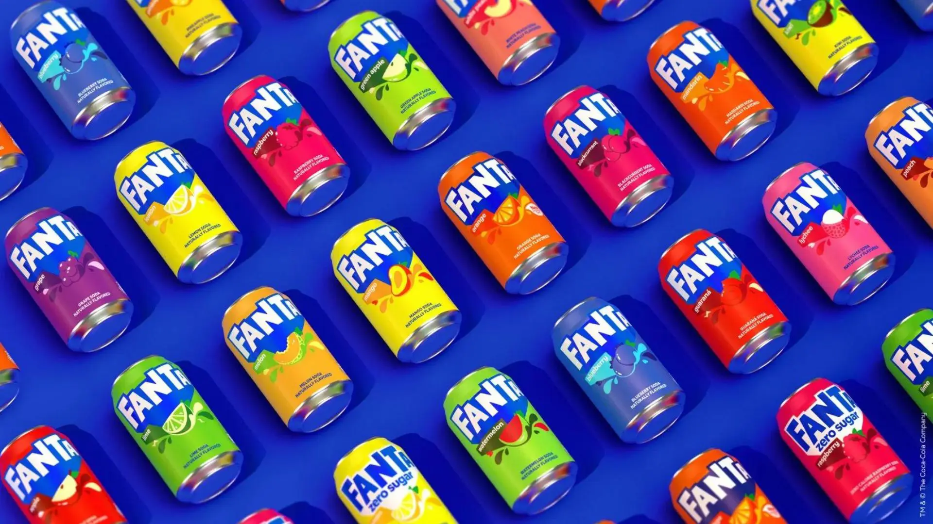
Additionally – aiming to appeal to all ages, Fanta rebranded with an eclectic “truly playful” bubbly global identity.
“It was about evolving what people love and know about Fanta – we didn’t want to throw away the old identity, we wanted to build upon it. The rebrand captures playful indulgence in my eyes. Fanta is all about fruity tastes that come in all different flavors and this is an identity that really brings that to life!” says Rapha Abreu, The Coca-Cola Company Global Vice President of Design.
Further created as the first major rebrand of 7Up for 7 years – 7UP skillfully redesigned their logo with a fresh look that is “all about being uplifting”, giving the branding more energy.
Mauro Porcini – PepsiCo Chief Design Officer – hopes that this branding will mean that 7Up, which was launched in 1929 and first branded as 7Up in 1936, remains part of pop culture.
Lastly, by wanting beautifully minimalistic graphic design to break with the traditions of Bordeaux, while also bringing up issues of climate change and the region’s future – OlssønBarbieri played with Bordeaux wine rules in the Château Picoron eye-catching rebrand.

Read on to explore this further!
1. Beer Can by Nendo
Manufactured to control the level of foam produced by opening the can – Japanese design studio Nendo develops an alternative beer can with two angled pull tabs.
They intended to craft a minimalistic canned beer that can “create an ideal foam” when poured into a glass, rather than too much or too little of the bubbly substance.
Cylindrical in shape – it’s a slender gray-hued container that features two numbered pull tabs as compared to a traditional single tab.

The first tab labeled “1” – opens the lid only slightly but generates a concentrated level of pressure inside the can, which activates the bubbles in the beer.
This allows the user to pour their desired amount of foam into a glass, before opening the second tab – labeled “2”.
Creating a smooth and foamless flow of beer, the tab opens the can’s lid to its fullest.

Additionally, the studio further positioned the two tabs at opposite angles on the lid of the can to allow users to flick them open as easily as possible.
Through research, they found that by fabricating a can with a smaller initial opening, the bubbles produced by the drop in pressure remain concentrated in the narrow slit.
“In this way, a glass with a liquid-foam ratio of 7:3, the so-called golden ratio, can now be easily achieved with canned beer!” explains Nendo.
2. Pepsi by PepsiCo
Updating the soft drink’s logo ahead of its 125th anniversary – Pepsi’s rebrand aims to draw on its history while focusing on its future as well as its commitment to Pepsi Zero Sugar.
“We’ve always been a bold and energetic brand and we want to instigate moments of unapologetic enjoyment.
We designed the new visual identity to connect future generations with our brand’s heritage – transcending everything we know and love about the brand to make something current and undeniably Pepsi!” shares Mauro Porcini, PepsiCo Chief Design Officer.
[ Read also What does it mean to be a Chief Design Officer? Interview with Mauro Porcini ]

Retaining the Pepsi globe – as part of the redesign, the word “Pepsi” is placed back in the center of the globe and written in a custom, capitalized font.
In contrast to previous versions in white and blue hues, the in-house design team chose black for the word “Pepsi”.
The color black – which encircles the globe logo – aims to draw attention to the zero-sugar version of the drink since black has traditionally been the color related to Pepsi Zero Sugar.

“In our updated color palette, the color black is bold and creates a beautiful contrast with the electric blue.
Black has also always signified Pepsi Zero Sugar, which is a huge area of focus and growth driver for brand Pepsi!” Porcini adds.
This rebrand was further launched as Pepsi additionally announced that in the UK it has dramatically reduced the amount of sugar in the original version of the drink.
3. Fanta by The Coca-Cola Company and Jones Knowles Ritchie
Presenting a unified global identity based on fun – Coca-Cola’s design team and creative agency Jones Knowles Ritchie overhaul soft drink brand Fanta’s logo.
“Fanta is one of the most playful brands we have in our portfolio. However, at the same time, it felt geared towards a younger demographic – our audience is anyone that is young at heart and it was important that we brought the idea of fun and play to an older audience.
At the end of the day, a playful brand needs to be truly playful!” says Rapha Abreu, The Coca-Cola Company Global Vice President of Design.

The rebrand simplifies the previous branding to make a stripped-back flat logo – the lettering has been neatened and shadows removed along with the smile-shaped icon from within the second letter A.
A lighter shade of blue has been further utilized for the thick shadow, which was extended downwards to form a point.

Additionally, as the logo will be used across all of Fanta’s range of flavors, as well as its orange variety – the design team removed the orange roundel and leaf from the logo.
“This meant making sure we were bringing every flavor to life!” Abreu adds.
4. 7Up by PepsiCo
Aiming to reinforce the uplifting nature of the brand – PepsiCo unveils a new branding for soft drink 7Up.
“Obviously this plays with the up in 7Up!” says Mauro Porcini, PepsiCo Chief Design Officer.

The redesigned branding retains all of the core elements of the previous iteration – the color green along with a large number seven – but aims to be more dynamic and have “new energy”.
While green was retained, a brighter tone was chosen and paired with a neon green. For 7Up Zero, the color combination is reversed.
“On one side we needed, and wanted, to respect the visual heritage of the brand – the green and seven as a visual protagonist” Porcini explains.
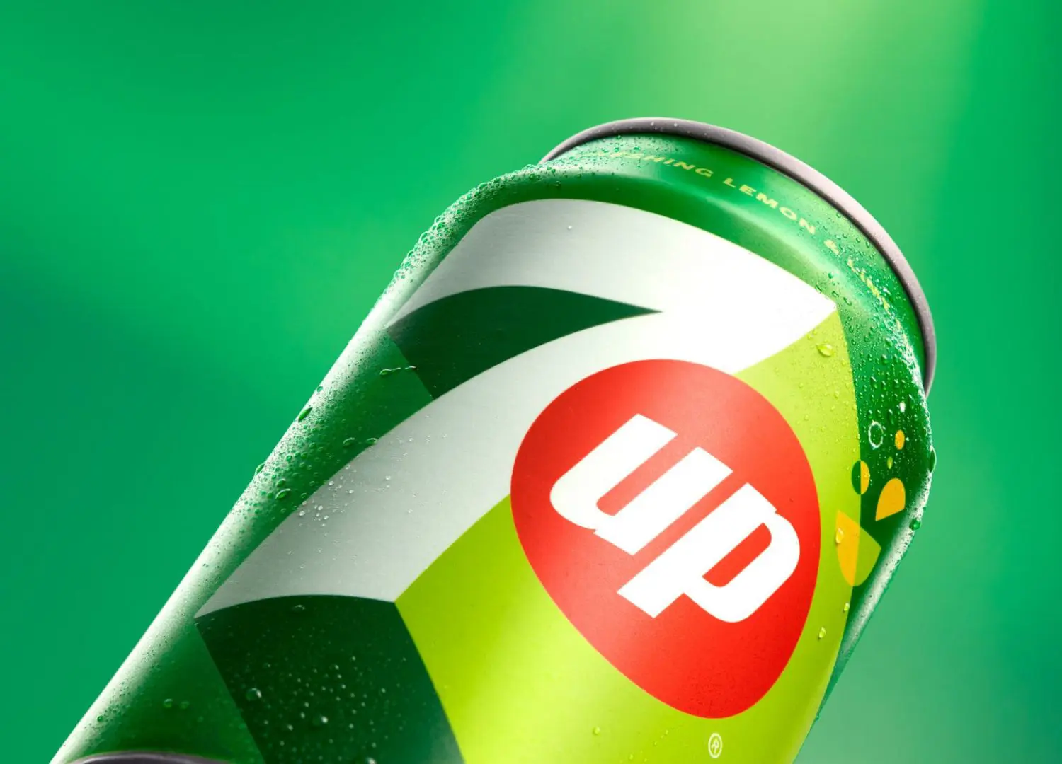
The brighter green is utilized to create a 3D effect for the seven and give it a sense of movement, while the word “up” is further incorporated into a red dot that has long been part of the drink’s branding.
“Every time I look at a brand in the company – the ambition is to elevate the brands above and beyond the category!” adds Porcini.
5. Château Picoron by OlssønBarbieri
Reflecting the restrictive wine making regulations in the French region of Bordeaux – Norwegian studio OlssønBarbieri set itself constraints when coming up with a minimalistic but playful brand identity and packaging design for the winery Château Picoron.
At first, the team used only one font – Bourrasque by the French type foundry Bureau Brut.
OlssønBarbieri picked it since it can slant 45 degrees in both directions – giving the studio ample room to play with shapes while creating an effortless flair.
Secondly, they decided to utilize only names that are palindromes (words or phrases that read the same backwards and forwards) for the different wines and create meaning through that limited choice.

They went with French palindromic names for the three top-of-the-range wines in the Château Picoron portfolio that have the Bordeaux appellation – Le bon Nobel, Ne de l’Eden and Mon Nom – and English ones for the three younger experimental wines, Tattarrattat, Madam I’m Adam and No Lemon, No Melon.
All of the wines are based on the Merlot grape, which is named after the Merle blackbird – OlssønBarbieri therefore adopted this bird as the mascot, logo-mark and “brand’s storyteller”.

Additionally, illustrations are used elsewhere too, all created in collaboration with French artist Jochen Gerner.
Small ones on the reverse of the bottle describe the winemaking constraints that went into that style – for instance, on the Ne de l’Èden, the illustration focuses on minimal intervention.
“This also presented an opportunity to initiate discussion on climate change and the future of Bordeaux wine – as the warm summers of the past years have made it difficult to control the sugar level and therefore alcohol content of the wine!” says OlssønBarbieri.