7 heavenly church-to-restaurant interior design conversions
Re-purposing a building successfully for commercial use can be a real challenge, the following are examples of repurposed church to restaurant interior designs that successfully fuse past and present seamlessly
Here, we take a look at 7 former churches from across the globe, which have been refashioned into iconic restaurants. Intrinsic to the concept of great interior design is the need for context.
Design draws not just on generic principles and current trends, but also on the unique character of the building under consideration. Location, previous functions, intriguing features, and the use of place-specific or specialist materials combine to give each structure an individual history.
Gallery
Open full width
Open full width
The challenge for a respected commercial interior design company is to find a way of telling the story of the building visually, giving users an insight into what makes it a special place to be. Showcasing the distinctive nature of a building at the same time as re-purposing it for successful, 21st Century commercial use can be a real challenge.
Churches and chapels, in particular, require skilled, sensitive design in order to create stunning interior space that fuses the past and the present in a seamless, appealing manner. What stands out in these transformations is the care which the designers have taken to identify the character of the building successfully, allowing it to be showcased and celebrated as part of its contemporary renaissance.
7 churches converted to restaurants:
MISU – Bengaluru, India
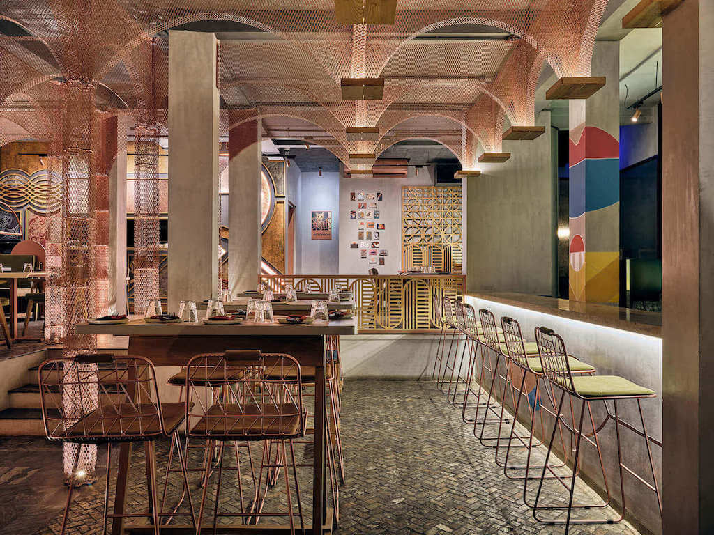
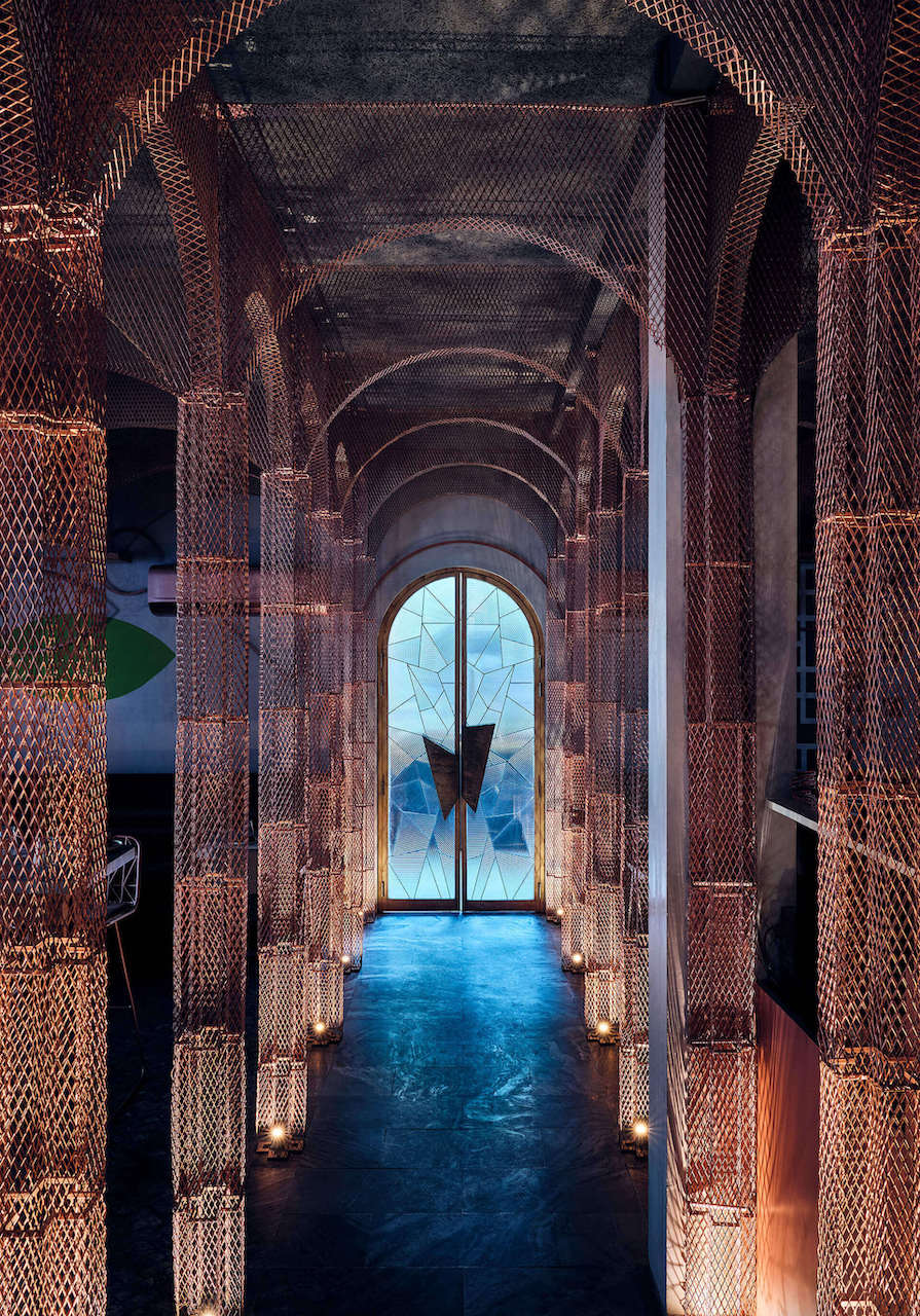
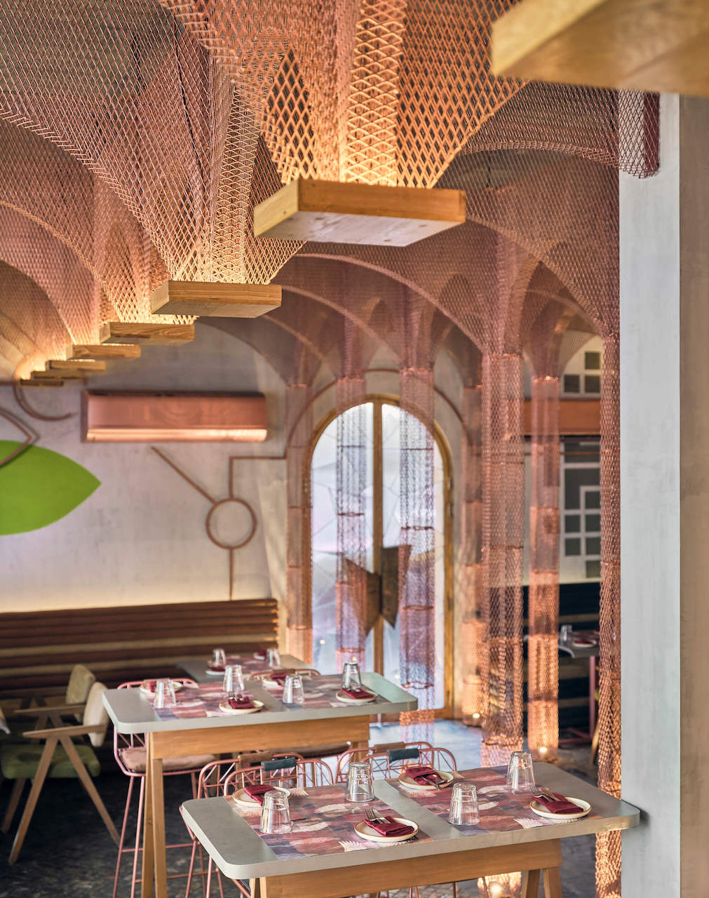
Fusing a number of futuristic design trends, the MISU restaurant, in Bengaluru, India, is located inside an abandoned chapel.
Intriguingly, the project is deliberately unfinished, encouraging diners to return and see what progress and innovation have taken place since their last visit.

The concept behind the transformation is to move away from the traditional decor of an Asian restaurant, providing excitement and novelty, along with captivating dissonance.
Rather than use a commonplace portrait accent, a hallmark of Indian restaurants, MISU features an engaging abstract face design.
The architects melded traditional colonial and classical architectural elements with minimalist Japanese trends and some exciting post-modern elements.

The result is a delicious dissonance: classical arches, stained glass windows, and the traditional chapel structure (central aisle with seating either side) are tempered with post-modern art, counter-intuitive colours and the creative use of wall paintings.
The overall effect is one of interwoven cultural and chronological strands, providing a novel and compelling visual banquet that acts as a powerful draw for diners.
At the Chapel Restaurant – Bruton, UK
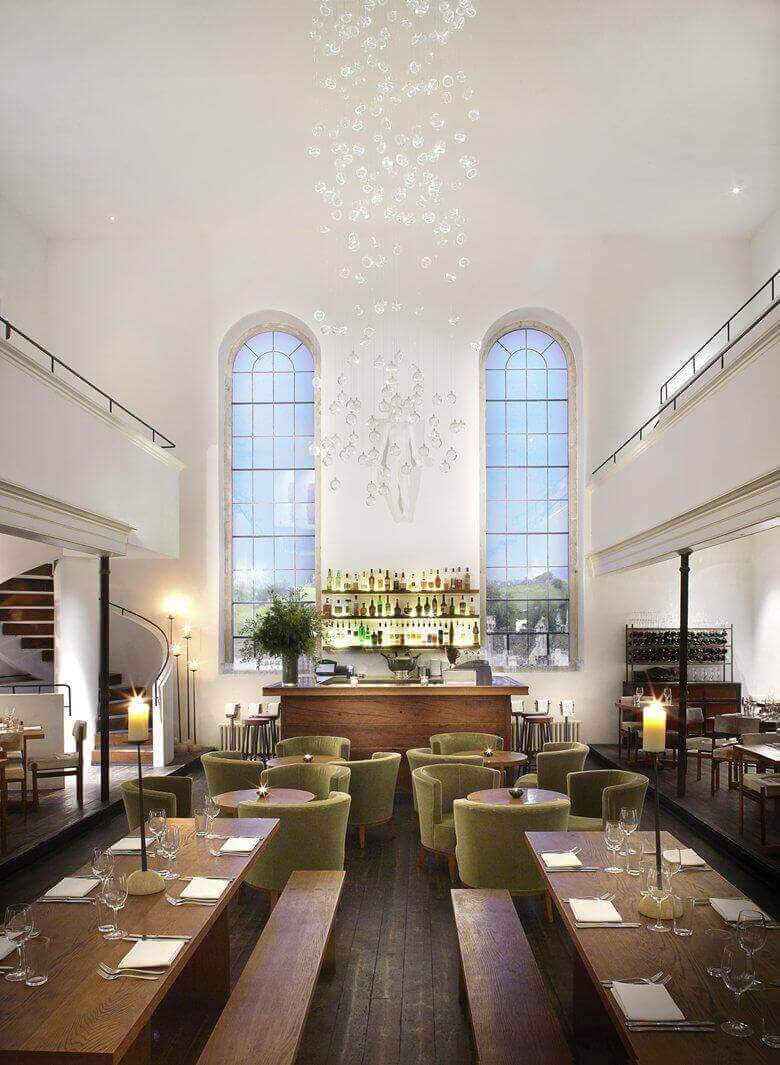
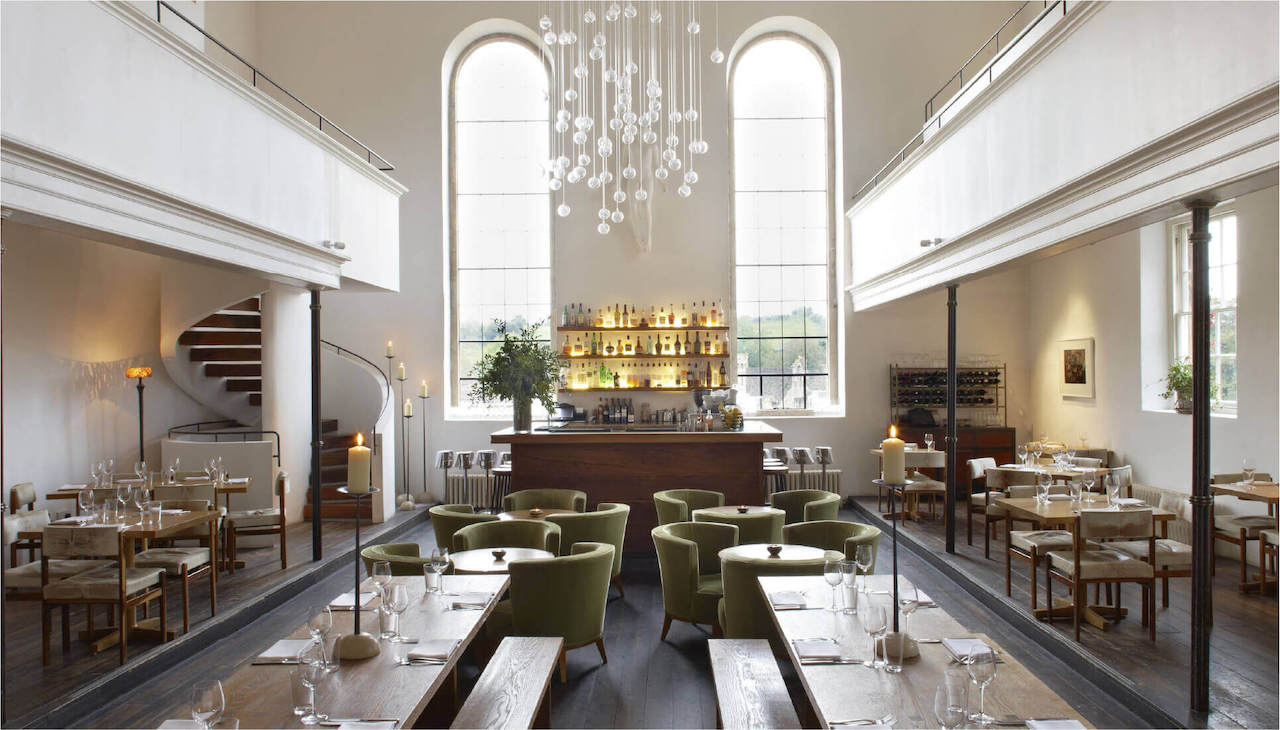
Stunningly renovated in a style that captures the simplistic beauty of this former Congregational chapel, the Chapel Restaurant incorporates not only an eatery but also a club, a bar, a wine shop, and a bakery.
White walls, large windows that facilitate natural light and the use of dark wood result in rustic minimalism that is timeless.

A neutral palette allows the shapes and textures in the building to come to the fore, adding subtle interest.
Locally reclaimed stone, oak, plaster, and iron fixings offer a fusion of old and new, providing an understated backdrop that showcases the vibrant, organic nature of the beverages and foodstuffs on offer wonderfully well.

One of the strengths of this project is how the design and materials used have been chosen on the basis of the chapel’s location and original purpose as a place of public gathering.
These themes underpin the renovation, resulting in a unique re-purposing that’s highly engaging.
The White Rabbit – Singapore
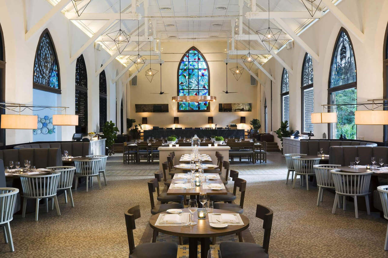
Moving forward from Singapore’s colonial heritage, this former 1930s chapel has been transformed into a chic, elegant restaurant that is home to one of the best selections of craft gins in Singapore!
Key features of the chapel have been retained but reworked into contemporary engaging accents.

Furniture has been placed so that the central aisle and the original tiled walkway (at a perpendicular angle to the central aisle) are prominent.
The original, arched shape of the windows remain, with fresh stained glass providing eye-catching illumination for the simple wooden furniture below.
The palette is neutral, with a focus on earthy greys and browns.

Dark woods, contrasting white walls, and exposed beams are all key features of the original building, which have been refurbished to create a classic backdrop that exudes a tranquil, welcoming ambiance.
The high ceiling and spacious nature of the setting make it a perfect location for comfortable dining, which helps to explain why a meal at the White Rabbit is one of the most sought after experiences in Singapore.
The Preacher’s Son – Bentonville, US
As much a local story as a restaurant, The Preacher’s Son is named after the chef Cooper, who is the son of the preacher who used to preach in the church across the road from the restaurant.
As befits a preacher’s son, the restaurant is housed in a former chapel.
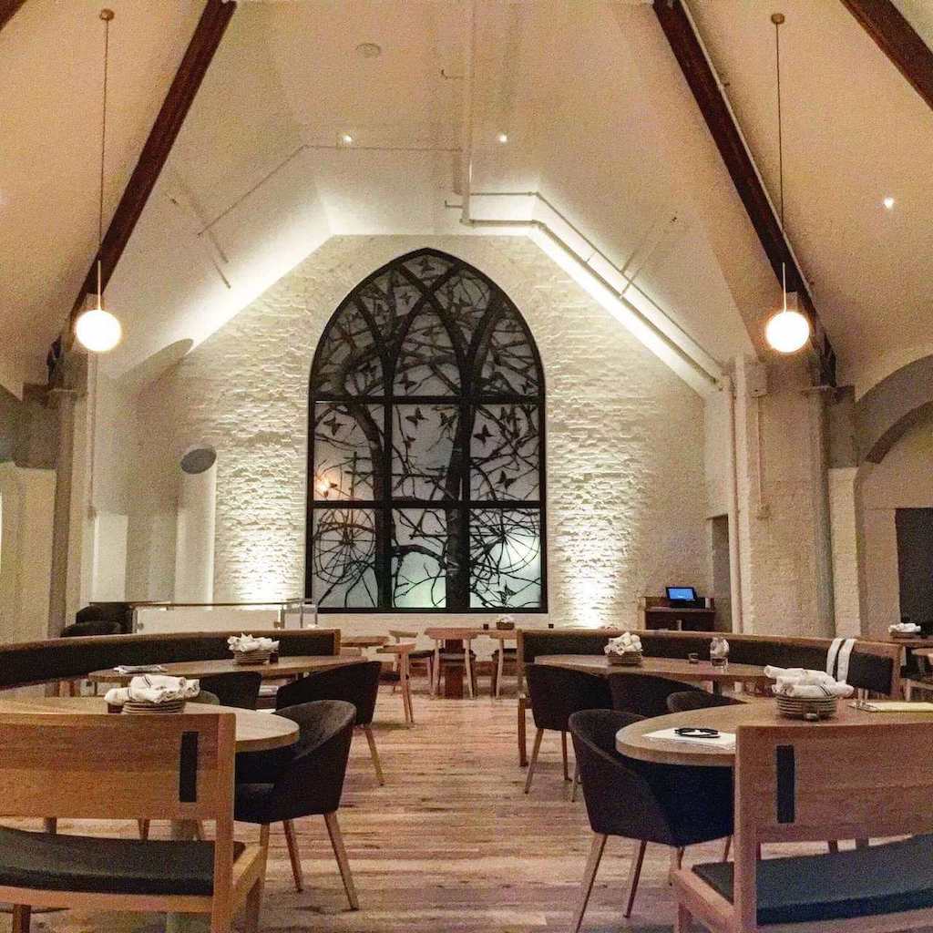
The building is light, airy, and spacious, offering a bright, welcoming ambiance that’s enormously appealing.

Modern accenting of key features within the structure results in stunning detail: the bell tower, now filled with 288 5″ gold bells; stunning window artistry that combines clear glass with beautifully crafted scenes of nature; and an apse that’s been reworked with champagne brick to give a bar like no other are just some of the ways in which the chapel has been sensitively re-purposed.

Natural wood, a classic monochrome palette, and plenty of original materials on display preserve the innate character of the structure at the same time as providing a smooth crossover into its current use.
Saphyre Restaurant – Belfast, Northern Ireland
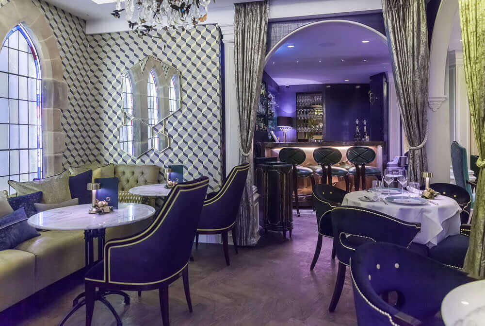
Impressive, gothic style frontage with an imposing flight of stairs to the main entrance provides an engaging preview of the design delights that characterise the Saphyre restaurant in Belfast.
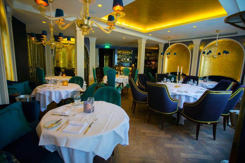
Kris Turnbull, who designed the interior, has used high-end, rich jewel colours to celebrate the gothic ambiance of the building at the same time as creating a rich, sumptuous interior that absolutely compels occupants to relax in comfort and enjoy what’s on offer.

Classical columns, arched windows, and impressive chandeliers help to retain the key features of the original structure.
Bold wall coverings (including stunning golden alcoves and some wallpaper that’s inspired by Victoriana) add plenty of quirky interest.
Sapphire blue upholstery, golden candlesticks, and potted plants provide a deliciously contemporary twist to archetypal 19th-century design details.

Little touches such as crockery that’s chosen to complement the colour scheme of the decor surrounding a particular table, the gold rope for curtain ties and a focus on high-end luxury upholstery that combines comfort with stunning good looks, ensure the Saphyre continues to be one of Belfast’s most well-known and well-regarded restaurants.
The Jane Antwerp – Antwerp, Belgium
Perhaps the defining characteristic of the Jane Antwerp is the way in which the spirituality of the former church has been retained.
Building on the concept that beautifully prepared and presented food demands respect and dignity, the Jane Antwerp interior has been designed to retain many original features of the former chapel in which it’s located.

Traditionally the place of the altar, the apse of the chapel has been fronted with clear glass and now houses the kitchen: diners can watch as chefs work their alchemy to create some of the best dining available in the city.
Whilst the building’s window shape is retained, the old glass has been replaced by contemporary panes featuring stunning artwork.
Original memorials and wall features remain, simply covered by fresh white paint to give a light, bright effect.

A stunning, modern light fixture runs down the length of the building, providing suitable illumination for the tables below.
A natural palette conveys a sense of simple elegance, providing an understated ambiance that allows diners to concentrate on the quality of the cuisine in comfort.
Grace – Portland, US
Formerly the Chestnut Street Church, today the building is a thriving restaurant whose interior retains many original features.
From the mezzanine gallery through to exposed beams, extensive windows, and high vaulted ceilings, it’s impossible to spend any time in Grace without gaining an insight into its heritage.

Warm woods, mirrors, and some carefully placed lighting result in a warm, intimate atmosphere that’s just right for spending quality time enjoying dishes from the restaurant’s impressive menu.
The concept behind the interior, which was designed by Paul Lewin, was to make a contemporary statement using the original building, materials, and features as far as possible.

The result is an interior that’s striking at the same time as being sympathetic to the original structure.
Details such as the ambitious timber and glass sculpture above the bar, and intriguing iron fixtures and fittings, showcase the fusion of rustic individuality and sympathetic, modern work beautifully.
The writer’s remarks
The examples given above serve to illustrate how good design can serve to ensure that each building’s story is told in a skilled and sensitive manner (read also ‘7 stunning restaurants with plant-filled interiors‘). These re-purposed chapels have been created not only to showcase their unique features but also to encapsulate local influences of place and time.
The result is a selection of restaurants that not only showcase fine cuisine but also offer diners the chance to experience the interior in a novel manner. Successful interiors are all about telling a story: in these examples, top designers have ensured that each building has been given the opportunity to speak, narrating their own, captivating tale.


