Step inside the world created by the Dutch design studio Beyond Space
Focused on creating eclectic spaces – Beyond Space brilliantly helps shape spatial identity for brands, institutes and individuals.
An Amsterdam-based design studio – Beyond Space was founded by Remi Versteeg and Stijn de Weerd with Esther Bentvelsen joining them as the third partner. Focused on creating eclectic spaces – this agency brilliantly helps shape spatial identity for brands, institutes and individuals.
“With a firm belief that architectural thinking applies well beyond matters of space – we draw from a range of interests, disciplines as well as experiences and seek to forge new connections to allow for the unexpected!” says Beyond Space.
As they combine creative entrepreneurship with a solid grounding in their discipline of origin and seamlessly blend their unconventional ideas with intuitive design – scroll to explore some of their extraordinary work.
Gallery
Open full width
Open full width
BS for Siersema
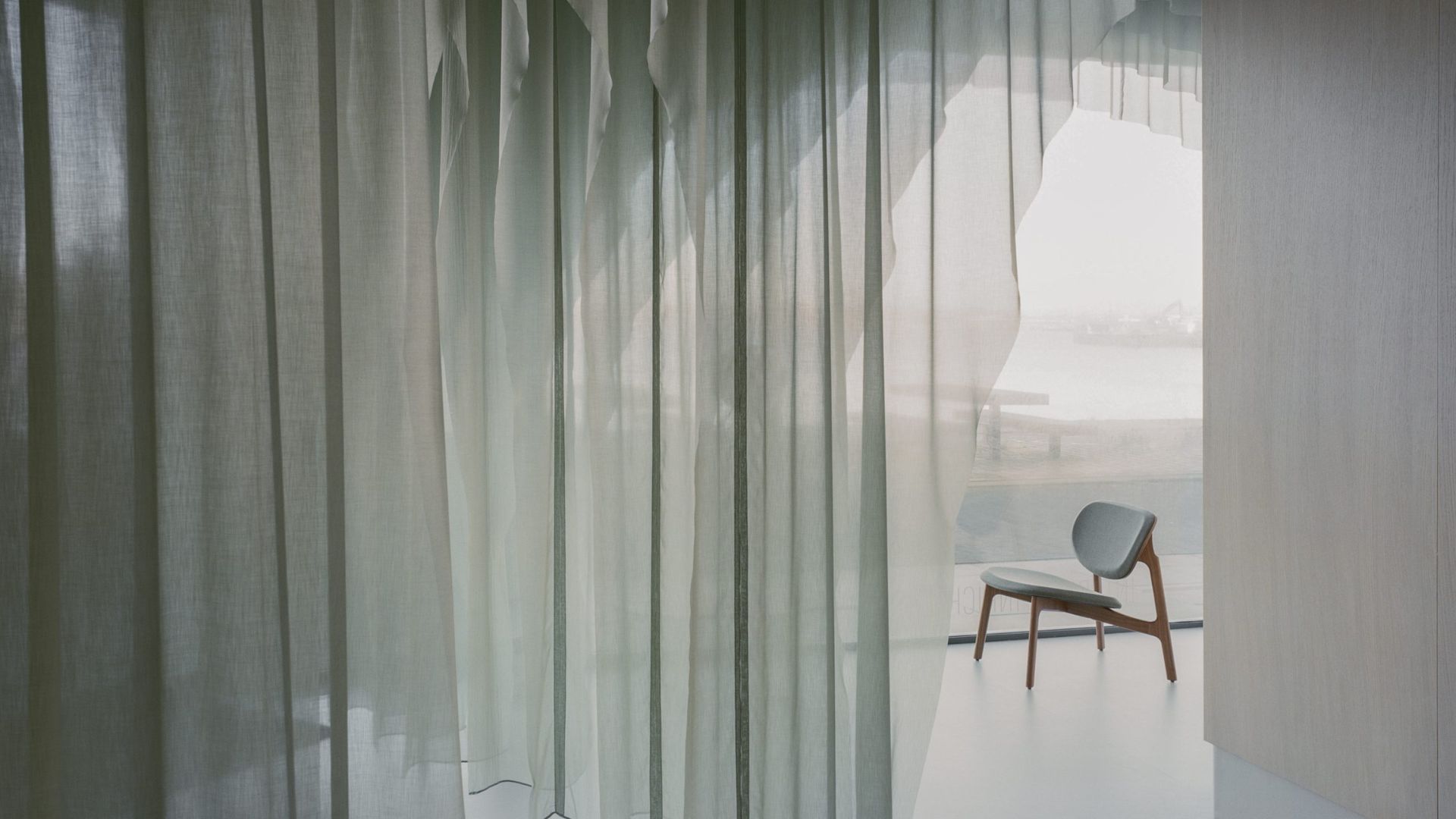
Beyond Space designed a stunning office interior doubling as a showroom for the new waterfront location of a high-end interior designer specializing in unique fabrics – Siersema.
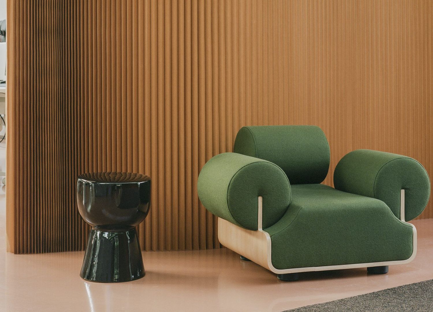
Asked to reflect the company’s identity – “we seized the opportunity to sculpt the interior from their own, lush materials. We filled the entire space with a rippling of ceiling-to-floor, semi-transparent, ocean-hued drapes – a kilometer in total – lasercut to hew out distinct spaces serving both office and retail purposes!” says Beyond Space.

Through the folds, sight lines across the entire area are retained, never losing the connection with its inspiration – the water of Amsterdam’s IJ-river. Even though this space benefitted from high ceilings and lots of light, the team wanted to create intimate and distinct working spaces without pulling up a single wall – retaining the strengths of the location and its connection to the water.
The client’s brief to have their company’s core business reflected on their spatial design gave birth to the idea to sculpt the area from equidistant repeating drapes of a soft, semi-transparent fabric hanging from the ceiling, but cut at different lengths to allow for – a meeting, office, seating as well as a common area.
They chose a neutral, natural and water-like palette for the fabric. As such, it doesn’t distract from, but serves the anti-space hewn from it. Coupled with the drapes’ natural rippling, the color of this space further echoes the calm waves of the water right outside.
“Sculpting the distinct spaces surrounded by these layers of fabric has an acoustic benefit as well. It feels intimate and separate, yet through the folds one never loses sight of the entire space and its outside environment” adds the studio.

BS for Roamler
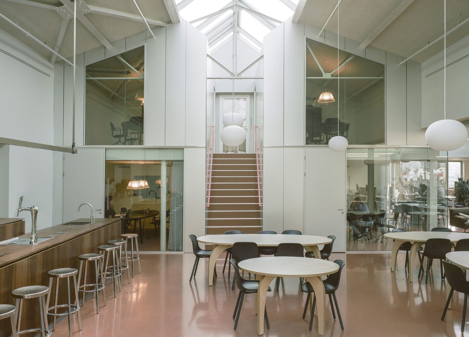
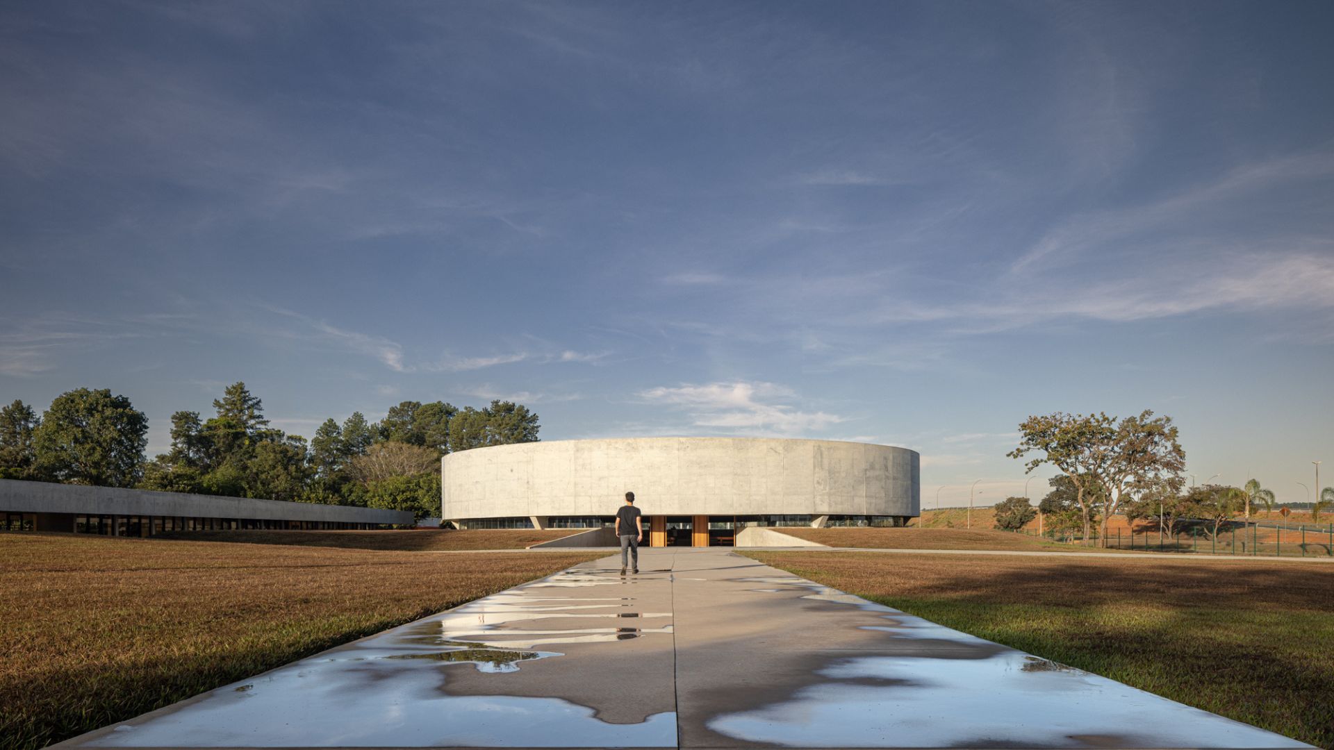
Four monumental halls with distinct, pointy glass roofs stand proudly at a post-industrial yard on the north bank of Amsterdam’s River IJ – “and for Roamler we transformed these structures into a spacious office” says the studio.
Filled with flexible work spaces that are fully geared – it sports some remarkable and eye-catching features to boot. For this transformation, the studio placed windows on the south façade that reach to the ground, added additional skylights as well as removed all internal walls to reveal the original steel construction. The result is – a light-filled wide space speckled with flexible workplaces that beautifully connects to the outside in harmony.

“The last of the four halls has a greater height than the other three, allowing for two floors. We decided to house all spaces that need closing off, like meeting rooms and bathrooms, in two box-like constructions we placed on either side. In between is the open kitchen which connects to the other three halls as one, wide open area” adds the studio.
Entering the structure offers a gentle transition into a truly peaceful sanctuary with mature and majestic cacti. Though of a sculptural quality, make no mistake – this structure is certainly not an object within a space, but an integral part of it; a true space maker both inside and outside it.
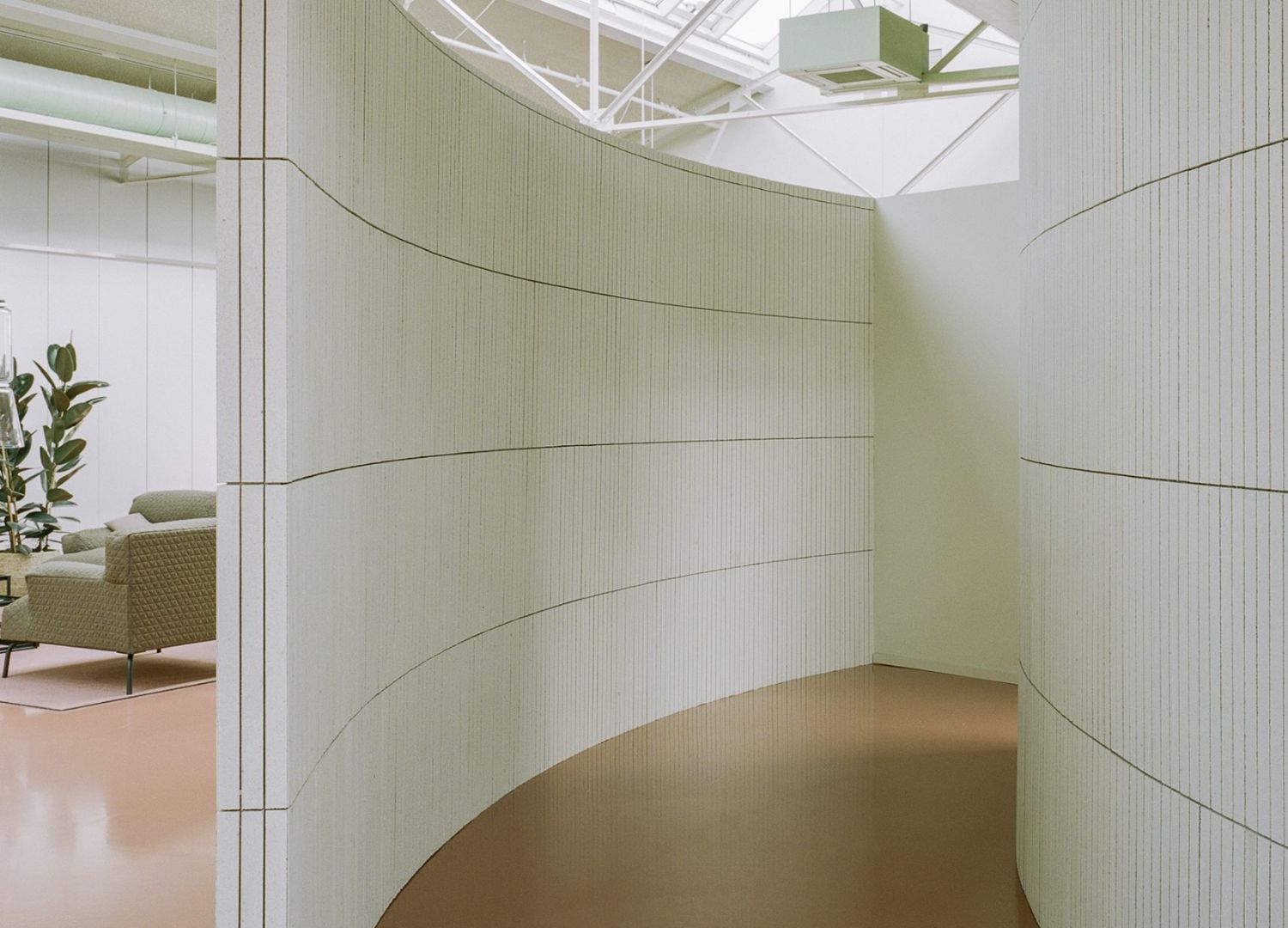
“Along with the area’s warm terracotta flooring being a connecting accent throughout – we embraced and left visible the installations, which were sprayed in a contrasting mint green. Additionally, right in the center a surprise unravels – a spiraling wall that transports those who enter to an inner courtyard lined with fully soundproof concentration spaces” they say.
A pièce de résistance – the spiraling wall leading to the internal cactus garden as well as most of the furniture are in subdued white and gray hues.

BS for Baugenossenschaft Aare Bern
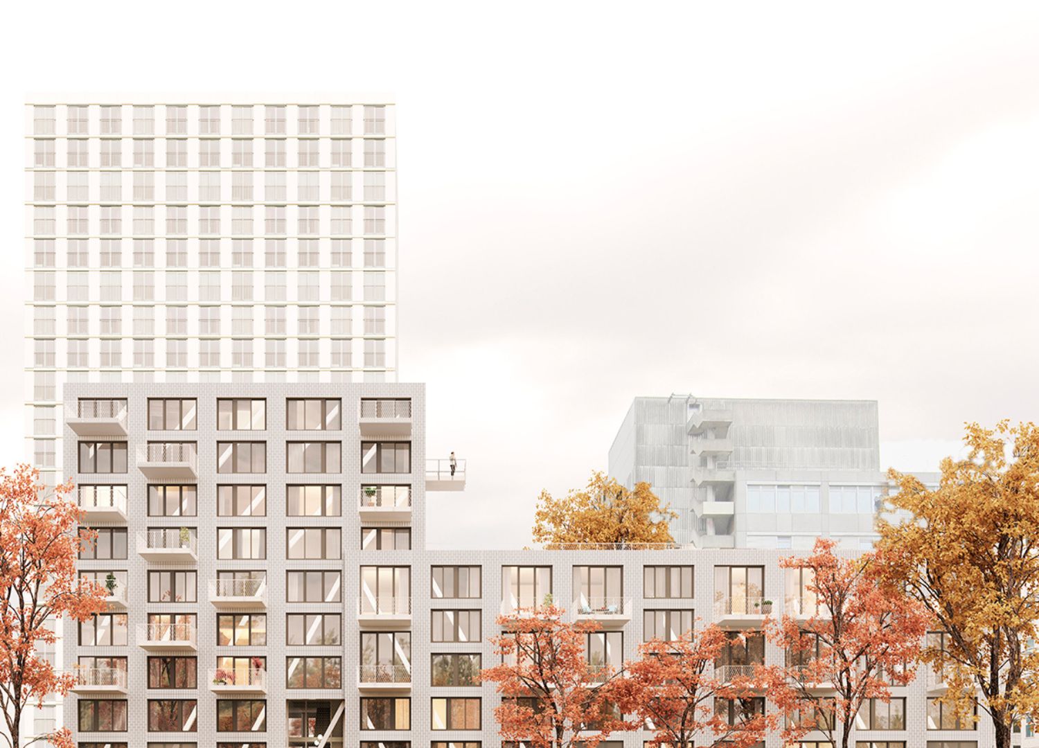
On the former site of the Wasser Energie company, the city of Bern planned a new neighborhood of approximately 350 dwelling units that would eventually house 500 to 600 residents.
Working closely together with Bern based architecture studio Fritschibeis, Beyond Space proposed a building in two clear volumes – containing 50 affordable family apartments in three types for a non-profit property developer.
“The ground-bound family houses have a double height living space which opens onto the garden. Above, there are two linked maisonettes which have a one and a half height living area, suited for families of diverse composition. By using ensuite rooms the living space can easily be enlarged when needed. In the tower apartments the emphasis is put on the perspective from the entrance towards the façade, through the diagonal arrangement of the living areas” says the studio.

These three typologies are complemented by various rooms which can function as individual studio apartments or as additional rooms to the neighboring apartments.
Ultimately, the building effortlessly reflects both Swiss and Dutch perspectives on housing in an integrated whole – experimentation and fun in the dwelling plans is coupled with beautiful materialization, controlled aesthetics and intricate detailing.
BS for Designplus Exhibition
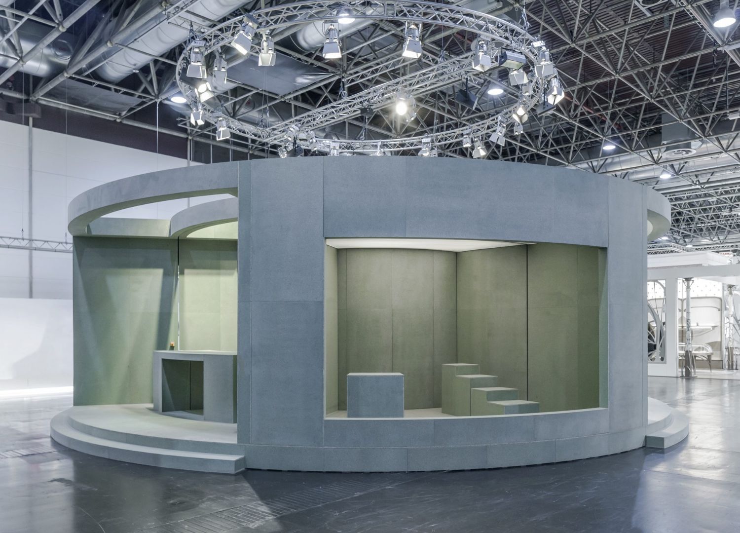
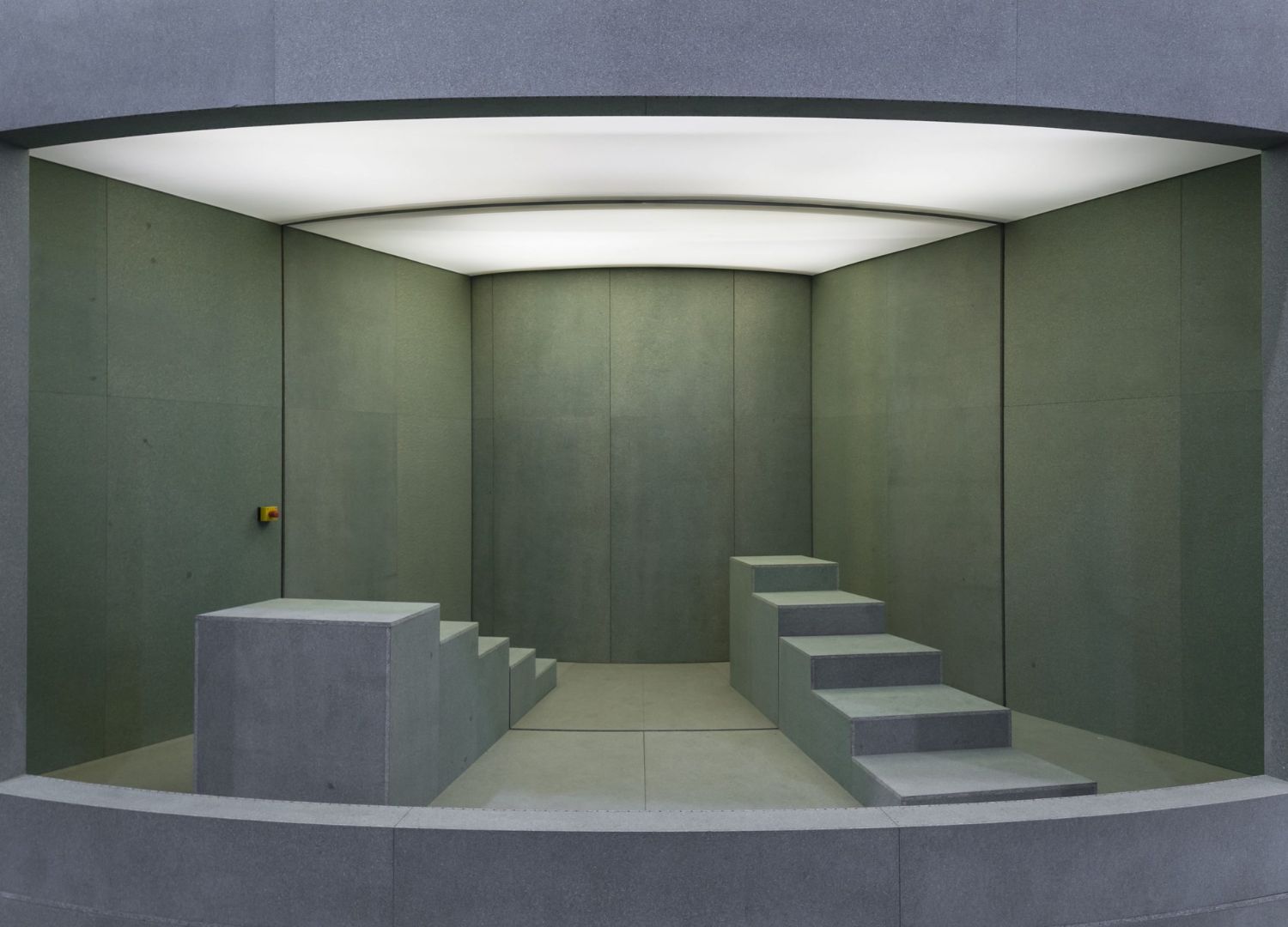
“Based in Germany, the Designplus Exhibition featured six archetypical rooms mounted on two circular platforms with a twist – where every twenty minutes the center ring rotated 60 degrees. This created six surprising new scenarios and including the bar in the center – there were a total of 37 different room combinations possible” says the studio.

The studio‘s design skillfully offered a contemporary take on the traditional exhibition, a more autonomous and laid back approach to stand out from the crowd. It provided visitors and exhibitors a more casual way of interacting and this approach seamlessly echoed in a low-key use of material – waterproof particle board only.


