The ingenious work of nendo – here are 10 of his best design works
Minimalist, but make it fun: here is our selection of 10 Nendo designs you should know.

The best kind of design should be simple and evoke an empathetic response. That’s what the Japanese design studio nendo is well known for. Since its establishment in 2022, the award-winning firm has gained recognition for its high-concept furniture and remarkable exhibition spaces.
Led by architect Oki Sato, the studio continues to amaze with its creative designs. Let us introduce you to ten of the most impressive Nendo designs.
Gallery
Open full width
Open full width
10 project highlights from the Japanese designer:
Ribbon Stool
If you’ve ever seen Nendo designs, you’ll surely agree most of them share an avant-garde feel. The Ribbon Stool, made for Cappellini, is no exception. As you can guess from its name, the stool resembles ribbons looped around each other. In a way, it’s similar to a ballet shoe.
The designer offered two versions for the stool. The alternative had a backrest shaped like Mickey Mouse. When both look so good, it’s hard to pick a favorite!

The Pooh Table Collection
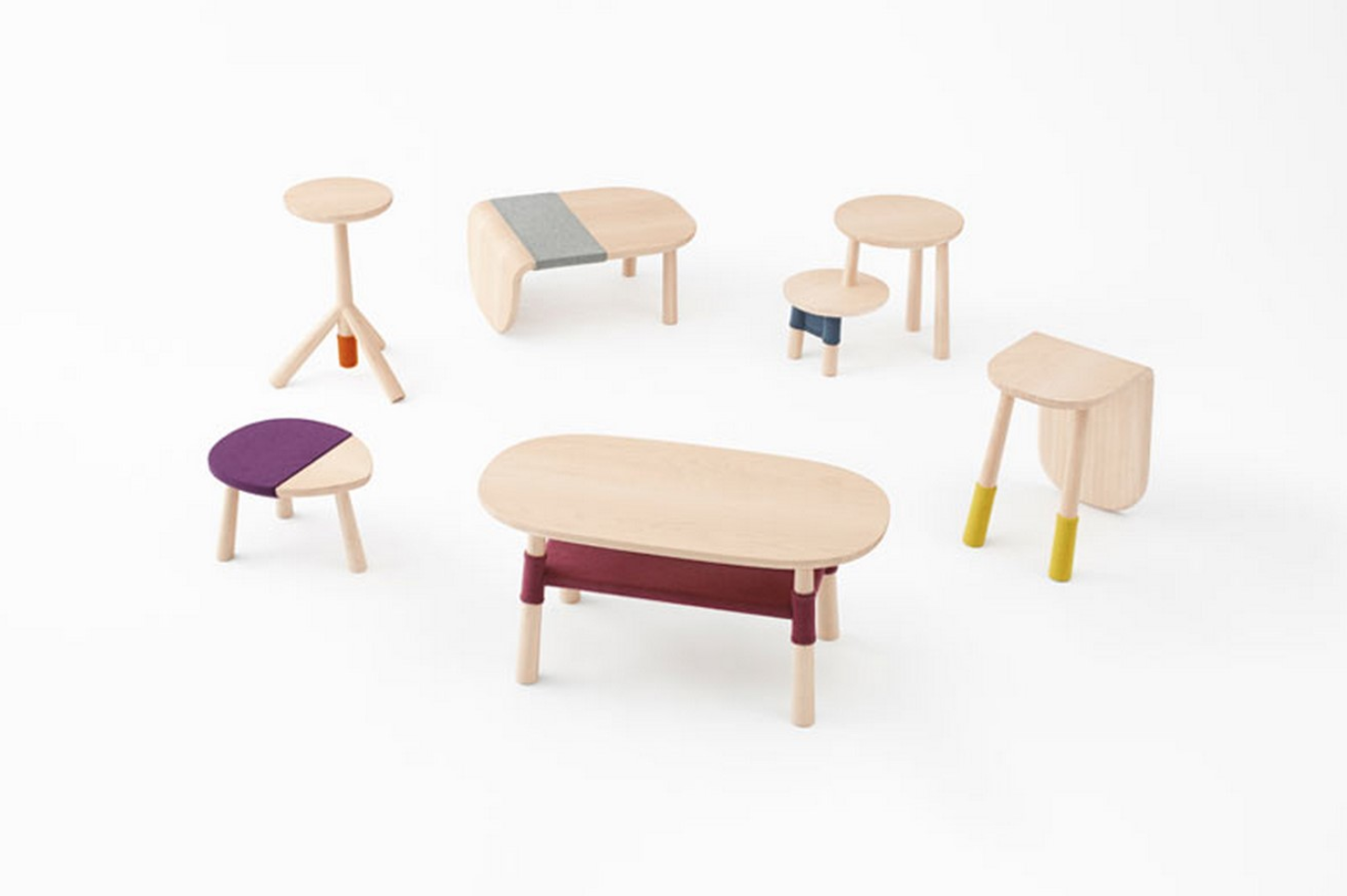
Have a look at this table collection. Can you recognize the characters from Winnie the Pooh? This particular collection Nendo designed in collaboration with Walt Disney. Within the project, the studio built several tables, which were based on the look of Pooh’s friends. Made of maple wood, this furniture is child-friendly but not childish, so it would be a perfect pick for a nursery.

Twig Chair
For Italian-furniture brand Alias, Nendo designed the unusual Twig Chair. What makes it so unique is the fact its arms and back can easily be removed, which makes it more convenient to transport or keep in storage. The Twig Chair is available in different shapes, colors, and materials, so it will be a great addition to any space. Users can pick between wood, plastic, and fabric.

Thin Black Lines
Among the most iconic works of Nendo are The Thin Black Lines Chairs, which were specifically created for a solo exhibition by Phillips de Pury. The theme for it was ‘Outlines’, so the design studio put all their effort into a chair that features slight black lines, which are similar to what you would see on drawn sketches. As Nendo writes, ‘The design gently breaks the relationship of before and behind.’ Simple. Sleek. But definitely not boring.

Mimicry Chairs
Part seating, part installation, the Mimicry chairs offer a new way for visitors to engage with the Victoria and Albert Museum, where they are placed. To create the transparent chair, the studio pressed punched metal. At first glance, however, it looks seemingly soft. At the museum, the chairs were placed in 10 different locations, and Nendo modified them to fit in the specific environment.

Semi-wrinkle Washi Lamps
Although Nendo is more recognized for its innovative furniture, the design studio has also worked on lighting design. The Semi-Wrinkle Washi Lamps are made using a traditional Japanese technique, where a fine screen is passed through a solution of plant pulp and water.
To create a light-washed effect, the studio made a hole at the bottom of the lamp. Depending on your preferences, the fixture can serve as both a table lamp and a pendant lamp. Either way – it will look equally stunning.

Chopsticks
We bet you didn’t know the award-winning studio has created, perhaps, the most beautiful chapsticks in the world! Collaborating with a traditional manufacturer from Obama in Japan, the company designed a series of contemporary chapsticks. In the collection, Nendo offered a fresh take on the style, materials, and functionality of the seemingly ordinary product.

Magne-hinge Glasses
Placing functionality as a priority, the Tokyo-based company has put its hand in accessory design too. Among the wide range of eyewear produced, our favorite is the Magne-hinge glasses. Apart from excellent aesthetics, they utilize the power of magnets, so there’s no need for traditional screw hinges. Consequently, the glasses are much more flexible and long-lasting.

Cabbage Chair
It’s difficult to narrow down just ten of nendo’s best designs, but there’s no question that the Cabbage Chair deserves a place on this list. The whimsical design was created for the XXIst Century Man exhibition, which focused on ways of repurposing waste to make something functional. His solution offers a chair that transforms into its shape from a roll of pleated paper. In the process, the design studio used resins to add more strength to the product.

Transparent Chair
Another product that showcases the company’s creativity is the Transparent Chair, made for Milan Design Week. This project utilizes polyurethane, which gives the chair plenty of elasticity. After a user has sat on it, the Transparent Chair quickly returns to its original shape. By using clear polyurethane, the studio has managed to create an illusion of the user floating above the ground.

End notes
Reimagining everyday objects with wit, nendo has certainly made the design world a more exciting place. The cutting-edge work of the Japanese studio is always unexpected, which makes it so great. Magnetic glasses. Ice-cream-shaped lamps. Winnie the Pooh-inspired furniture. He never fails to create the ‘aha’ moment.


