An inhabitable elliptical void at the House by Murayama + Kato Architecture
The House by Murayama + Kato Architecture features a huge oval hole in the main living area, defining an original use of space and a novel architectural feature.

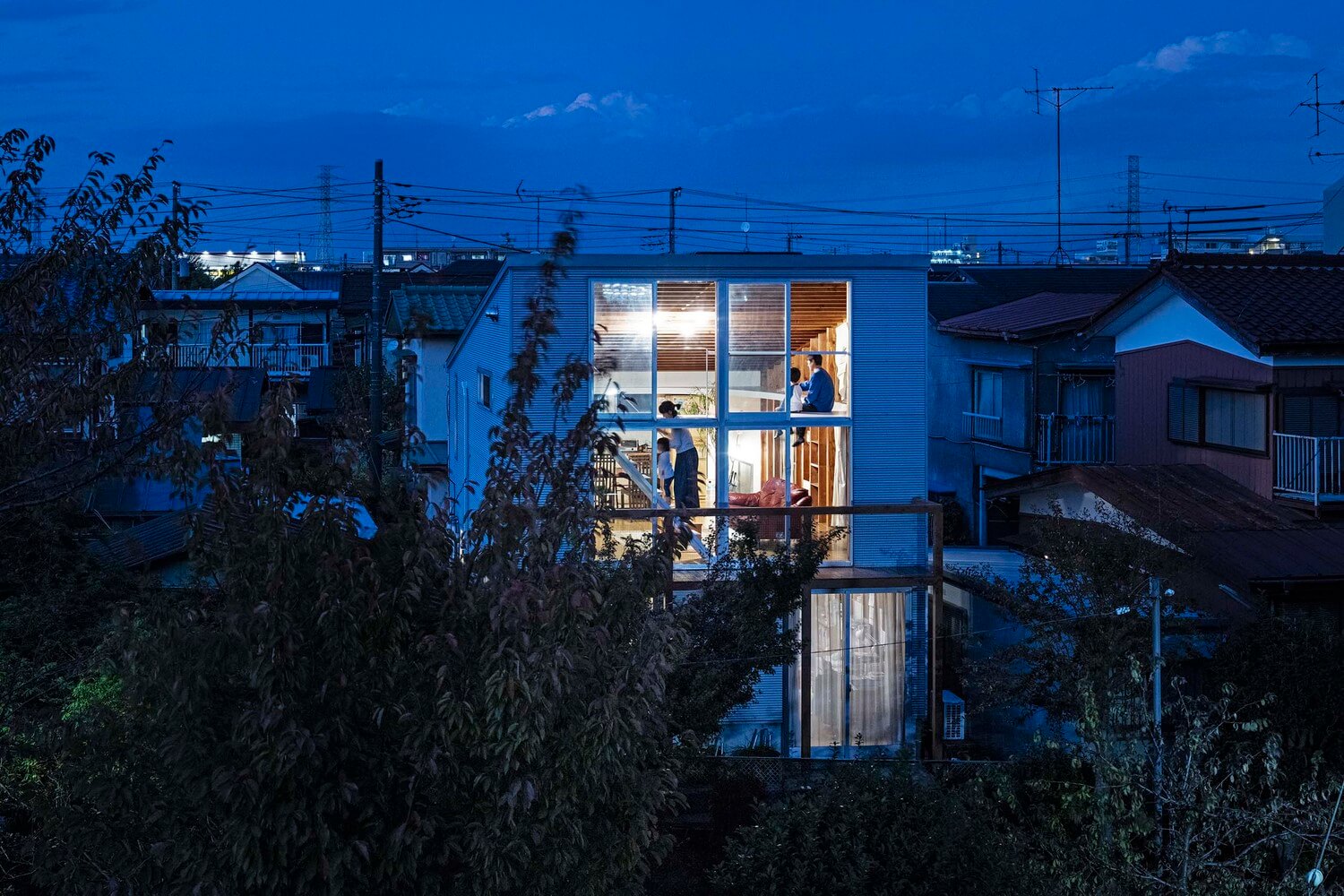
A 20-year old property in Tokyo recently underwent an inspiring renovation to maximise the space within the oddly-shaped interior. The House by Murayama + Kato Architecture transforms a Tokyo home with a slanting roof into an intelligent interior design with almost two floor levels.
A full second storey wouldn’t fit within the property so Murayama + Kato Architecture had to think of an innovative way to make the most of the high ceiling to maximise the living space.

The minds behind House by Murayama + Kato Architecture – Toru Murayama and Ayako Kato
Both born in Japan, Toru Murayama and Ayako Kato founded Murayama + Kao Architecture in 2010. After founding the practice, Murayama became a research associate at Janto Gakuin University and Kato became a lecturer, project researcher, and associate professor at several universities including the University of Tokyo and Nara Women’s University.

Materials & Techniques – Glass and Support
One of the main features of the House by Murayama + Kato Architecture was the south-facing window that filled the whole aperture. The sloping roof was pitched upwards to maximise the light intake from the glass. Where the roof was pitched, it created a very high ceiling, but it wasn’t quite high enough to be a double storey room, so the architects had to design something unique.
The pitched roof doesn’t just create an additional living space, it also acts as a structural and environmental component to the design. The roof makes it possible to remove the existing bracing and allows ventilation in at the top of the glazing.

Style & Aesthetics – Super elliptical void
The architects proposed to create another level within the room, by constructing a super elliptical void at 1.8m high. This void overlooked the living, dining, and kitchen space. It provides just enough headspace for an adult to stand where the roof is at it’s highest.
The oval installation provides a space to relax and overlook the activities below. Where the ceiling is at it’s lowest, above the kitchen, it makes the perfect overhead storage and thus helps to merge the two-floor levels together.

The House by Murayama + Kato Architecture wouldn’t pass the health and safety regulations in most countries
This interior design is so appropriate for Japan where the health and safety regulations are not as strict as most western countries. Any architect facing these harsh regulations would have to design glass balustrades or include a safety net – which would completely ruin the effect of this design.

Deign Memento – Looking down into the pond
The oval design of this construction creates the illusion that you are looking down into a pond, whereas in reality, you are looking down into the open plan living area. The open plan design helps to accentuate the spacious atmosphere created by the fully glazed aperture that fills the highest wall.

The writer’s comment – Impressive innovation
I was extremely impressed by this project when I first saw it. The architecture designed for the House by Murayama + Kato Architecture is truly inspiring and shows how new spaces can be added to a property that had excessively tall ceilings. The heavy use of timber is an elegant contrast to the white oval floor that forms the additional 2nd floor.
If you want to know more about Japanese home designs that are disrupting the norm, don’t miss Stairway House is an invitation to walk to the stars.


