Type design in branding: find a brand’s voiceprint to make it truly unique
What is the most strategic choice for a brand in terms of type design? The answer is not easy, but we tried. A hint? It has a lot to do with history, culture, and the power of recognition.
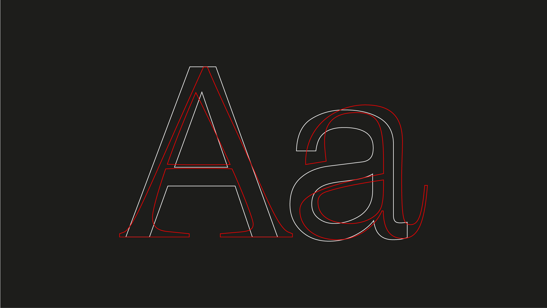
Why typography matters? Type design has a huge creative, aesthetic and communicative potential that oftentimes goes undetected by the most. Typefaces can shape and express cultural contexts to all messages that appear in any kind of visual communication, thus influencing the perceptions and the effect on the public audience. Let’s be honest here: who would respect a prohibition sign written in Comic Sans?
From sticky notes attached to office doors to emails, from press releases to integrated communication campaigns, up to gigantic headlines that dominate on billboards in city squares: fonts are ever-present. Typography has been a constant element over time and in communication channels.
Gallery
Open full width


Open full width
The Code of Hammurabi, medieval scribes, Gutenberg’s moveable type printing and the metaverse all have one thing in common: the aesthetic appeal of the text has the power to convey connotations and sanctions to the reader, beyond the actual meaning of the written words. Just as shapes and colors give life to any image, typographic characters are the building blocks that give context and personality to communication messages.
“The very purpose of our alphabet is to give a visual structure to experiences, memory and abstract thought. A message which we hear is soon forgotten, but the one which we see and read is more permanent because it penetrates memory on more than one level and can be referred to over and over again.” – Ben Rosen, Type and Typography: The Designer’s Type Book, 1976.

A brand’s voiceprint
It might be redundant to say that brands need their own tone of voice, visual style and personality to put their ideas across – just as a human being would. However, it is rare that we hear about a brand’s voiceprint. And this is exactly what typography stands for: we can recognize a person in the next room simply from their voice, and we could easily recognize a brand simply from its headline style on a billboard. In this sense, there are three main ways to inextricably link brand and typography.
Firstly, by adopting a font that is very recognizable for its strong characteristics (e.g. Futura Condensed Extra-Bold for Nike, Didot for Giorgio Armani, Courier for IMB) that it is almost impossible that it goes undetected. In this case, a brand de facto appropriates a font and creates an automatic connection so strong that it would feel paradoxical to see that very same font applied in a different context.
Secondly, by adopting a bland font and using it in a memorable way. This is what happened with Helvetica and Off White: one of the most neutral fonts out there (or is it?) chosen by a fresh streetwear brand to make it absolutely iconic. Here, decontextualization is key.
Lastly, by creating a bespoke font. A choice that has grown in popularity over time, pushing a large number of brands to resort to a custom typeface to underline their unicity (e.g. Spotify, Netflix, Burger King).

Is custom type the answer?
At this point one might ask: then what’s the better choice? Well, surprise surprise, there is no straightforward answer: there are ideal choices for specific situations. To understand what that ideal choice is, it might be helpful to start with a few questions: how big is the company? How does the company use typography? What are its communication channels? What is its target audience?
Custom typography design projects can take years to develop, with the inevitable consequent costs. It is fair to say that, nowadays, professional type-design courses are many and the resources are easily available. Digital type foundries are proliferating and offer quality product catalogs at an affordable price – as listed by It’s Nice That in its Global Type 100 list – though this abundance might lead to a flattening of the offer and custom typefaces could end up looking a lot like one another.
This could result in the revamping of the actual content over its visual expression, but the stylistic impoverishment would be almost unbearable – at least for us in the industry.

A brand’s history, and real history, are heavy weights
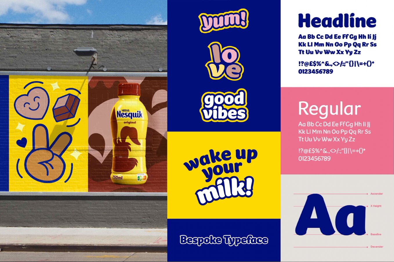
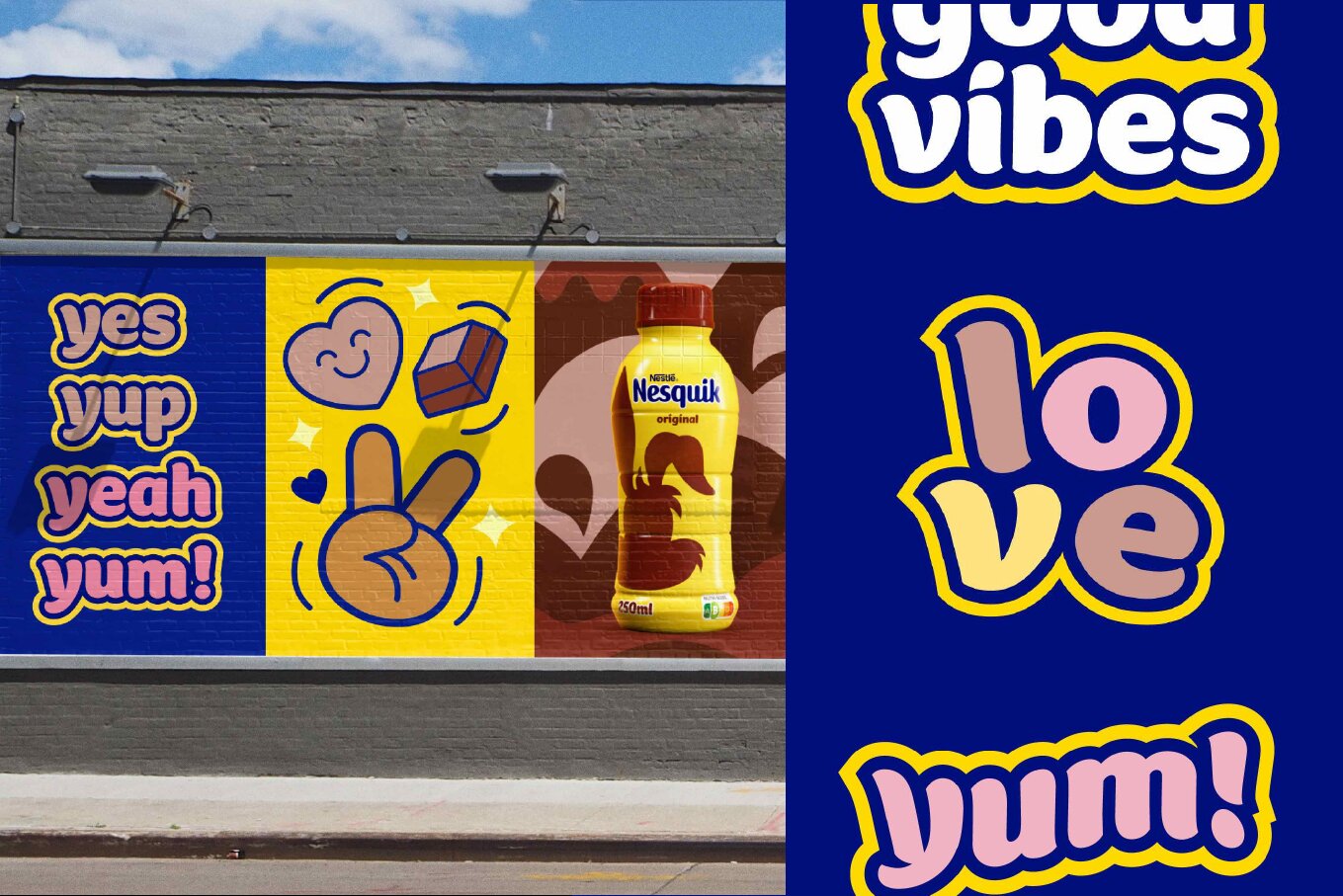
However, with a job properly done, this risk is nonexistent: if the font is the product of a deep analysis of the brand, its history and personality, the final result will inevitably be unique and distinctive. This has been the case for Nesquik’s recent rebranding with the creation of a custom character display that embodies the true spirit of the brand in all its liveliness, with chunky and fun curves. Similarly, NatWest has created an entire new alphabet from the cubes that compose its logo.
Another trick to overcome visual depletion is to draw inspiration from history and culture. Funnily enough, two great examples come from the football world: both Venezia FC and Real Valladolid use a typography deeply rooted in their territories that perfectly match their visual connotations.
The first has adopted the already existing font Jenson – named after the typographer Nicholas Jenson who lived in Venice in 15th century – which is extremely elegant and sophisticated, just like the city it represents. Real Valladolid has designed its own font, Pucela, from the shapes of the colorful store signs that typify the streets of Madrid.

As many say, “fonts are culture” in the way they can express a brand’s, a place’s, a community’s cultural heritage. This is why, no matter how we decide to select our font, it is crucial it expresses what a brand stands for and gives value to its history. Just as for human beings, this is the only way we can assure total unicity and distinctiveness.
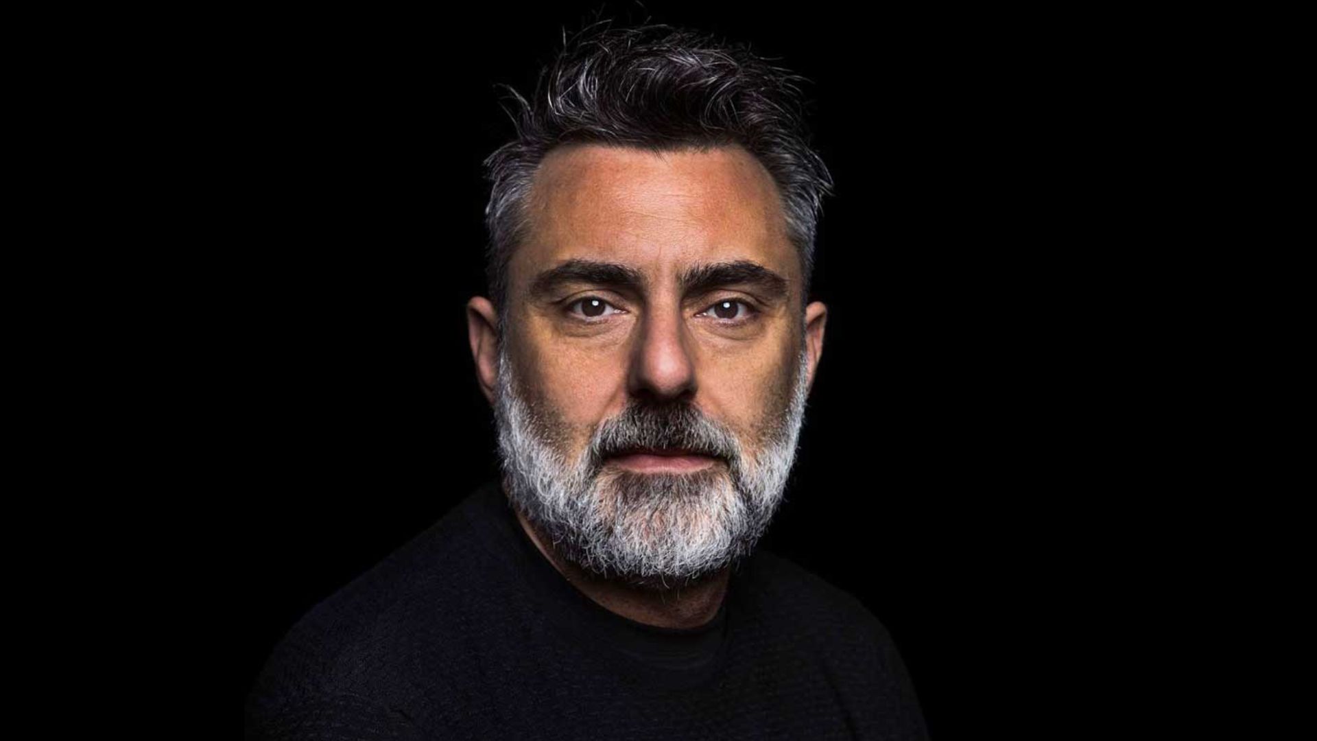
About the author

Jacopo is a designer with 5+ years of experience, specializing in visual identity with a focus on typography. After a three-year course at the Accademia di Brera, he earned an MA from Raffles Institute where he studied with professionals from studios such as Hort, Pentagram, Lava, Base Design and others. Prior to FutureBrand, he collaborated with Landor London, CBA, FAI-Fondo Ambiente Italiano and Blossom. He is a member of the publishing collective Tazi Zine and runs the Type-Hunting page @lettere.urbane. His work has been selected by Slanted Magazine, FrizziFrizzi, Cheap Festival, Fedrigoni365.
Instagram