LAYER has created a voice assistant with a happy (or sad) personality
Capsula Mini is LAYER’s attempt at making digital voice assistants, which are inexpressive and unhuman, expressive and more human-like.
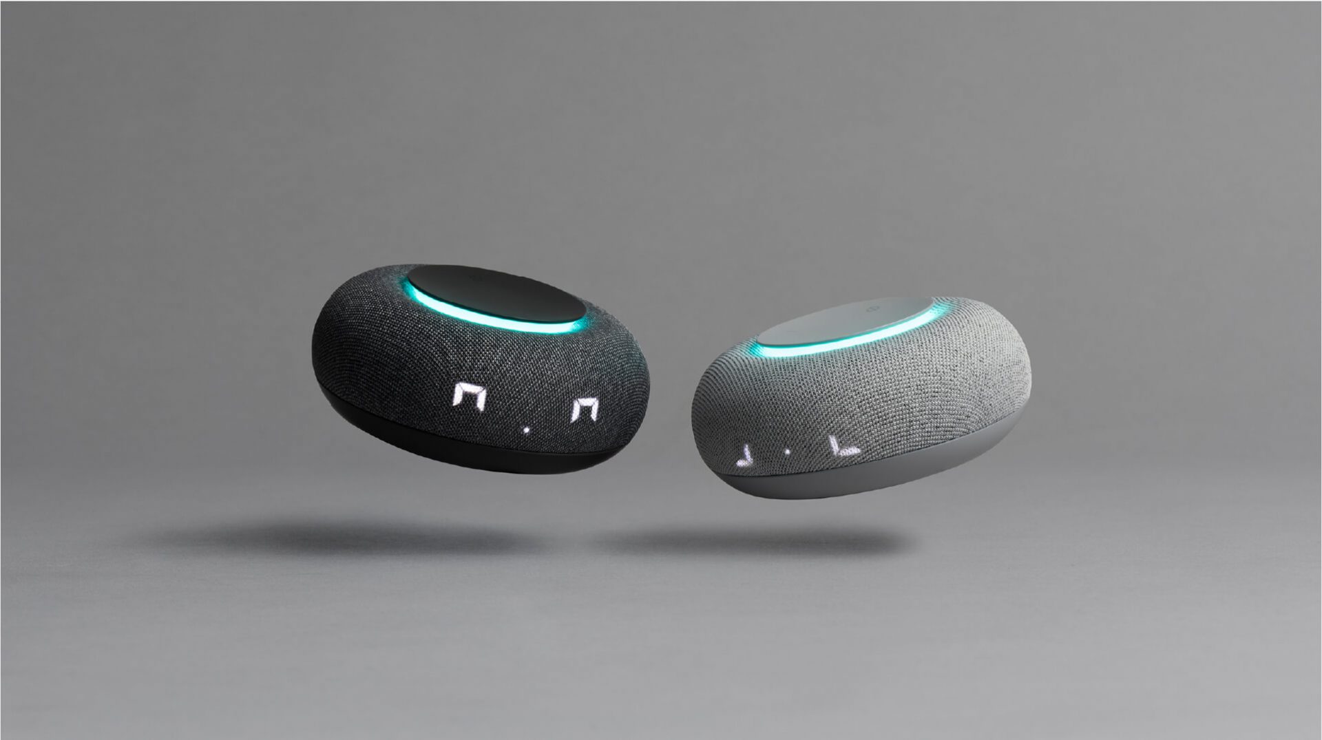
Technology keeps evolving but voice assistants and digital companions like Siri, Alexa and Google still feel cold, unrelatable and ironically enough, unhuman. To combat this, creative design studio LAYER, which was founded by industrial designer Benjamin Hubert in 2015, has created the Capsula Mini voice assistant capable of expressing sadness and joy.
LAYER has achieved this by anthropomorphising the device—which is a complicated way of explaining the way it features human characteristics. As if it’s doughnut-shape wasn’t enough to make it feel friendly and appealing, a seven-segment display lights up to represent two eyes and a nose that can communicate a range of emotions, also including happiness, surprise and interest and sadness.
Gallery
Open full width
Open full width
The studio works across strategy, ID, CMF, UI/UX, engineering and art direction, which in this particular project have been combined to create an endearing smart assistant for mail, Russia’s largest internet company. The firm regularly collaborates with leading brands including Nike, Samsung, Bang and Olufsen and Google.
The friendly and minimal visual language of Capsula Mini is intended to make it accessible and appealing for users of all ages, from young children to elderly people with varying levels of tech-savviness. The form is driven by the need to integrate both an intuitive LED feedback display and a physical touch interface.

“This kind of approachable interaction was important as Capsula Mini needed to be welcoming and appealing to everyone from children to adults,” the studio explains. “By creating a character that users can seemingly befriend and communicate with, the high-tech device becomes engaging and intuitive to use.”
A textile-wrapped form conceals the LED display, with volume control and power buttons sitting on top. Meanwhile, an LED band below the interface panel offers subtle yet clear information regarding the status of the smart assistant, indicating listening mode, mute, start-up, and changes in volume using varying levels of brightness and colours.

When it comes to materials and parts, LAYER also focused on minimising components and reducing the bill of materials (BOM). Running parallel to these objectives was a desire to maximise the sensitivity of the visual language and create a high perceived value with regards to aesthetics.
The smart assistant utilises affordable yet robust materials, such as plastic and textile, which have been elevated through close attention to detail and finish. The plastic, for example, has been transformed to offer a haptically desirable experience through the use of in-mould texturising to create a soft finish.

LAYER also focused on colour-matching the plastic finishes and acoustic textiles to visually simplify the design language and elevate its appearance. The smart assistant is available in two colourways—dove grey and charcoal—but the company says it will release more in the future.
As it plays music, another objective was good sound quality. Despite its small size, the design team achieved this through a full-range driver with an aluminium reflector and acoustic chamber.


