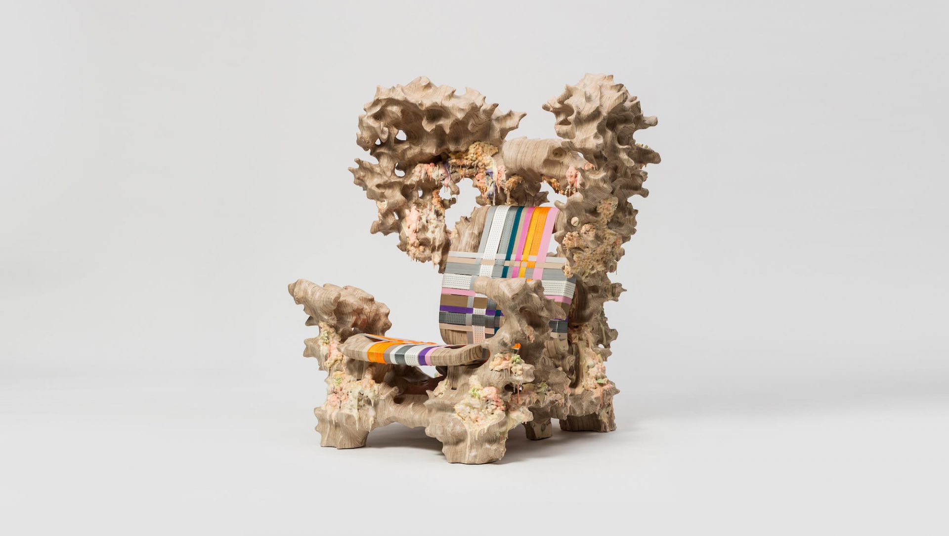
The Displacement Collection features acrylic furniture in cautionary colours
Beijing-based design studio Cometabolism attempts to reactivate industrial components and obscure their functions in different environments.

Ahead of its first solo exhibition in Shanghai later this year, here is a look at a project by one of Beijing’s most exciting up-and-coming design duos. The Displacement Collection is a long-term art project by Cometabolism Studio, which serves as an expansion of its series titled “Mixed Public-Private Boundary”.
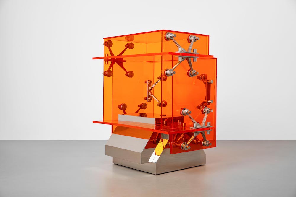
In a similar vein, it aims to blur the boundaries between public and private by incorporating industrial components and obscuring their functions in unexpected spaces. They include stainless steel elements, which the designers have used to secure sheets of bright orange acrylic together creating furniture with various functions. “The concept of this new collection aims to discuss how objects exist, statically or dynamically in spaces,” they explain.
Gallery
Open full width


Open full width
“[It] amalgamates the dimension of time into space, creating a series of new art pieces to fit in a world filled with varieties and uncertainties.” The Displacement collection includes a shelf that doubles as a side table made up of polycarbonate panels in different sizes. Together they form a two-tiered compartment, which sits atop a speckled base.
The ‘Displacement Bench’ echoes the same aesthetic, this time with multiple rhombus-shaped pieces fixed together to create a row of seats. The final piece in the collection is a mirror, which features an arch-shaped mirror decorated with squiggly pieces of acrylic fixed to mini LED strip lights and stainless steel boxes.

These objects are screaming “look at me!”
The Displacement Collection took approximately 2 months to complete and draws on several manufacturing techniques including laser cutting to shape the acrylic and sand-mould casting for the stainless steel. Whilst these are obvious to the naked eye, a little less so is are the symbolic colour choices, which play a significant part in underlining the meaning behind the collection.

“High-saturation blue and orange are often used for warnings and reminders in public spaces, such as street signs and warning tapes, building protection nets, etc.,” explains Zhang Ning, co-founder of Cometabolism studio. “We hope to use those colors to remind the viewer to notice everyday objects and industrial objects that we ignore in our daily life.”
About the author

Kieron is a freelance writer and Digital Consultant who doesn't consider himself a design lover but a user of design - which to him is more than enough.
Linkedin