10 graphic design trends in 2019
Illustrations, styles, colours, shapes and typography of 2019. For those who want to keep up with the latest trends and get inspired
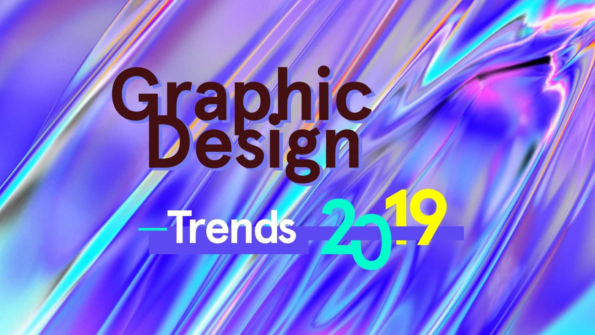
We have just turned away from the first half of the current year and we can now make some evaluations about what is happening to graphic design trends in 2019. Every year a lot of trends arise and some can merge or just affect each other, but not all of them are meant to last.
Some trends vanish pretty soon; others are just temporary and last for about one year; some others stay and dominate the design field for many years until people, sickened by the excessive popularity, consign them to oblivion and set on something different.
This is the natural trend development curve: what at the beginning looks innovative and used only by early adopters, as soon as it turns common and widespread, it has to face a popularization process and it becomes, on the contrary, a symbol of bad aesthetic taste and standardized mediocrity.
Well, what have we noticed in this first half of 2019? You can get inspiration from to keep up with the latest 10 graphic design trends for your 2019.
Graphic design trends – here is the shortlist:
Bespoke illustrations
2019 is definitely the illustrations’ redemption year. The last five-year period was characterized by a huge use of illustrated vector elements, from icons and pictograms to the seasoned and consumed tendencies of flat design. It is now the time for new custom illustration, tailored to the brand’s needs and identity.

From now on, companies will start (and some have already started) holding their own bespoke illustrations copyrights, and this will help the brand identities to differentiate among each other, moving — finally — away from the visual stereotypes we have seen in the recent years.
The iconographic universe we have been used to, for sure flourishing thanks to icon platforms such as “The Noun Project”, led company identities and graphics to flatten and set on this kind of popular flat styled illustrations.

The icons available on these platforms can be downloaded for free, are ready to use and can fit almost any project, from FinTech to butcher shops.
Today brands are moving to custom illustrations (we are sure illustrators’ wallets will be more than happy) in order to highlight their unique values and distinguish. No doubt this will be a costly choice for companies, but the investment is worth the purpose.
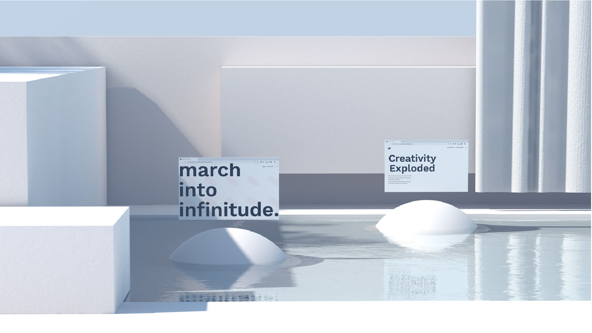
3D seamless animations
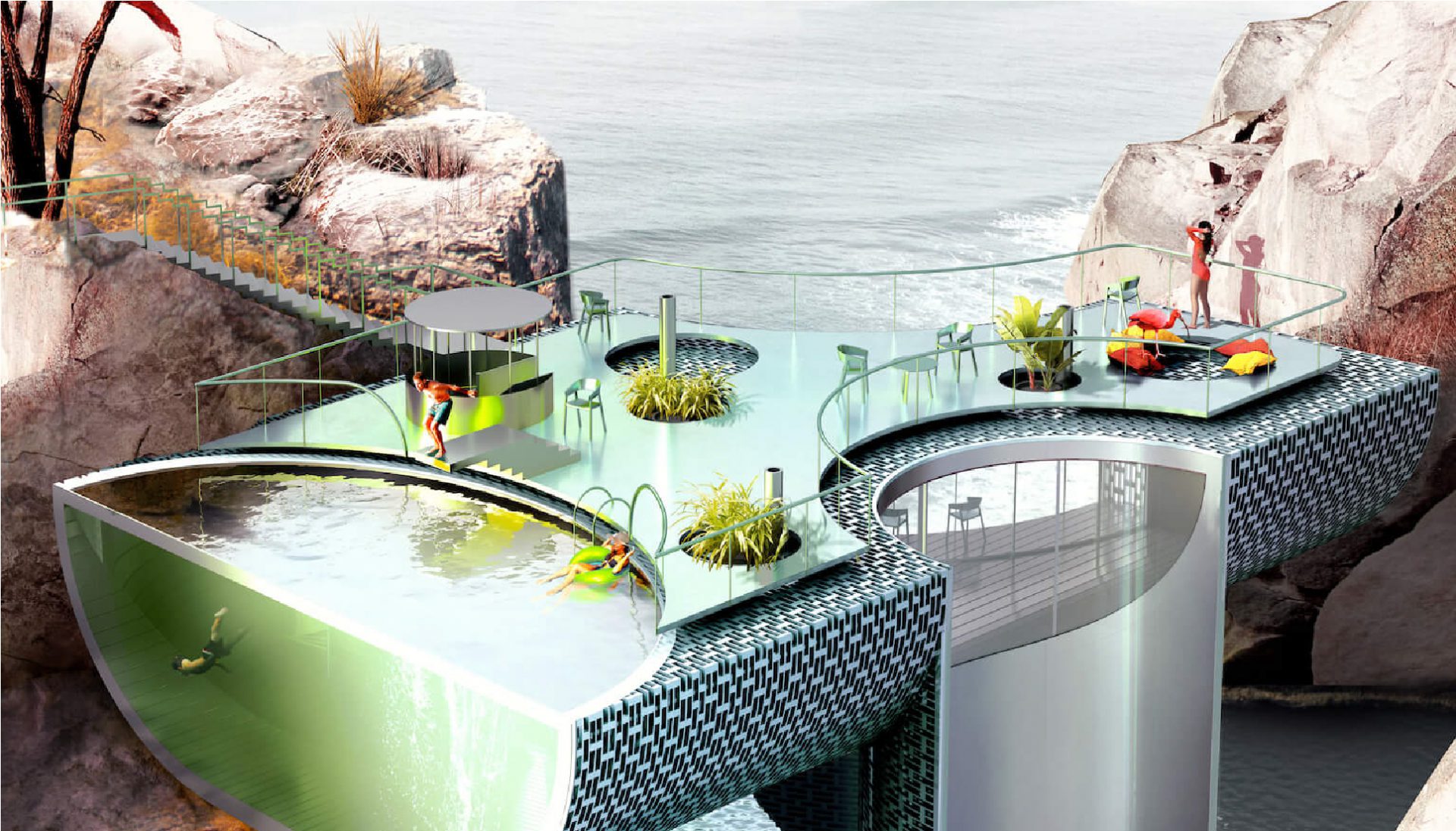
The recent 3D modelling software development has fostered experiments inside the field of abstract looped animations.
True masterpieces of technical virtuosity: in these designs, there is basically no real subject. They are meaningless animations meant to showcase and display the project’s aesthetic and technical perfection.

Honestly, is not hard to be enchanted by these dynamic geometries and shiny materials that revolve, merge together and relentlessly dance on the screen without an end.
Animated logos
Following the above mentioned dynamic tendencies, logos as well have been touched by the animation phenomenon.
We are perfectly aware of the fact that our eyes are inevitably captured by dynamic objects, but this ploy was never used as much as today to drive innovation and interest to the field of logo design.

It is about one year since this trend has started blooming and for sure it will not be a temporary one. The versatility of these short logo animations, that lets them be widely used in every digital medium, together with the strategic capability of attracting users’ attention, will be the key to success of this trend in 2019.
Chromatic trends: gradients 2.0 and vivid colours
Let’s now step into the colour design field to understand what is happening. It is not difficult to notice how the visual universe has recently got more and more colourful, painting its palette year over year with more vivid and rich colours.
The feeble pastel shades that for a long time have been ruling over the design field left now the floor to more eye-catching colours, and this happened, once again, due to the usual fight for the attention of every potential end-user.

Gradients deserve a different and dedicated paragraph since they have now reached a level of maturity and complexity that makes them true graphic assets on which entire design structures often rely, especially as regards web design and user interfaces.
Two colours gradients are quite no longer used: they have been replaced by gradients 2.0 or multicolour ones, which are a sort of polished and designish version of the old WordArt headlines dating back the beginning of 2000.
It’s almost 20 years since then, but at the end of the day, trends are nothing but style loops that come and go after time periods.
Futuristic memories
Another trend we can highlight for 2019 is about a graphic style which is a mixture of futuristic reminiscences that recall an 80’s science fiction movie imagery.
This style is characterized by fluorescent colours and selective colour channels, as well as by a great usage of impactful glitch effects, that are maybe too much to digest for an ordinary consumer.

Just to make a guess: has this trend arisen because of Black Mirror’s success and popularity? Maybe. It would be really interesting to make some considerations about media sociology and the impact of tv series consumption on designers’ creativity, but this is not the most fitting place so anybody can make their own evaluations.

Isometric design
Maybe is because of geometry’s and technical drawings fascination, but the isometric design trend is still up and running and seems it will not stop soon.
Following the geometrical tendencies that are empowered by the visual excitement of diagonal lines, it will not be rare to run into many graphic designs structured on isometric layouts.

Moreover, 2019 is going to be 100 years after the Bauhaus foundation, and the debate about the oblique and modernist compositions from Gropius’s school will help the isometric design trend to grow and diffuse.

Outline typography
A lot of graphic elements have gone through the outline tendencies: from icons to interface buttons. As the trend is decreasing in other fields, now is the turn of type designs to empty their fillings out and look light and delicate, framed only by the outline stroke.

This type of trend is mostly combined with bold and big sized headlines so that the readability of the empty words is not very much affected by the fineness of the stroke that defines the letters.
The web design and all the digital fields are more likely to utilize this kind of typography, apart from the exception of the field of interior design, where graphics and letters may be used as a wall decoration in some projects.

Micro-animations
This trend, typical of web/app user interfaces, is literally booming. It deals with very short animations that are triggered when a user accomplishes a certain action by pressing an element from the interface (usually a button).

They really are micro-interactions that return in a highly evolved way feedback about the accomplished task. While browsing the net it is easily possible to find many examples of sophisticated short animations through which UI is enriched.
To be honest, they are not very much functionally essential elements, but good design is also this: taking care even of the smallest detail, and in this case, the effort can produce outstanding and remarkable results.

While browsing the net it is easily possible to find many examples of sophisticated short animations through which UI is enriched. To be honest, they are not very much functionally essential elements, but good design is also this: taking care even of the smallest detail, and in this case, the effort can produce outstanding and remarkable results.
Asymmetric layouts
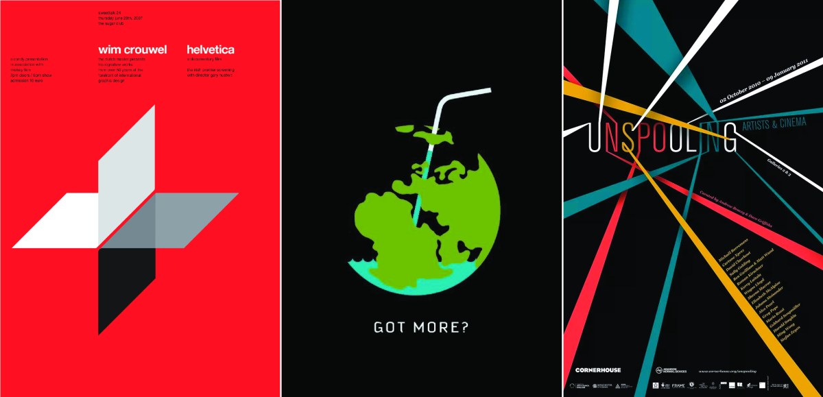
Trends are cyclical, as we said at the beginning of this article. And it seems that asymmetric design is a tendency which is coming back on track in 2019.
Let’s forget about good composition balance and editorial design rules, now is time for unstable and visually unbalanced layouts.

For the sake of perceptual tensions that are established on a paper (or a screen). Sometimes this kind of layout may sound a bit irritating, especially for the more accurate people, but this is exactly what makes asymmetric graphics interesting. Because they are not banal, nor standard, and truly trespass your design guides and schemes.
Overlapping elements
Totally not the newest trend, but once again proved to be the most actual tendency since it entered the “Top 10 trends” graphic design list 5 years ago.
Elements overlapping and dynamic composition balance are still frequently used to capture user’s attention thanks to a visually interesting page design.
On second thoughts, it’s all about applying the Gestalt theoretical principles known as modal and amodal completions, that can help to stimulate the brain’s eye by partially obstructing some elements and therefore driving readers’ attention.
The overlapping technique is often combined with the asymmetric design and crosses over the grids and their sub-modules.
Article by Ludovico Pincini, a visual designer based in Milan. Design critic, beauty hunter, keen on graphics and everything visual. Sometimes trendsetter and influencer, on Instagram as @ludovico.pincini.


