Art combined with branding: 6 interactive installations to boost marketing
Despite the timeless debate around the purity of culture in relation to economic intents, art combined with branding is becoming the keystone to implement innovative marketing strategies which attract modern customers, increasingly engaged in dynamic, original and interactive contexts
Matching art and marketing is always risky. Many art enthusiasts could be horrified by this combination, as it is a widespread belief that market logic can’t go hand in hand with a purely cultural message. Though, interactive installations are one of the most used “tools” to arouse customers’ curiosity.
The market often encases and dries up the creativity and, in the collective imaginary, it is almost inconceivable that an artist may easily bend to economic needs.
Nevertheless, now more than ever, marketing needs inspiration from art in order to entertain customers and gain their precious attention. Branding statements and communication actions must be highly engaging, striking the attention and involving the public emotionally.
For these reasons, initiatives to engage customers increasingly involve original installations raising the debate around the authenticity of art and its genuineness in relation to commercial purposes.
Beyond the debate, the line between marketing, entertainment, communication and art is getting blurrier each day that goes by: this selection of immersive and interactive art installation shows the fruitful marriage between creativity and business.
Here is our pick on 6 interactive installations
Funarea by Fubiz Studio, Paris
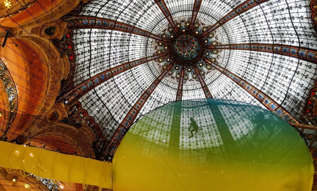
Funarea is a circular net with vibrant and multicolor shades, suspended at the height of 12 meters. It was designed by Fubiz Studio for Galleries Lafayette Paris Haussmann. The event took visitors back to their childhood through various “fun zones” spread across the entire store, including football pitches, Polaroid photo booths and old-school arcade games.
In celebration of the summer season, the suspended installation was the center stage, placed right under the department store’s art deco glass dome.
Accessible by a footbridge on the second floor, the rainbow-colored installation transformed the French department store into a giant playground, encouraging visitors to admire the iconic dome, but also to have fun by bouncing on the stretched surface.
Affinity in Autonomy by Sony, Milan
Sony has staged an artificial intelligence-themed exhibition during Milan design week 2019, which explored the future of robot-human relations. Affinity in Autonomy enabled visitors to experience five unique spaces designed with moving colors, lights and sounds and providing five different interactions: awakening, autonomy, accordance, affiliation and association.
The first zone, Awakening, was a colorful installation consisting of illuminated blob-like shapes that mimicked visitors’ body movements.

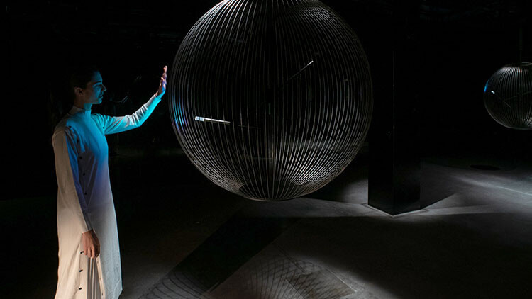
The second zone, Autonomous, held a pendulum within an orb-like cage, whose swing was influenced by the presence of people in the room. The third zone, Accordance, was the most large-scale and immersive, featuring numerous white spheres of different sizes, programmed to respond to nearby movement in their own distinct way.
Then came two more zones: Affiliation, where visitors could interact with various Sony products and Association, which asked guests for their views and feedback robotically.
This interactive exhibition, which was recently held also at the London Design Festival explored Sony’s vision on how robots can enrich society and people’s lives.
Le Cube by MANA and Scott Oster, Paris
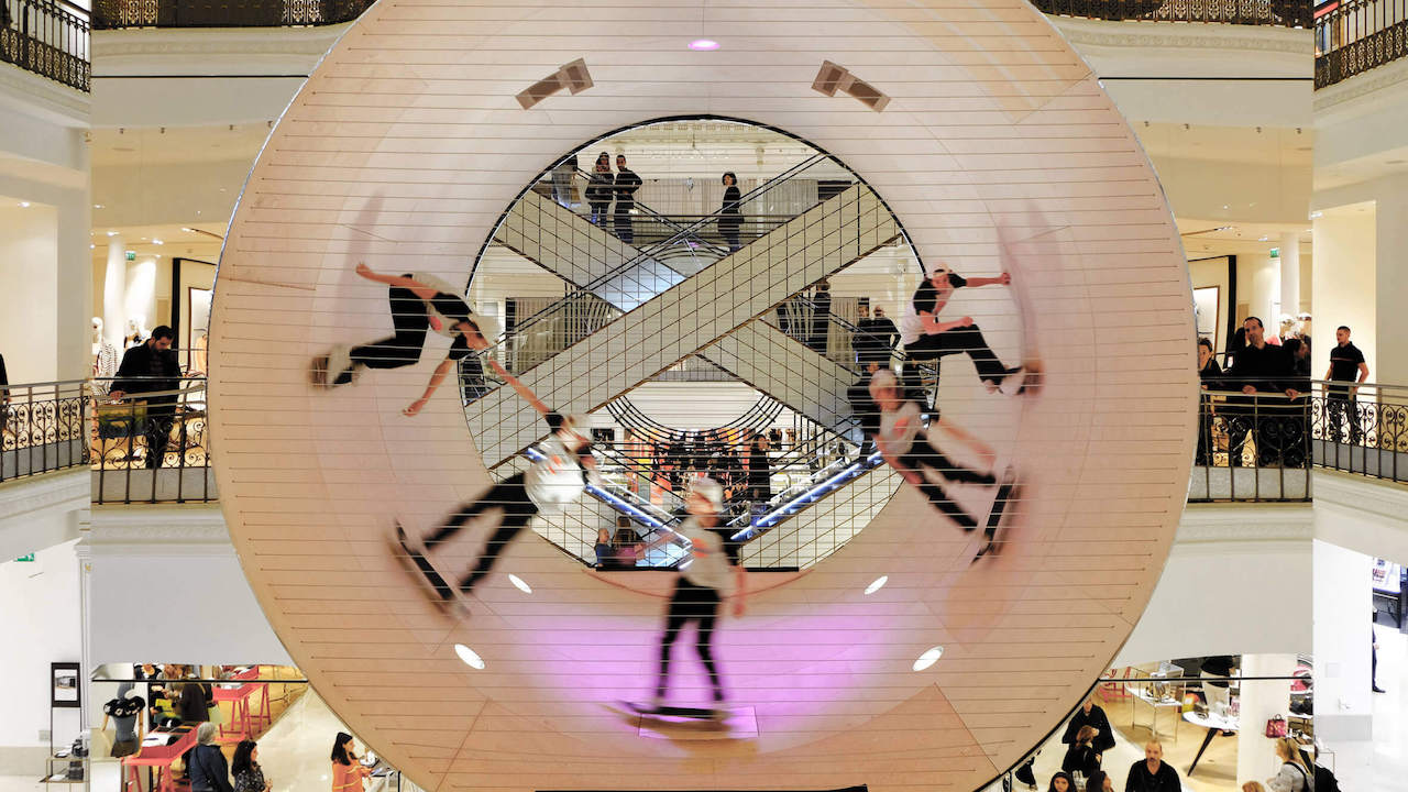
Launched as the centerpiece of the Los Angeles Rive Gauche exhibition in Paris, Le Cube designed by architecture studio MANA and skateboarder Scott Oster, was displayed inside the French capital’s department store Le Bon Marchè.
The installation consisted of a 35’-degree concave skate ramp encased within a reflective silver cube in the main atrium of the building.
Le Cube, clad in sheets of lightweight aluminum, measured 6 square meters and was comprised of four timber-framed bays, two of which cantilevered over the structure’s smaller steel-framed based so that it seemed to float above the shop floor.

Moreover, its reflective surface meant that, when the cube was not in use, shoppers walking along the atrium and the balconies could catch their own reflection.
Not only a simple installation, but Le Cube was also central to many live shows where skateboarders performed gravity-defying stunts.
Urban Imprint by Studio INI, New York City
This immersive installation, presented at NYCxDesign week, was created by designer and engineer Nassia Inglessis from Studio INI in response to a brief from MINI-backed A/D/O to explore the notion of personal identities in cities. Urban Imprint features a canopy magically moving up and down as visitors walk beneath it.
The installation is intended to invert the typical relationship between people and the urban environment.
To create the morphing effect, Inglessis connected the floor and the ceiling with a completely mechanical pulley system, comprising 400 strings hidden behind a mirrored screen at the back of the structure. As visitors step on the platform, it dips down, triggering the pulleys to tighten and lifting the roof into a dome shape.

The leather-like material, used by Inglessis, is made from a mixture of rubber and concrete, water-jet cut with markings to form a honeycomb pattern that makes it supple enough to move.
It was colored in a dark red shade, picked up on the hues of the bricks wall of A/D/O yard, in order to blend in with the surroundings.
Raytrace by Benjamin Hubert, Milan
Raytrace installation, presented during Milan Design Week 2019, was created by the designer Benjamin Hubert from LAYER, in collaboration with Cosentino, leader in the production and distribution of innovative surfaces for the world of architecture and design.
The installation was made of Dekton®, an ultra-compact surface enhances thanks to a special lighting show.

Raytrace offered an interactive experience, showcasing the harmony between nature, light and architecture: set within the dark, atmospheric tunnels of Ventura Centrale, Raytrace was a 25-meter long and 6-meter high triangular passage, which visitors could walk through, becoming an integral part of the installation.
At the entrance, the attention was captured by organic patterns that danced on the surfaces, imitating the refractive effect of light into the water and evoking the deep sense of quiet of the underwater world.
Walking through the tunnel, visitors could see their own shadow projected on the walls of the structure, while two mirrors at the end of the tunnel created the illusion of infinite space, generating a light show on all surfaces.


