Seeking the perfect balance between male spirits and female souls
La Moitié Boutique by One Fine Day Studio in Guangzhou, China, is presenting and setting in perfect balance the feminine and masculine aesthetic opposing different colors and styles.
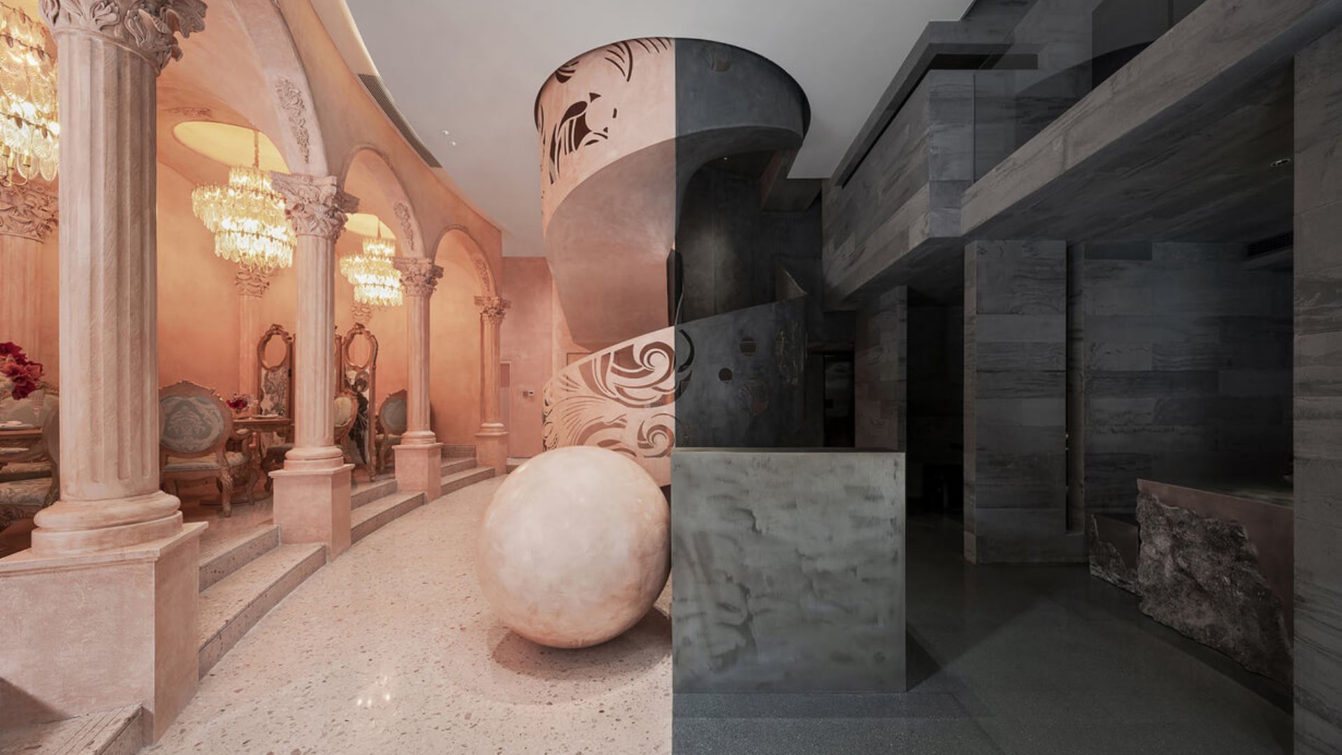
The La Moitié Boutique is a brave interior design project spanning over 326 square-meters over three floors, located in the prestigious complex of Aoyuan City Plaza in Guangzhou in China. It’s an experiment on how to twist different styles in one single interior space.
The ground floor is dedicated to shopping while a French restaurant is housed throughout the first floor and the mezzanine, while the second floor is open for everyone that is up for a designer retail experience.

The name of the boutique “La Moitie”, in French meaning “half”, explains the whole idea of the space. The fashion store is run by a couple, therefore the idea of giving both, masculine and feminine energy to the interior. What is surprising is to what extends the idea of balance is brought.
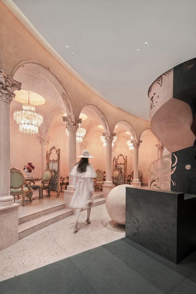
The logo of the boutique features a black square and a pink circle, and the interiors literally interpret this logo, fitting in one empty box a square and a circle, in perfect harmony.

The Minds behind the La Moitié Boutique – One Fine Day Studio
The idea of One Fine Day Studio started in 2010 at Shantou University: in 2013 it was formally established in Guangzhou, with brand strategy, design and promotion activities as the main services offered by the company.
The studio’s team specializes in brand positioning, brand architecture, brand identification, brand naming, store identification, and environmental identification.

The founder & creative director of One Fine Day Studio is Cai Qizhen, who also works as a teacher at Changjiang College of Art and Design, Shantou University while dedicating himself to the study of traditional imagery and modern design.
Materials & Techniques – Two different energies translated into materials and colors
This boutique is a multi-commercial space. There is a restaurant on the first floor and mezzanine, and the second floor is a designer showroom space.
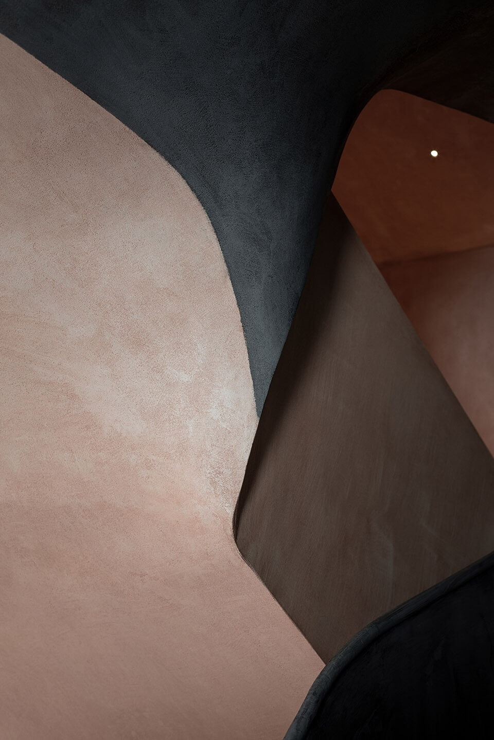
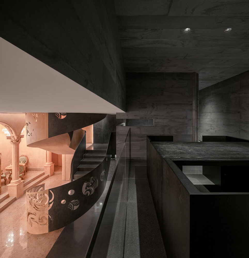
The levels are connected with a staircase placed at the very center of the space, like a magic portal that transports visitors from the feminine world to the masculine one and vice versa.

Style & Aesthetics – Classical pink against avant-garde black
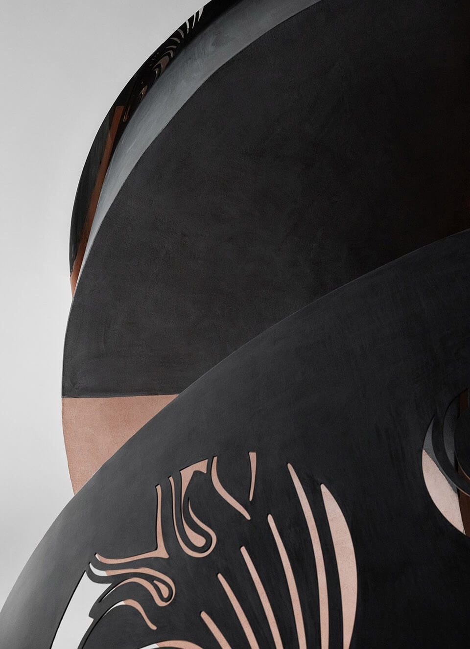
The space outlines two contrasting parts: one is pink and the other one black. The store is divided into two “boxes”, in which a real and unreal space is shaped by colors and materials.
The pink box represents the classical romance of women, while the black box counterparts and completes the rest of the space with a modern and futuristic vibe. When one enters the space, the two sides are clearly visible.
The café section with arches, columns and chandeliers presents a Baroque-inspired style, balanced by an understated retail section captured in black stone.
Up the stairs, in the fashion showroom, the women’s area is decorated with classic Chinese elements and in the men’s area, dark marble is used to infer a masculine atmosphere.

The dramatic space trip
The store space creates a surreal vibe through the unconventional division of spaces. Instead of a physical barrier (as we are all used to), the division is achieved with strong chromatic contrast, made with such elegance and harmony to become an integrating part of the concept.
Design memento – Brave dichromatic game
The idea of strong contrast has existed in the design field for long. In the case of La Moitie Boutique, we witness the merging of two opposing aesthetics. La Moitié presents a clear separation between light and dark environments. Half of the boutique is lined with arches, columns and chandeliers, emitting a soft, gentle aura, while the other half is designed with a darker and colder, minimalistic approach.

The writer’s comment – “Unusual design experience”
During the design process, usually, balance and harmony are achieved by blending all of the elements into one. La Moitié boutique’s design example showed that not necessarily every time has to be the case.
From a concept like this one, there is the risk of a wacky outcome, but instead, we have a perfectly balanced and harmonic dichromatic space.


