Visual presentations of design objects often clear the space entirely of context
Moody Hitchcock-inspired interiors create psychological spaces for Atelier Avéus furnishings. The studio presented their latest design objects set within a fictitious film world.
Visual presentations of design objects often clear the space entirely of context. They leave the viewer free to imagine the object in their own setting. Or, simply to let the object’s form be the main focus. Atelier Avéus takes an entirely different approach by letting the setting take over from the product.
The use of film references adds a layer of tension and drama to the unconventional product imagery.

The mind behind ‘Production Design Story #1 – Hitchcock’ – Atelier Avéus
Atelier Avéus is a London based firm started by French architect and designer, Morgane Roux-Lafargue in 2016. The studio focuses on interior design, object design, and artistic direction with a strong conceptual base. Morgane completed her Bachelor of Architecture at UCLouvain in Belgium, and her Master of Architecture at École Nationale Supérieure d’Architecture de Paris-Malaquais, in Paris. She went on to also complete a Masters in Industrial and Product Design at Domus Academy.
In 2019 Morgane was invited by Martina Gamboni to design the meeting room for Strategic Footprints. Titled ‘Symbolic Room’, Morgane created a meditative space that reflected upon archetypes for the year-long installation. The studio has previously drawn inspiration from artists and filmmakers. The random mix of materials and shapes of ‘Non-Objective tables’ is a reference to early 20th Century suprematist paintings. And, a series of furniture and visuals conceived around the theme of waiting, was inspired by Jim Jarmusch and Wim Wenders’ work, plus painter Edward Hopper.

Materials & Techniques – A storyboard of 3D renders
In keeping with the film theme, this collection has been conceived similarly to a storyboard. Separate images have been crafted to showcase a few select interior objects by Atelier Avéus. The series blurs the boundary between fiction and reality by placing real design objects within fictitious settings. The rooms are photo-realistic 3D renders completed in collaboration with Ergun Ayral.
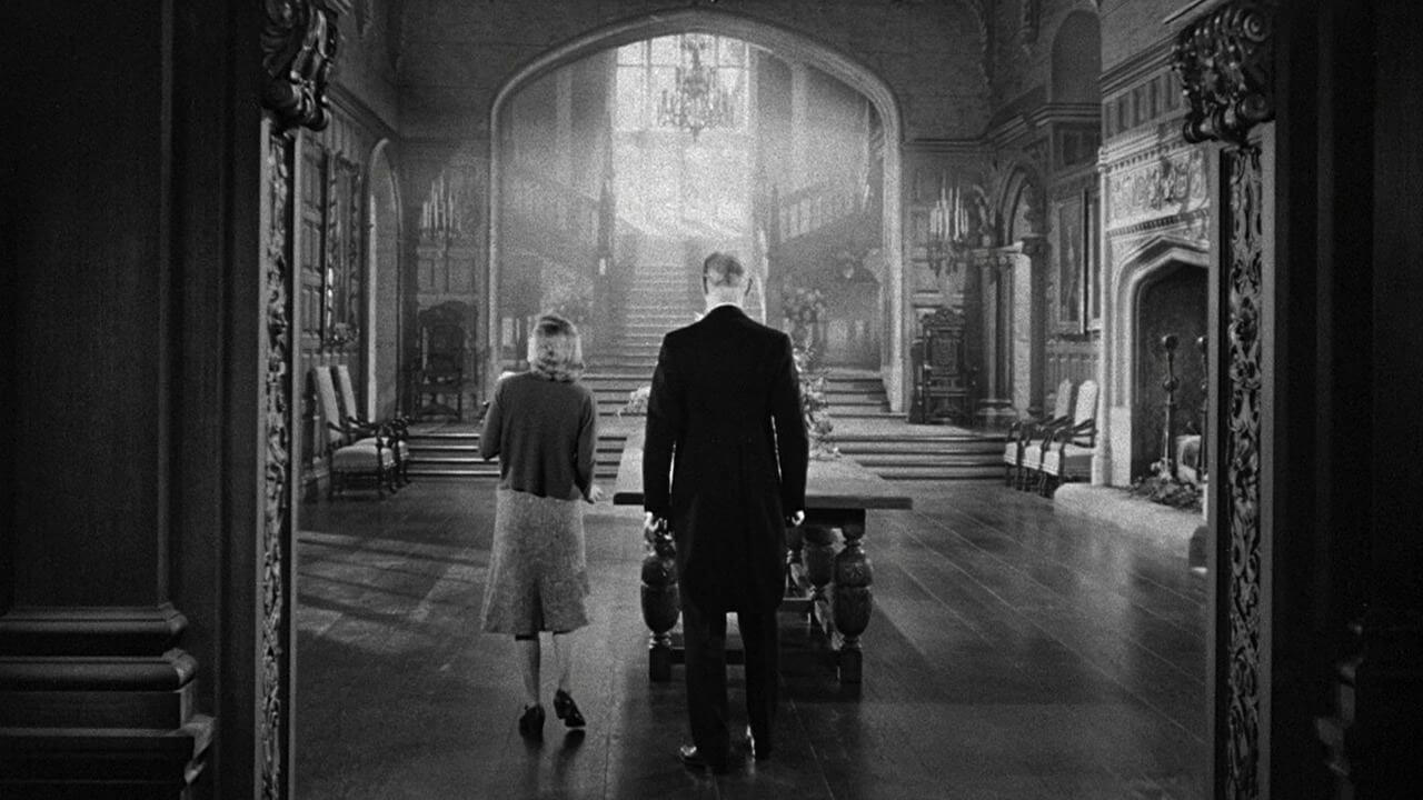
Each scene has been imbued with a strong narrative quality. A line of text in characteristic yellow subtitle style is stamped across the bottom. Nods are given to three famous Hitchcock movies: Vertigo, Rebecca, and Rear Window.

Style & Aesthetics – Moody spaces that highlight the architecture
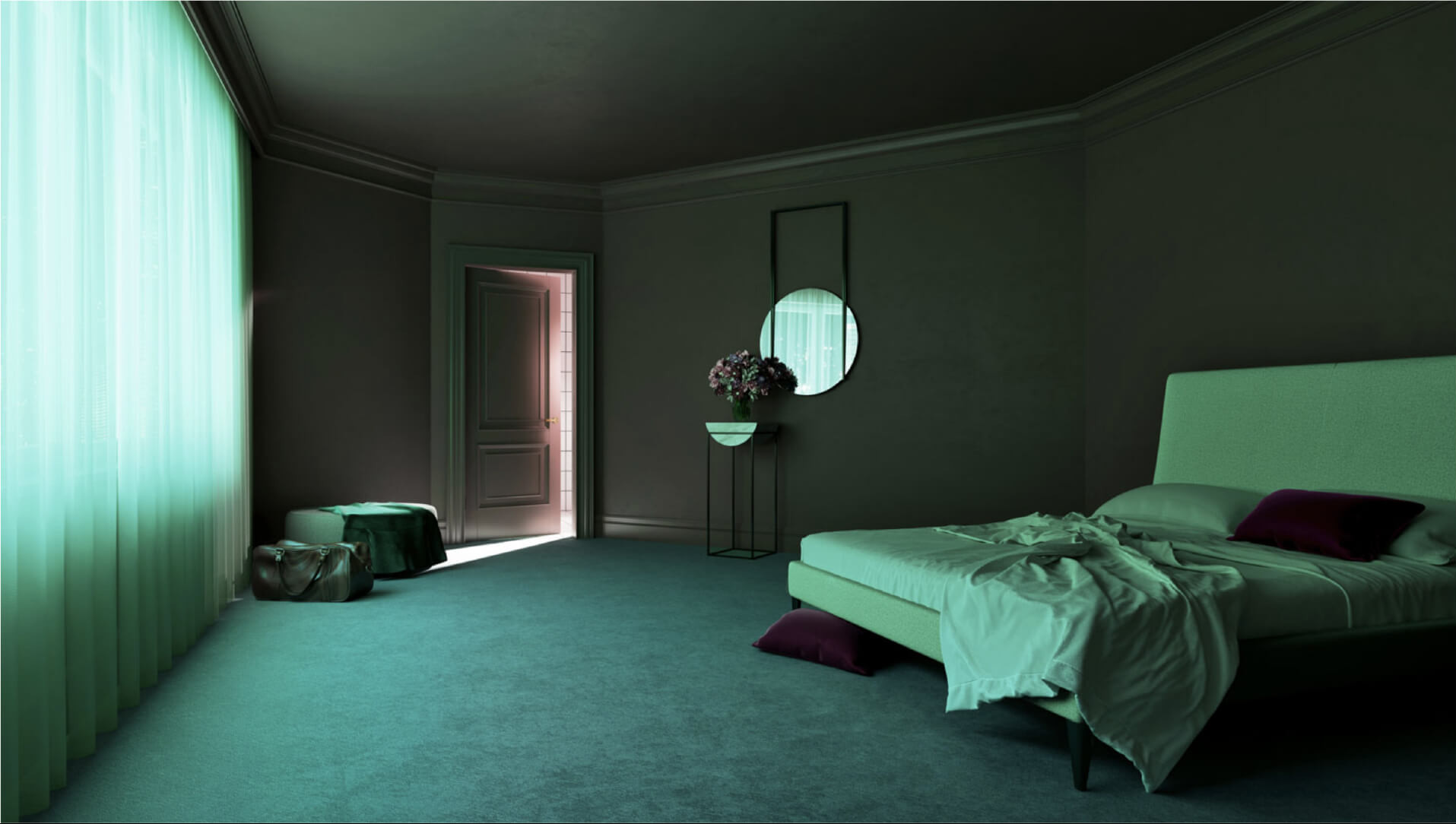
The color palette of ‘Production Design Story #1 – Hitchcock’ is somber and moody. The lighting gives the images a liminal feel—is night about to fall? Is it the middle of the night and the rooms lit by neon signs blaring outside? Or, is it just after dawn? The stillness gives nothing away. As with movie sets, the locations feel more extraordinary than mundane. The architecture takes a central role—doors, windows, and a staircase are focal points of the compositions. Human presence is implied, but not seen.
In ‘The Secret Hotel Room’ the door to the bathroom is left half-open and lets a shard of white light into the room, cast otherwise by green light. Bright reflections from outside draw attention to the featured console and mirror hung against an angled wall.

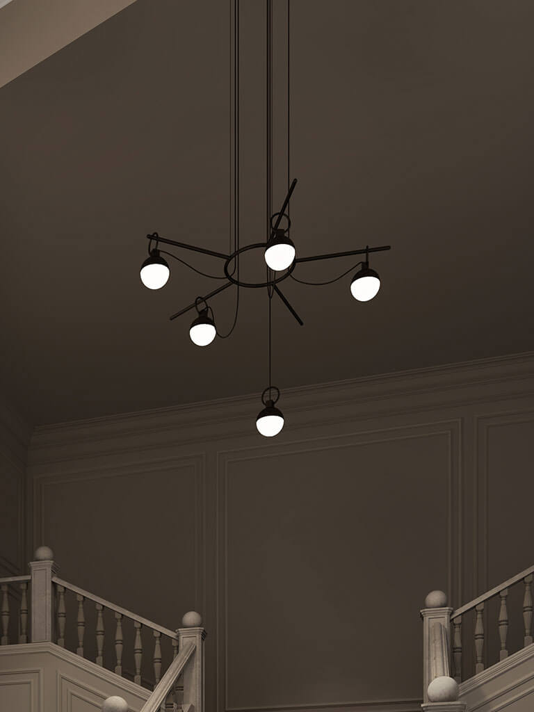
The staircase in ‘The Uncanny Lobby’ marks the dramatic transition between public and private. It is the threshold so often featured in films that moves people from public space to the more private. As Morgane explains: “the suspense inherent to the stairs is proportionally linked to the speed the character walks them. Each step measures the amount of time that separates him from the next narrative step of the story.”
‘The Confinement Room’ is a clear reference to Rear Window. The LL Armchair sits empty but facing the apartment building opposite, with its many lit windows. One senses immediately that it is placed to be the vantage point for a voyeur. The large glazed window of the room offers a dramatic expanse for viewing but also highlights the isolation of the room itself.

Room interiors or mental spaces?
Hitchcock was a master at using architectural space as a means to create experiences of suspense. As Morgane points out: “Hitchcock often represented the physical world as a projection of a disturbed person.”
Rooms and environments tormented his characters the way their inner thoughts did. Spaces were often disturbing, distorted, and frequently depicted as either expansive or claustrophobic.

Design memento – Introduce a wider cultural narrative
For Hitchcock, the visual was always primary, and his use of elaborate and strategic set design was well known. This series similarly utilizes architectural space to create tension and mood. The entire presentation appears more like a work of art than a product image. Visual art has often played with cinematic devices, especially to evoke feelings of nostalgia. Through careful selection of references, the products are brought into a complex web of ideas and cultural narratives that are much larger than the product alone.

The writer’s comment – The designer’s conceptual space
‘Production Design Story #1 – Hitchcock’ not only ties specific products to a mood of suspense. It is also a space for Morgane and Atelier Avéus to express their conceptual concerns. As with Hitchcock’s sets, the rooms become an expression of psychological space—this time of the designer.


