A foldable slide-phone that folds down to the size of a credit card
The Japanese studio has unveiled a compact smartphone concept with three foldable screens that unfurl into a notification display, a selfie mode and a widescreen.
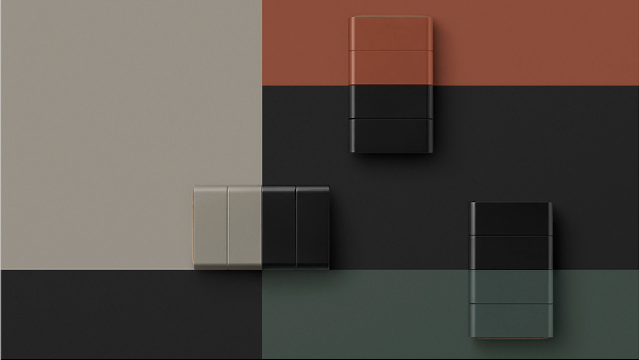
The Slide-Phone by nendo brings a new sense of functionality to foldable phones instead of just the screen being enlarged. Like the old-school clamshell styles of the 1990s, a recent trend in smartphones has seen a move towards models with screens that fold away when not in use.
They are a strange hybrid but foldable smartphones are unique in that they cater to both users that want larger screens and also those that prefer more compact devices. The slide-phone by Nendo is exactly that and with a slightly different design that sets it aside from those dominating the market right now.
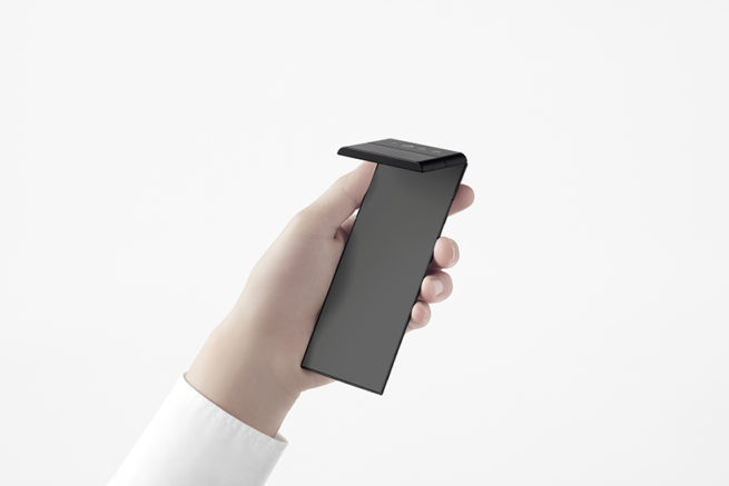
Most foldable smartphones with OLED monitors open out only once, to reveal a screen that is two or three times as big. Instead, the Slide-Phone concept uses several hinges allowing the full-size phone to fold down three times in the same direction.
Gallery
Open full width
Open full width
The minds behind Slide-Phone – Nendo and OPPO
Nendo is a Japanese design studio founded by designer and architect Oki Sato, with offices in both Tokyo and Milan. Founded in 2005, the studio’s work centers around simple, clever concepts adapted to the design of furniture, installations, interiors, household products, and art objects. Some of the projects Nendo has worked on this year include a series of playground equipment for children, a collection of self-assembly handbags made from single sheets of laser-cut leather, and an installation at Le Bon Marche in Paris.
Nendo collaborated with OPPO, a Chinese manufacturer of smart devices including mobile phones and LCD-TVs among other electronic goods. As a company, OPPO officially launched in 2004 and in 2016 it became the biggest smartphone manufacturer in China. The company has created an entire series of smartphones, one of which was revealed in November 2020 called the X 2021, which also expands like the Slide-Phone but instead uses a miniature conveyor belt to do so.

Materials & Techniques – Leather lined, inch-worm device with an OLED screen
The Slide-Phone uses folding technology to enhance the portability and exploit the compactness of the device. Like an inchworm, the phone makes use of three hinges to slide sideways, transformed by a user’s one-thumb operation. Each of the hinges is covered with suede leather.
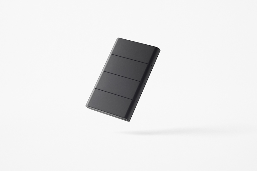
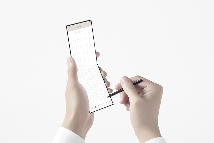
When folded down the phone measures roughly the same as a credit card – 54 mm x 86 mm. Sliding the second fold reveals a further 80 millimetres of the screen and allows the user to make use of the camera, located at the top of the device. In its largest state, a 7-inch screen turns into an operating panel with touch screen buttons. In this mode, users can operate on several apps displayed in a row.

Style & Aesthetics – Sleek and Shiny
Like any other smartphone, the thin touch screen Slide-Phone is sleek and shiny, with an ergonomic design that slightly curves at the edges. The use of suede was intended to give the Slide-Phone a more natural feel, while the exterior is coloured in black, silver, safe green and brick red – calming tones selected for the way they complement the leather.

Like a piece of paper
The inspiration behind Nendo’s slide-phone hinge system, which makes sliding from different modes extremely easy, was paper. Nendo wanted the phone to feel like a notepad, with the action of opening and closing the screen like flipping a page. There is also a slot in the side of the phone where a stylus can be taken out and used as a pen on the touchscreen.

Design memento – A family of products designed with UX and portability in mind
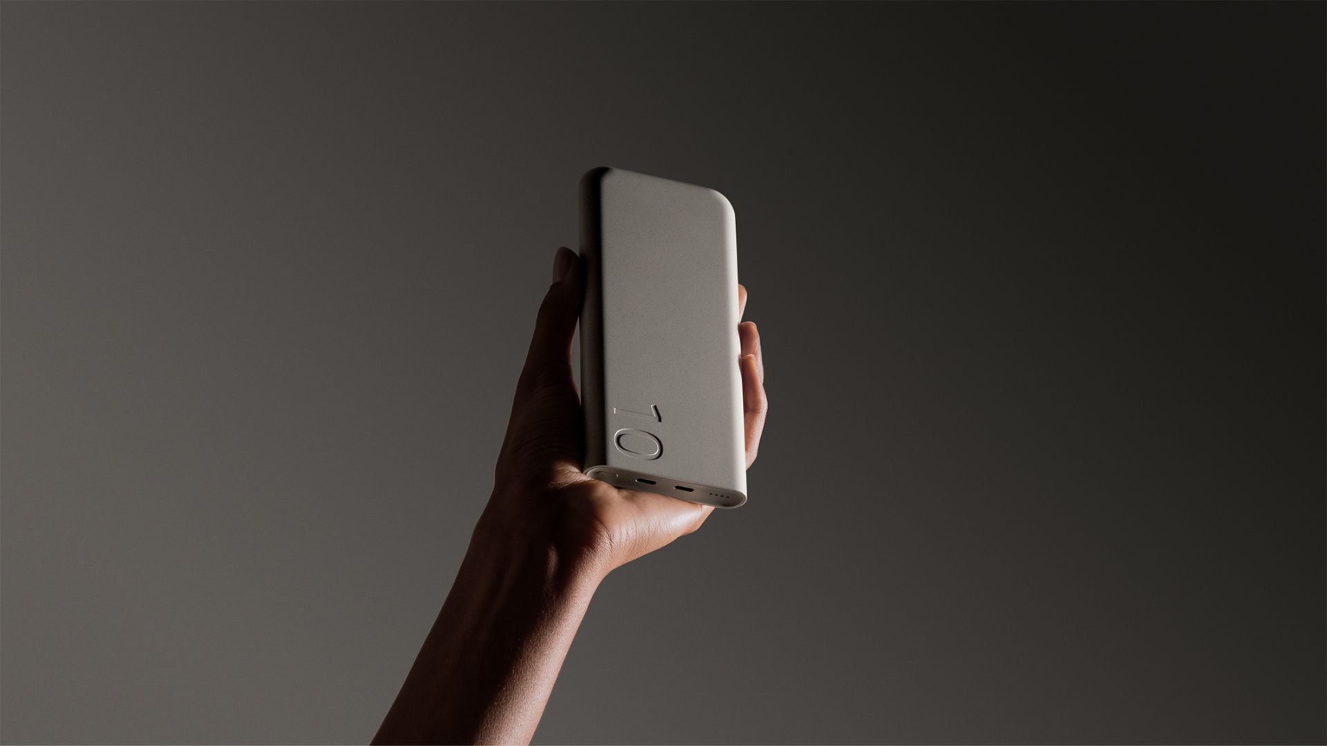
Alongside the Slide-Phone, Nendo has also designed a mobile accessory collection called Mobile-Link, inspired by a pair of true wireless earphones. The collection includes a smartwatch, an AI speaker, a portable charger, and a wireless charger all designed to enhance the user experience.
For example, the two earbuds click together to form a doughnut shape while a dedicated neck strap can be fed through the hole at the centre of the two attached earbuds, allowing the wearer to wear them like a necklace.

Writer’s Comment – The jury’s out
Whether or not folding smartphones will take the lead over chocolate bar models remains to be seen, so a concept like Nendo’s Slide-Phone is still very much welcome. More than its ability to unfold, however, I prefer the page-like ease in which it does so – an element that is very much reflective of Nendo’s ability to create moments of pleasure and aesthetic satisfaction.


