Custom-made “space-saving” furniture creates a striking interior
Providencia House, a rooftop Barcelona apartment, was renovated by AMOO Architects to create an open-plan interior design utilising space-saving furniture for maximum floor space
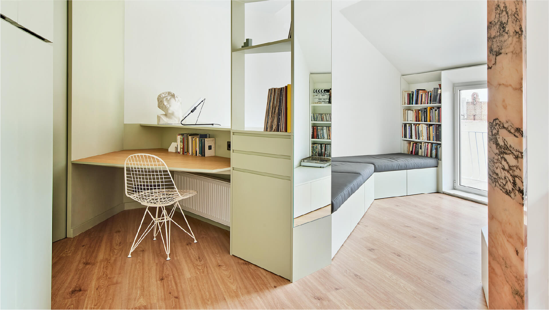
Located in the Gracia neighbourhood of Barcelona, this house sits on top of a building that was built in 1959. Providencia House is about creating a space-saving interior design that’s filled with multi-purpose furniture.
The home was struggling with poor lighting and restrictive movement throughout the rooms. Therefore, AMOO was commissioned to open-up the home and transform the space into an open-plan, bright apartment.
Gallery
Open full width
Open full width
The minds behind Providencia House – AMOO, Aureli Mora and Omar Ornaque
AMOO Architecture Studio is the collaboration between Architects Aureli Mora and Omar Ornaque. Their work encompasses architecture, product design, and graphic design – using all their skills to offer a package service. In their projects, it’s evident that they like to consider every aspect of the design as a whole. Their work links traditional techniques with the idea of spontaneity and invention, to create a contemporary design.
AMOO often collaborates with other designers including Oriol Gelabert, Ines Martinel, Ainhoa Mur, Ma Jesus Quintero, and Albert Renau.

Materials & Techniques – Custom-made furniture
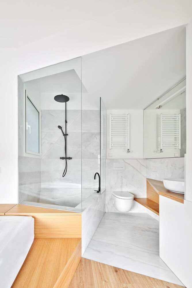
Providencia House, enveloped in an unusual, continuous 1.65cm high façade and sloping roof, proposed a challenge to the architects. Custom-made furniture needed to be created which adapted to the unique spaces and angles that the home possessed. Sofa beds turn into desks at this home, and beds turn into bathtubs! The whole home is designed for fluid use.
At the start of the project, the architects decided to remove all the walls that weren’t load-bearing, in order to create a large common area that enables the homeowners to move around without any constraints.
The South East façade of the building is the longest façade. To improve the insulation of this façade, the architects installed a cladded shelf that runs from one side to the other. This frames all the windows and integrates them into the interior design.

Style & Aesthetics – Bright and contemporary
The interior design is a contemporary blend of pine, glass, and white walls. The bright and airy interior is complemented by the open-plan design that allows light to travel freely around the space. Marble was used in several places within Providencia House including white marble in the bathroom and terracotta toned marble in the living room surrounding a supporting pillar.
The interior is full of “space-saving” design to maximise the floor space and allow the homeowners to feel a sense of openness. Pink and green pastel colours were used in the bedroom, living room, and kitchen on the cabinetry to break up the white interior.

Combining white contemporary interiors with bursts of colour
AMOO are known for their use of pop colours within their seemingly clean-white architectural designs. Their use colour to add a burst of interest within white modern spaces. For Providencia House, they used pink and green to add warmth to the interior.

Design memento – Multi-purpose furniture
One of the most beautiful aspects of this design is the multi-purpose furniture that works to keep the open-plan idea that the architects initially wanted for this home. Wardrobes, beds, desks, and storage are combined in a unique way to optimise space.

The writer’s comment – From boxy to bright
I think that the architects achieved an incredible interior that previously appeared quite boxy and restrictive. By removing several internal walls, they achieved a design that allowed natural light to penetrate all corners of the home. The custom-made furniture was a necessary touch to ensure that the home was given a spacious feel. This is an excellent concept that was executed to a very high standard.


