Sustainable retail design – 8 stores give us a glimpse of a green future
From utilizing hemp and mycelium to 3D-printed recycled plastic, designers and brands are now taking steps to make retail sustainable.
From Snøhetta to Han Chong, Andreas Kostopoulos, Nagami, JamesPlumb, Nina+Co, MRDK, FADAA – today designers and brands are taking steps towards sustainable retail design by seamlessly using a natural material palette. Effortlessly bridging the gap and pushing the boundaries of material use and circularity, every choice is aimed at minimizing waste or reviving waste products.
Gallery
Open full width
Open full width
For instance, Snøhetta put together clay and oak in an eclectic Holzweiler store – “for its first international outpost in Copenhagen, we followed the concept of ‘tracing’, devising an interior scheme that reflects traces of the brand’s Norwegian roots alongside the minimalistic aesthetic found in its previous retail spaces!” shares Snøhetta.
On the other hand, Self-Portrait wrapped its one-of-a-kind London shop in mint-hued Cornish clay and tonal surfaces – “by leveraging on minimalism, materiality and color, we wanted to create an intimate sensory and focused experience free from any interferences or visually distracting architectural qualities and functions that can typically overwhelm retail environments!” Self-Portrait Founder and Creative Director Han Chong says.
Did you know that 75% of all areas covered by glaciers have melted due to rising temperatures and that hundreds of tonnes of plastic are produced daily that lives on for centuries polluting our planet?
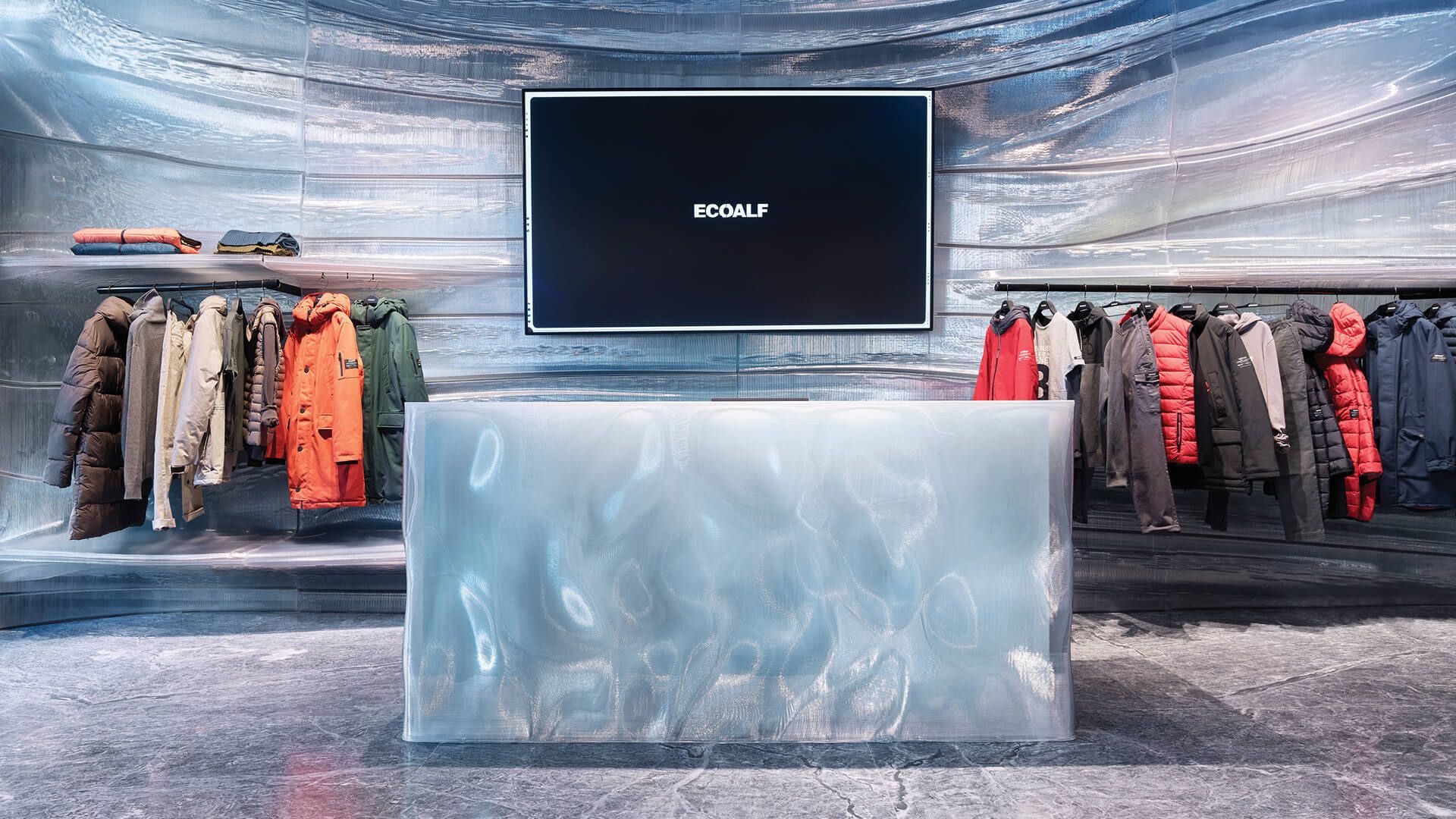
Stepping in, Nagami skillfully 3D-printed recycled plastic to mimic melting glaciers in Spanish boutique Ecoalf – walls, shelves and display tables are made from 3.3 tonnes of repurposed plastic waste sourced mainly from hospitals and utilized to craft translucent surfaces.
“In the future as we expand we want to have production sites around the world making things locally and reducing our carbon footprint even further!” shares Manuel Jiménez García, Nagami Co-founder.
Additionally, JamesPlumb fused hemp and bulrush elements at Cambridge Aesop store – “hemp absorbs a huge amount of carbon as it grows and bulrush being literally of the local waters made sense, both due to its beauty and tactility and because of the chance to use a material that would travel few miles and utilize little energy in production!”, Hannah Plumb and James Russel, JamesPlumb Founders explain.
With an aim to reduce waste in the beauty industry, change consumer behavior as well as inspire them – Nina+Co beautifully used salvaged materials and biotextiles for Big Beauty’s first store in London.
MRDK further created a ‘journey through nature’ at an Attitude shop in Montreal with blocks of granite nestled amongst planted beds to display plastic-free beauty products – “from the moment you step inside, the design of the space reflects a commitment to sustainability and a connection to nature!” says Guillaume Ménard and David Dworkind, MRDK Founders.

“Circularity was key – almost everything we brought into the building was entirely bio-based or recycled. The furniture is expertly built to last but can be disassembled for reuse, recycled or returned to the earth as nourishment!” shares Nina Woodcroft, Nina+Co Founder as she brought biomaterials into the MONC eyewear store in London.
Lastly, FADAA brilliantly utilized bio-concrete screens to shade the Decoration One retail boutique in Jordan – “bio-bricks are growing in popularity as a sustainable building material and a variety of compositions have been tried over the past few years!” FADAA explains. Read on to know more about each area of these 8 innovative shops that narrate a story of material exploration and experimentation!
Sustainable Retail Design – Highlights:
Snøhetta for Holzweiler
Incorporating subtle references to the fashion brand’s Norwegian heritage and Scandinavian minimalistic aesthetic – architecture practice Snøhetta features natural materials for the Holzweiler boutique in Copenhagen. At the center of this 100-square-meter store is a tall, hollow sculpture by Norwegian artist Ingeborg Riseng which shoppers step into.

Its undulating outer walls are fitted with display shelves and coated in a smooth layer of clay, while the inside has a rough, craggy surface. An oakwood display plinth winds its way around the periphery of the store – eventually connecting to a curved timber partition at the rear of the floor plan.

Fabricated by Danish textile design studio Tronhjem Rømer – additionally, behind the wall lies a changing area with cubicles and curtains. Made to evoke the shifting shades of the Norwegian sky, this fabric is digitally printed with subtle yellow and pale blue stripes. “Both the floors and ceilings were further preserved from the store’s previous fit-out!” shares Snøhetta.
Han Chong and Andreas Kostopoulos for Self-Portrait
Designed by Self-Portrait Founder and Creative Director Han Chong in collaboration with New York-based architect Andreas Kostopoulos – luxury fashion brand Self-Portrait opens a store in London with mirrored surfaces and Cornish clay walls. Harmoniously blending minimalism, materiality and color – this 200-square-meter store’s interior is characterized by natural materials.

Mint-pigmented Cornish clay covers its walls and provides a textural quality through its visible markings, which are reminiscent of limewash. Custom terrazzo flooring in hues of white, gray and mint blankets the majority of the floors while areas such as the fitting rooms are decorated with plush carpets in matching colors to add a softer touch to the space.

Additionally, between the textural clay walls – expanses of mirrored panels adorn the vertical surfaces and surround street-facing windows from floor to ceiling to visually extend and blur the boundaries of the retail area. While utilizing rich and textural materials – “we further looked to create a store that was minimalistic as well as free from distracting architectural elements by reducing the store to its bare essentials!” Chong says.
Nagami for Ecoalf
Spanish design studio Nagami completes a shop interior for sustainable clothing brand Ecoalf near Madrid that’s 3D printed from recycled plastic. With the aim of bringing together design and technology to raise awareness about the climate crisis – additive manufacturing specialist Nagami crafted the plastic panels using a robotic arm equipped with a custom-built extruder that can print complex 3D forms.

“We wanted to highlight the melting of the polar glaciers due to climate change – so the walls are meant to represent a glacier that is cracking!” explains Manuel Jiménez García, Nagami Co-founder. To enhance the feeling of walking on a glacier, natural stone tiles embody veins reminiscent of cracking ice on the floor.

Additionally, all of the components utilized for the interior can be disassembled and reused or recycled for future projects. “The plastic itself is almost infinitely recyclable – losing just 1 percent of its structural performance with each new use!” García adds.
JamesPlumb for Aesop
Taking cues from the nearby River Cam, London design studio JamesPlumb intertwined hand woven bulrush shelves with earthy hemp accents for the interiors of Aesop store in Cambridge. Comprising earthy-toned walls – this Australian skincare and cosmetics brand’s space is defined by oversized, textured shelves made from freshwater bulrush plants that are locally sourced and handwoven by rush weaver Felicity Irons of Rush Matters.

“Other shelving in this room is created from hemp grown on the nearby Margent Farm, which was combined with bio-resin to form geometric slabs of cabinetry that display various Aesop products as well as a large sink!” shares Hannah Plumb and James Russel, JamesPlumb Founders. Additionally, at the back of the store another room encompasses walls painted in a darker hue than the street-facing area, which further takes cues from the brown flowers of bulrush plants.
Nina+Co for Big Beauty
Wanting to embrace waste materials and biomaterials such as mycelium – design studio Nina+Co uses materials informed by the ingredients utilized in natural skincare products for Big Beauty’s first retail shop in Hackney, London.
Raw stone edges, metal patination and earthy tones are blended with soft, oversized, rounded forms for a calming effect throughout the area where – besides the retail space – there’s a private treatment room for massages and facials. The main store was designed to be flexible and host events with seating arranged around a large travertine stone table – which was sourced 50 percent from salvage and 50 percent from offcuts.

“We used expanded cork blocks that were shaped into storage units and salvaged steel – which has been reworked into shelving!” Nina Woodcroft, Nina+Co Founder says. Additionally, many of the materials chosen are informed by the minerals and ingredients utilized in natural skincare from clay to mushroom extracts and seaweed.

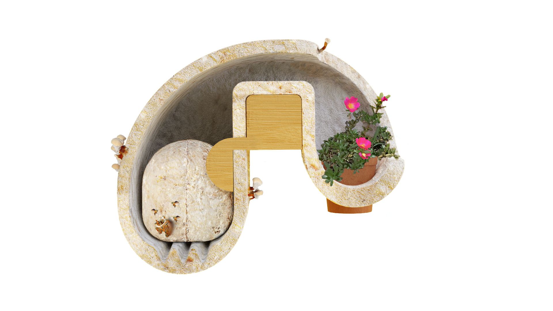
Mycelium was grown to form plinths and legs using the reishi species – reishi mushroom and clay were further utilized to pigment curtains of a seaweed biotextile, which have tiny trapped air bubbles to look like sea foam or bath bubbles. The seaweed biotextile, along with hemp fabric, is further hung as a backdrop for the window display that shades the interior.
MRDK for Attitude
Blocks of granite amongst planted beds are used to display plastic-free beauty products at the Montreal Attitude boutique created by local architecture firm MRDK, also known as Ménard Dworkind. In this 93-square-meter space – planted beds in the store window and around the area overspill with greenery and a raised ceramic floor creates the impression of traversing a boardwalk between them.

Chunks of granite are utilized as pedestals for displaying products in the window, while a much larger block in the center has a pair of sinks carved into its flat top. “This centerpiece perfectly complements the natural theme of the area, giving visitors the sense of being in a nature surrounded by rock formations!” explains Guillaume Ménard and David Dworkind, MRDK Founders.

Additionally, the majority of Attitude’s products are presented on white oak shelves that emerge from the plant beds on both sides of the store. There’s further a refill station that customers can use to replenish the aluminum bottles – promoting sustainability.
Nina+Co for MONC
Cornstarch-foam shelves meet mycelium display plinths in this London store that Nina+Co designed for bioplastic eyewear brand MONC. Upon entering the space, visitors find themselves under an undulating ceiling installation crafted from corrugated panels of cornstarch foam.
“Thicker blocks of the material were utilized to create rows of shelves which can be used for packaging or simply dissolved in water when they eventually start to show signs of wear and tear!” Nina Woodcroft, Nina+Co Founder shares.

Additionally display plinths fabricated from mycelium – the vegetative part of a fungus – are dotted across the area to showcase different eyewear models. In between the shelves – a couple of long mirrors are balanced on hunks of concrete that were salvaged from roadworks nearby.

Nina+Co further worked closely alongside Welsh manufacturers Smile Plastics and London joiner EJ Ryder to make the shop’s recycled PET island and bench seat, which are an apricot-orange hue and can be reused. Walls throughout the interior are lastly finished with VOC-free clay paint while the unit’s existing floor was covered with a water-based sealant.
FADAA for Decoration One
Crushed shells are used to form the bio-brick partitions at a craft-focused homeware and ornaments boutique Decoration One in Aqaba, Jordan by architecture studio FADAA. Protecting the interiors from the harsh south sun – the studio implemented partitions of stacked hollow rectangular bricks based on the traditional mashrabiya screens found in Islamic architecture. These bricks are created from the shells of oysters, mussels and clams left over as waste from the coastal city’s seafood restaurants.

Additionally, lime-plastered walls and native plant species feature in the store for a healthy indoor environment. “To accommodate Decoration One’s ever-changing collections – modular oak tables and sheer curtains can be moved and rearranged to organize the space as desired!” says FADAA.

More tables crafted from hand-chiseled local basalt and limestone further contrast the wood furniture and offer alternative ways to display the products. “Lastly, a splash of color is introduced by the zellige ceramic tiles that clad the curved sales counter!” FADAA adds.


