Top 10 graphic design trends in 2020 by Ludovico Pincini
Get inspiration from the latest design trends in graphics from 2020
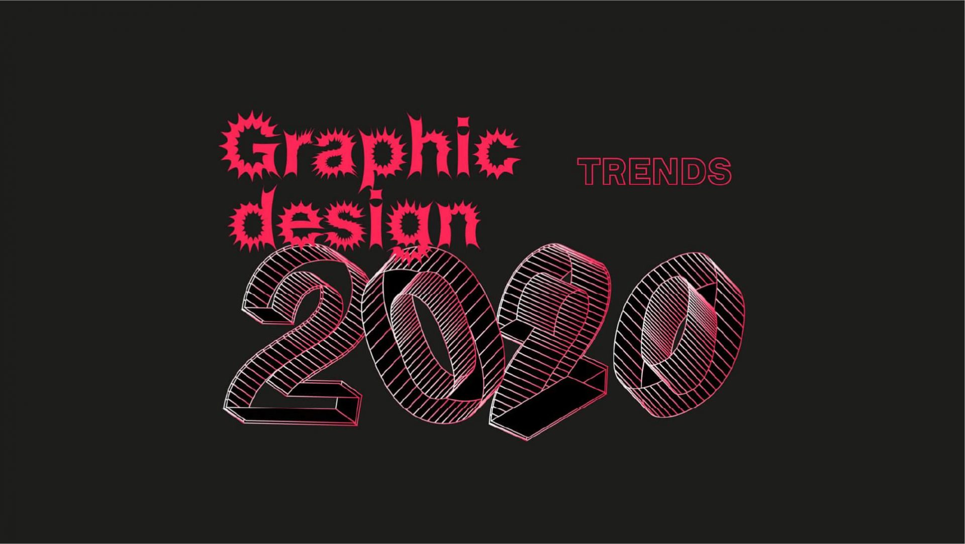
We are in the first quarter of 2020 and we’ve got enough time to spot some relevant graphic design trends that are definitely occurring in the visual design field. Here the list you can take inspiration from, for your designs:
10 graphic design trends in 2020:
Eco-friendly graphics
Sustainability is definitely a trend nowadays, and graphic design has been positively affected by the Greta Thunberg-ization too. Many and interesting eco-friendly initiatives have been arising both for printed and digital designs.
Ever heard about Ecobranding?

It is an interesting experiment that proposes a more ecological branding design, saving, for instance, some ink from logo printing or energy consumption for digital interfaces through the usage of “economical” colors such as black or green.
The real challenge is trying to transform your brand into an eco-brand, without losing the power of the original identity.
Less recent but still actual, the ink-saving fonts, which are custom-designed typefaces that can save approximately 25% of ink usage for printing. There are many on the web, and free to use, such as the famous Ecofont (based on a dotted concept), or Ryman Eco (based on stripes).
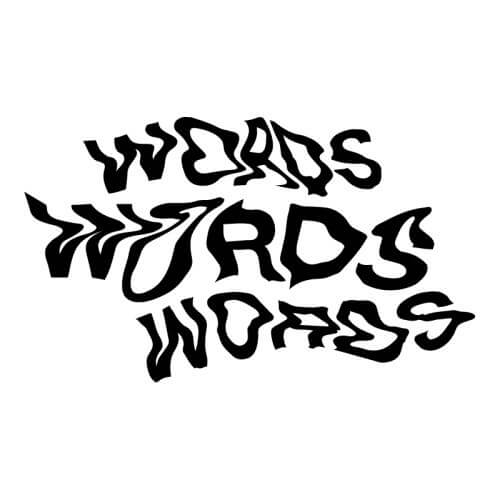
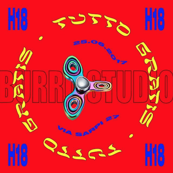
Font distortion
Who said fonts have to be static and geometrically rigid? We have already seen in the past few years the tendency to distort images, but there is also a trend happening right now in distorting typefaces to generate curious and unusual looks.

Animated layouts
A new hybrid way to convey messages through posters in “.gif” format. Mixing static layouts and single dynamic elements creates original animated posters that can also be enriched by new meanings under a semantic perspective.
A powerful visual technique with high potentialities in the future. Look at these beautifully engaging poster designs: static posters are for boys, animated layouts are for men!

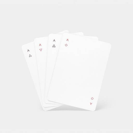
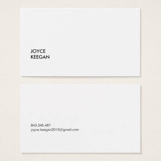
Superminimalism
No need to explain. (Super minimalist description too).

Experimental trash
You know when something is so bad (or weird) to see that is somehow eye-catching? Well, there is a tendency in creating almost trashy visual experiments as the highest form of graphical professionalism. It may sound as an oxymoron, but is no joke.
These designs are rebel and disobedient aesthetic phenomena that are trying to break the laws of traditional graceful graphic design.

Horizontally sliding texts
Like train station notice boards, texts are slowly sliding from one side to the other of the screen. This trend is especially used for horizontally scrolling texts on websites, instead of using the old-style vertical parallax.

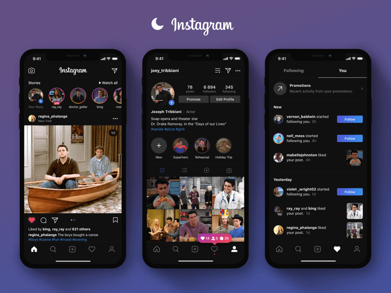
Dark interfaces
First came Spotify years ago, then other platforms started enabling users to switch to dark mode interfaces. Now it seems every digital service has to turn its UI into black.
Honestly, this is not a very smart UX choice, as it tends to make the interface “heavier” to our eyes, and therefore more difficult to interact with. Still a trend though.

Sketch over image
This trend is highly spreading, also thanks to Instagram filters that users can apply to their photos. The effect is all about generating a digital sketch over an image recreating the background shape as an outline, sometimes shifted sometimes overlapping.

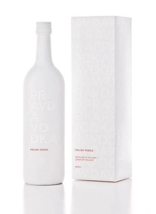
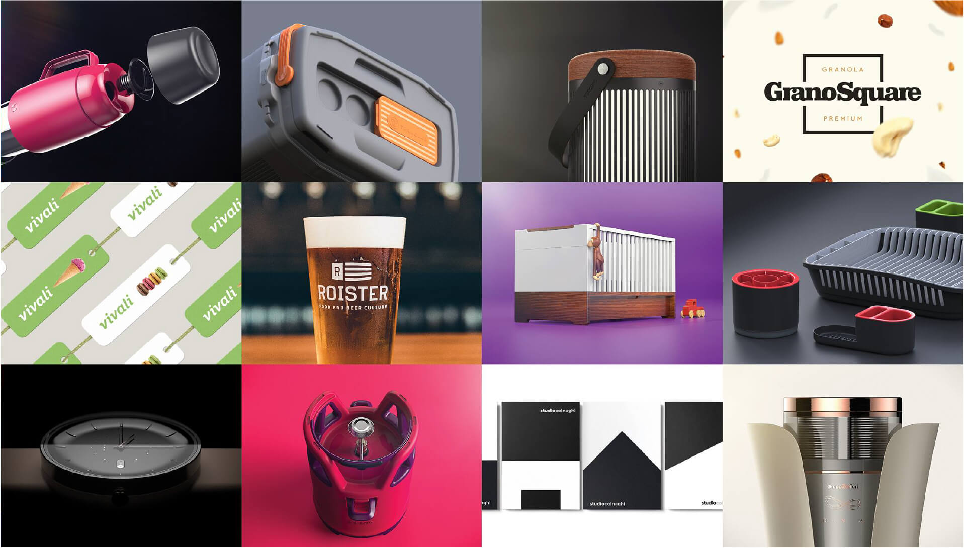
Monochrome packaging
Going monochrome is a very smart way to create products that are highly iconic from a branding perspective, and extremely recognizable on store shelves from a commercial one.

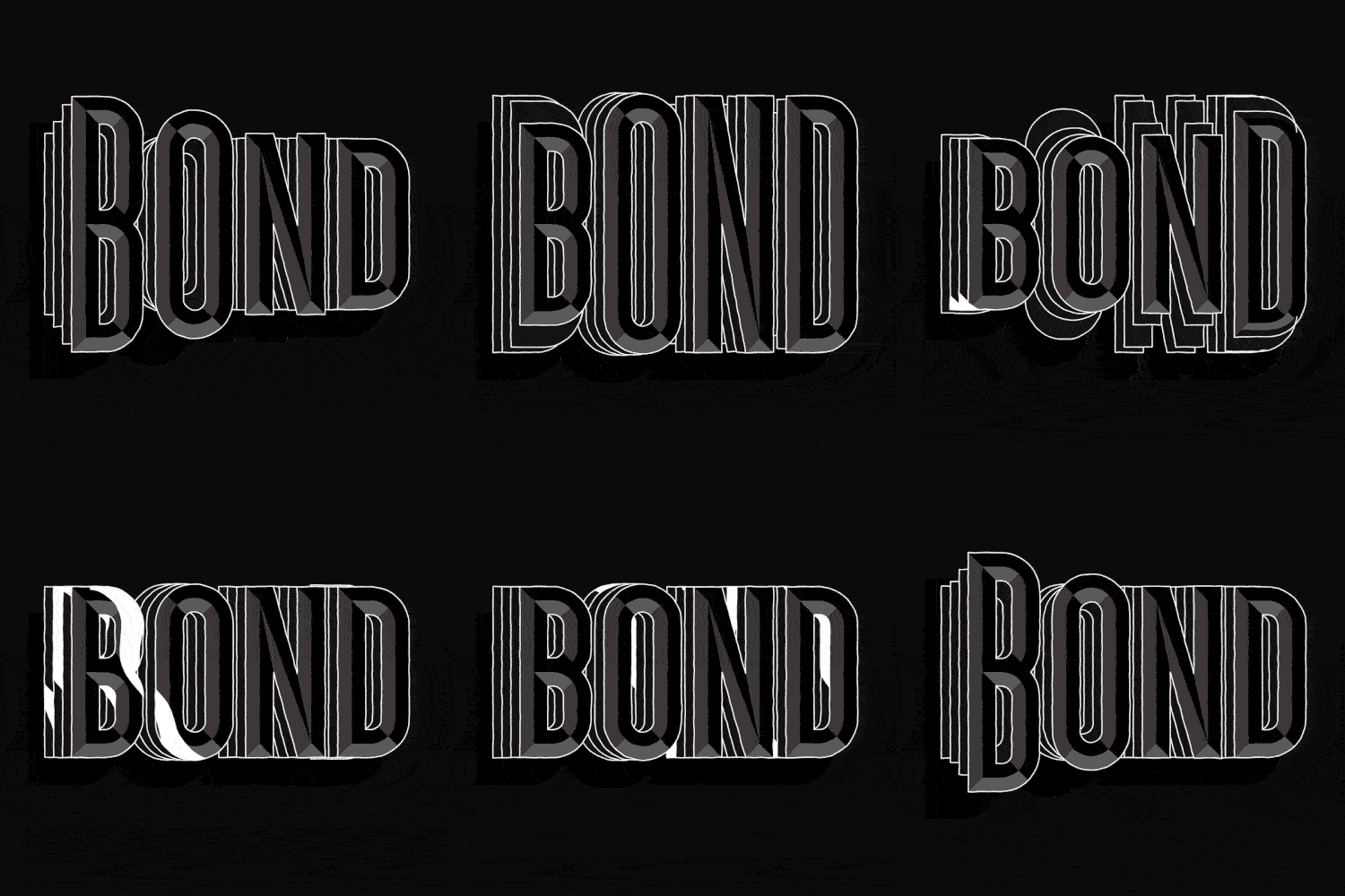
Kinetic typo
Besides the above mentioned animated posters, dynamic tendencies are taking place in typography as well. Users’ eyes are always captured by moving elements, so kinetic typefaces are being used more and more to drive interest and get the reader’s attention.
The outcomes are certainly trendy: it is pure addiction for our eyes!

Guest article by Ludovico Pincini.


