The Renaissance-inspired bar in the heart of Rome – VyTA Farnese by Daniela Colli
Decorated with Renaissance-inspired shapes, textures and materials, VyTA Farnese embodies a contemporary hospitality space that features exquisite craftsmanship and spatial design that’s suitable for social distancing.

Located in Rome, overlooking Piazza Farnese, VyTA Farnese is a transformation of Caffè Farnese. Daniela Colli from COLLIDANIELARCHITETTO has created a contemporary space that bursts with modern elegance and refined sophistication from the Renaissance period.
A combination of millennial pink, European modernism, and unique craftsmanship embraces the VyTA brand, who are distinguished in the hospitality sector, in both Italy and London.
The minds behind VyTA Farnese – COLLIDANIELARCHITETTO Interior design studio
COLLIDANIELARCHITETTO is an award-winning architecture and interior design studio based in Rome. It was founded by Daniela Colli in 2009 who is renowned for her distinctive contemporary vision of society and her impressive historical knowledge and her cultural roots of interior design.
Her work ranges in scale from furniture to architecture and urban design, with a strong focus on blending the past with the future. Her work is typically seen within the hospitality sector across bars, cafès, restaurants, hotels and SPAs.

Materials & Techniques – Playful textures and traditional materials
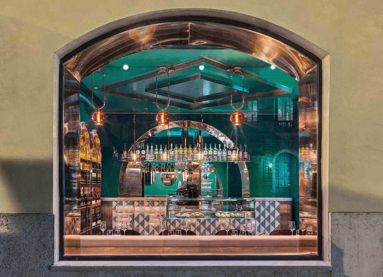
VyTA Farnese utilises refined materials and decoration to spark the interaction between people: it was born from a connection between place and identity. Daniela Colli used polychrome marble, lacquered surfaces, mirrors and velvets, bold shapes and a lively colour palette – from emerald green to millennial pink with shiny copper accents. These carefully selected materials provide a historical context that the large store-front windows frame beautifully.

Style & Aesthetics – Inspired by the Renaissance
The interior design draws inspiration from the Renaissance period. The use of geometric shapes, symmetrical design and the expression of the orthogonal plan blend with the square and round arch injecting life into the original elements of the previous Caffè VyTA.
VyTA Farnese is designed across two floor levels: the bar, restaurant and take away window are located on the ground floor. The three adjoining spaces are connected to each other through large archways decorated in rose gold copper – which creates a sense of depth and perspective. Emerald green wallpaper and lacquered ceilings fill the transitions between each space. On the lower level, the kitchen and utility rooms are located which are accessed down a heavily textured staircase that’s finished in Alpi green marble, embellished with rose gold copper sphere appliques.
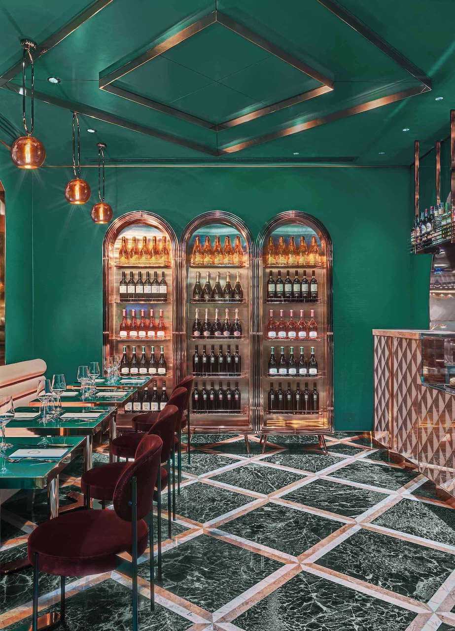
VyTA Farnese features a takeaway window on the ground floor which allows customers to be served outdoors
In the challenging COVID-19 scenario, the ability to serve customers through a beautifully designed window on the edge of the street is a clever solution to keep the business running as normally and safely as possible. The design of the take way bar overlooking the street and Piazza Farnese represents a smart solution for food & beverage ventures.

Design memento – Designed around interaction
VyTA Farnese redesigns the concept of connecting a restaurant with its customers by inviting guests to breathe outdoors while serving them through an elegant, Renaissance-inspired, takeaway window.
VyTA Farnese doesn’t forget the tradition of Italian bars or the ritual of great coffee, but it’s embraced at a standing counter as part of the busy lives of the passers-by.

The writer’s comment – Daniela Colli pays exceptional attention to detail
The designer, Colli, pays impressive attention to details not only in the choice of materials and craftsmanship but also in the context of the future of hospitality. The choice of materials is exceptionally beautiful as it captures the essence of Renaissance style interior design exquisitely.
Human experience and interaction with people seem to be at the forefront of Colli’s design for this project. Interaction with guests is at the heart of the space, whether that’s interaction on the street or within the restaurant.


