Designing the playbook for workplace wayfinding – The Google Case
Large offices and their campuses are some of the most complex spaces to understand and navigate
As one of the world’s preeminent experts in creating workplace wayfinding systems, it would have been fair to say that we struggled with an approach of minimal or near-zero information provision. Along with differing views of the problem: “People work here everyday: they don’t need signs”, we were told. “It’s not that complicated, we just need a few in the reception area – that’s where it gets busy”, and “Oh, and the design needs to have our new brand and identity”.
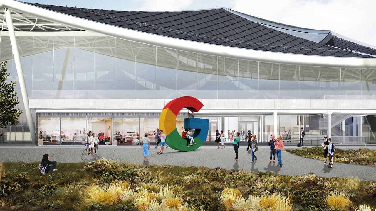
It’s always good to start by talking through people’s experience of the building. Especially when that building is complex; longer than the titanic, ten stories high, has teams and departments that wax and wane throughout the year, has 3,000 desks, is the office of 6,000 employees and welcomes 19,000 visitors a year.
Gallery
Open full width


Open full width
It is usually as clients tell us of anecdotes of never starting a meeting on time because people can’t find meeting rooms, chaperoning visitors from reception otherwise they’d never find anything, and video calls with colleagues on different floors in the same building because they don’t actually know where each other are, that the true nature of the task reveals itself to both client and designer.
Take these issues and multiply them by a campus, a city, a country, a rapidly expanding global company situated in countries throughout the world, and the scale of the challenge can be daunting. This was the challenge facing Applied when we started working as Google’s wayfinding consultant of record in 2016.

One approach, common to many global companies, is to create a set of stringent, corporate-branded guidelines that deliver a single look and feel to wayfinding no matter the building, campus or country. There is clearly value in this approach. It equates to efficiencies in planning, design and application and anchors brand awareness – there is no doubt about the identity of the occupant.
Google wanted a different approach. A cost-effective and scalable wayfinding system that would enhance people’s experience of places, and of Google, and that allowed each office to feel distinctive, to have its own sense of place while remaining definitively a Google office. It meant understanding how and where consistencies should be applied to reinforce Google’s brand and where it could flex to help create a distinctive sense of place.

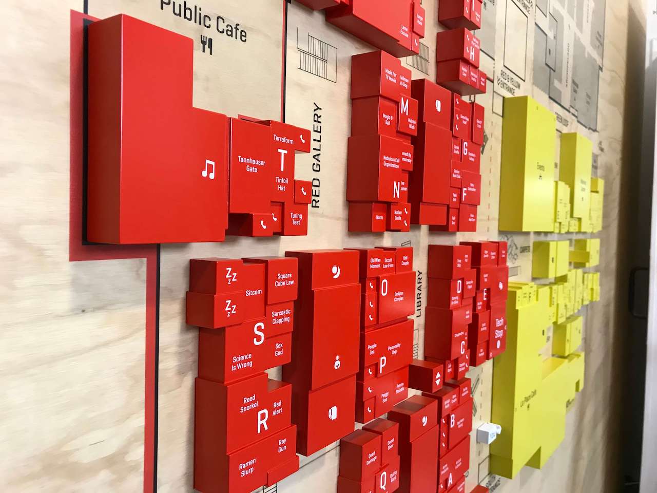
The idea was to create a platform strategy – the development of a core system architecture including naming and content hierarchies, placement principles, campus legibility and archetypes, brand integration, accessibility guidelines, and colour strategy – that enabled consistency at the right level and allowed local customisation.
Each element of wayfinding was defined as one of four levels of consistency ranging from standardised – identical designs regardless of place, through to freeform – complete artistic freedom to create unique interventions that support a sense of place.

Getting the right balance of elements to create consistency, at times can feel like a record producer twiddling knobs and sliders on a mixing desk to get the right harmony – time-consuming, but worth it in the end.
We created an online Wayfinding Playbook accessible throughout Google’s intranet, to advise, guide and control system roll-out. It includes principles and fundamentals to planning and design rules, through to specifications and templates for signage and placemaking – a one-stop-shop for Google’s wayfinding design teams implementing building, campus or district level schemes.

In the current climate, getting back to normal, getting back to our workplaces will be a challenge. They have never had to work harder, to be easier to use, feel safe and inviting at the same time. When Googlers again start to travel between offices, and enter a new building for the first time, a glance in the lobby towards a familiar floor plan will give them that unmistakable feeling of being in a Google office.
The right approach and balance of wayfinding and placemaking elements help us navigate, but are also the key to productivity and a happy workforce.