The playful reconceptualization of Hello BABY children’s centre by SVOYA STUDIO
How Svoya Studio used curvilinear forms and soft pastels throughout the interior design of Hello BABY children’s centre, in Dnipro, to create intertwining versatile spaces for education and amusement.

Located in Dnipro (Ukraine), the Hello BABY children’s centre fills the first floor of a residential complex, measuring an impressive 517m² area. The project aimed at reimagining a versatile, purpose-built children’s centre in the heart of Dnipro.
At first, SVOYA STUDIO was tasked with designing an extension to the existing children’s centre, however as the project developed, they were asked to extend their interior design into the existing spaces.

The minds behind Hello BABY? SVOYA STUDIO
Founded by Juliya Martynenko and Denis Sokolov, Svoya Studio is an interior design, architecture and product design studio that is built on family values, friendship and the love of creative exploration.
Throughout their portfolio of work, it’s evident that their key focuses centre around human interaction and relationships. Their creative process is built from boundless love and high professionalism to achieve designs that are unique among architectural structures, residential buildings and public spaces.

Materials & Techniques – Timber and curves
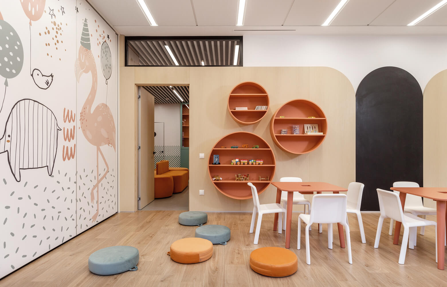
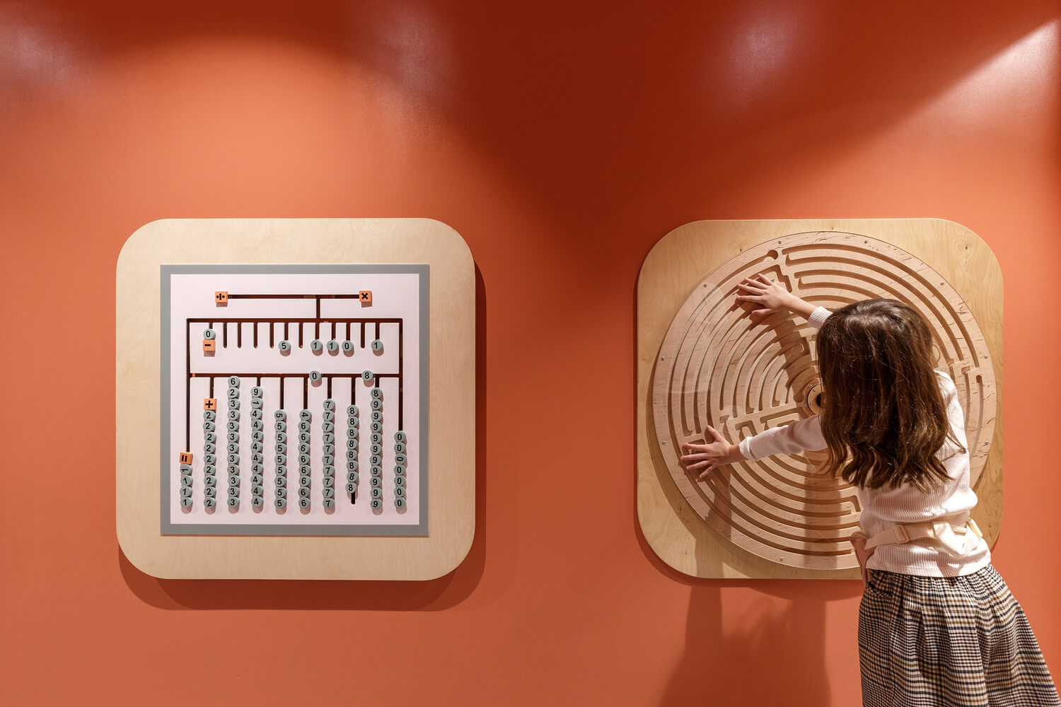
The interior design of every room heavily utilised timber, whether that’s for cabinetry, seating or the many bespoke games installed on the walls throughout the children’s centre. Timber was used to provide the centre with a Scandinavian aesthetic that focused on maximising the functionality of the space.
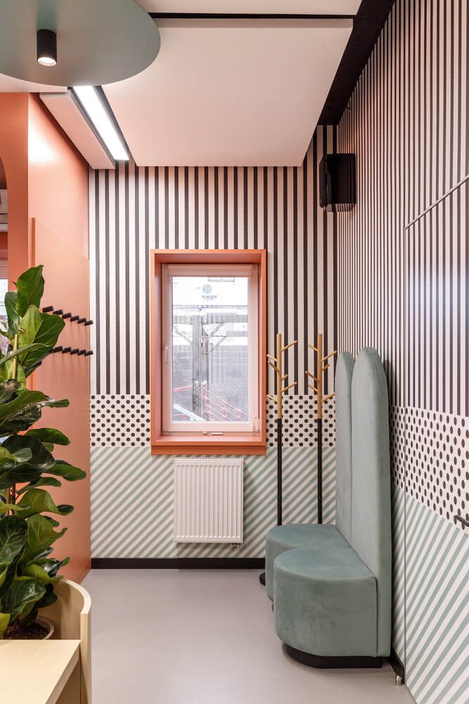
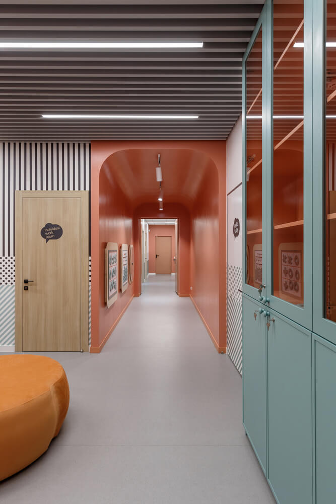
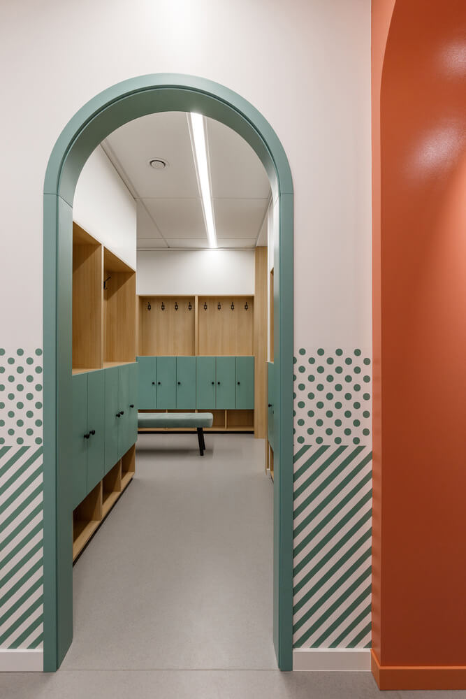
All the furniture, cabinetry, wall art, hallways, lighting and games were designed with curved edges to soften the interior design and provide a comfortable and safe environment.

Style & Aesthetics – Playful pastels
Hello BABY children’s centre is purposefully designed to connect each room in a broken-plan layout which ties each room together but also provides a divide between each space.
Broken into “groups”, the floor plan consists of the “entrance group” which combines a reception, a small café and a collection of themed products. Leading from the entrance space is a corridor that flows through the middle of the children’s centre. This corridor was designed to expand the functionality capabilities, which led the architects to install games and stylized seating throughout this space.
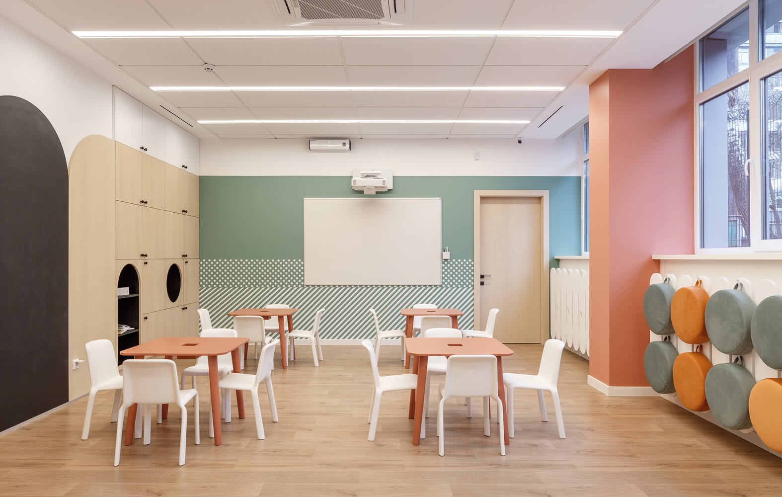
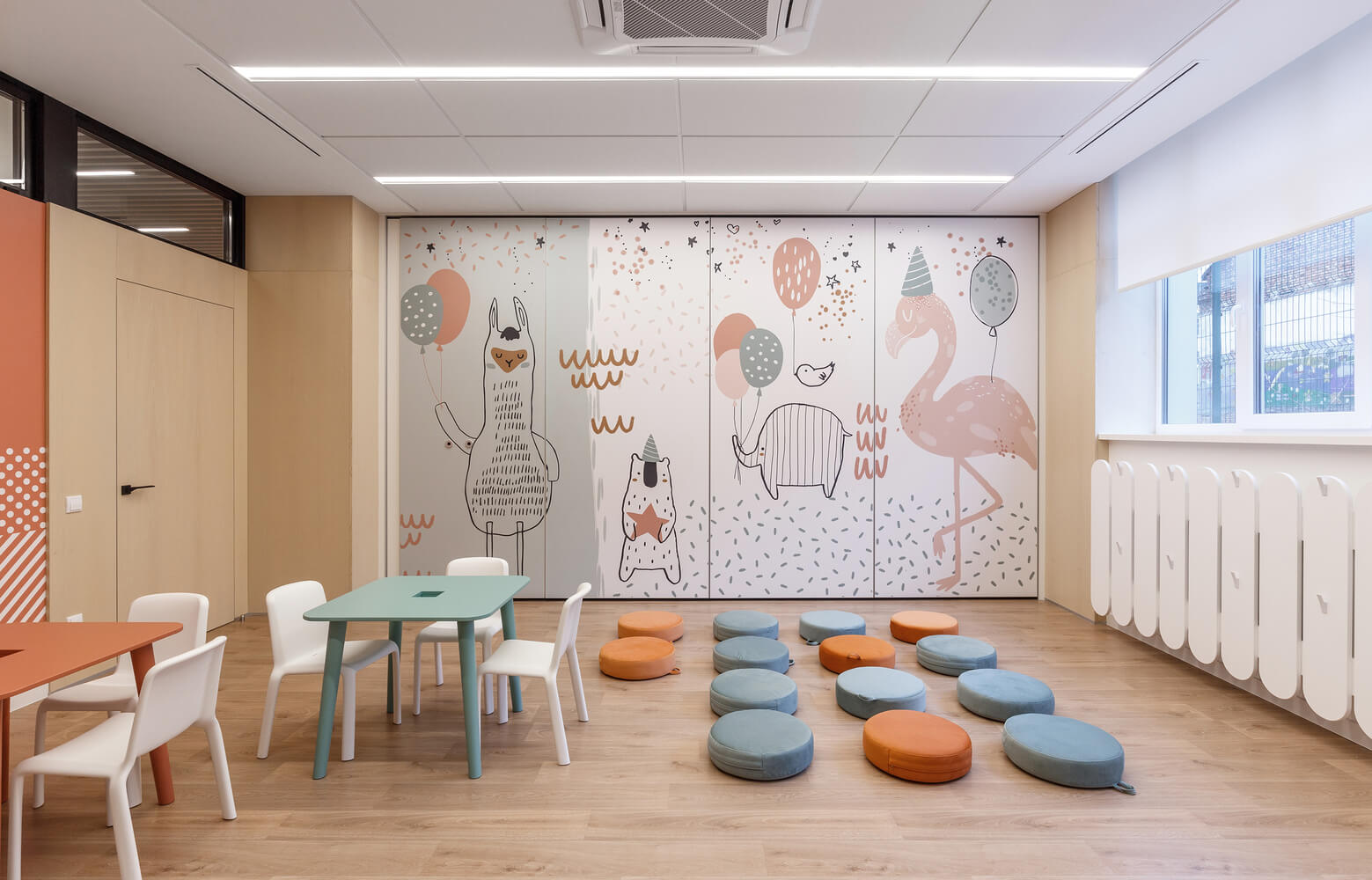
From the walls to the seating and bespoke wooden games through to the cabinetry, the architects used pastel tones of green, grey, orange and blue in every room. This consistent colour palette turned every interior into a bright and vibrant space and allowed each room to flow seamlessly into one another.

During the design of Hello BABY, the name and branding was developed by Alexander Sidorenko
At the initial stages of the project, Alexander Sidorenko developed and new design concept for Hello BABY which included the name of the children’s centre and the branding that can be seen throughout the interior design.
Design memento – Playful interior design with functionality at the forefront
The most outstanding aspect of this project is how SVOYA STUDIO designed the interior of each room to be functionally versatile and adapt depending on the requirements throughout each day. Various spaces can be adapted from playrooms with mats on the floor or rooms with desks and seating areas in a matter of minutes thanks to the functional design.

The writer’s comment – Soft play
One of my favourite qualities of this is interior design concept by SVOYA STUDIO is how they used curved forms throughout the whole children’s centre to result in not only a safe environment but a comforting one. The curved forms create an inviting hug for the children, allowing them to feel supported and nurtured.


