Creating tactile, joyful web experiences with Niika
Based in Australia, studio Niika creates unique experiences through beautifully designed websites, highly bespoke artworks, and incredible branding.
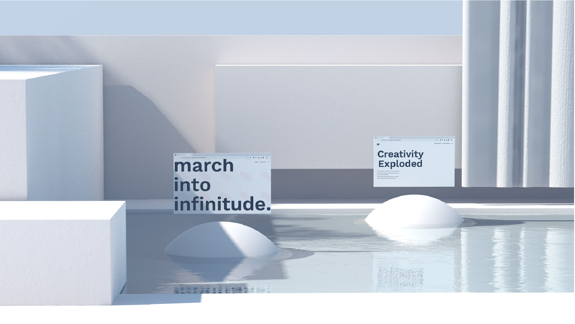
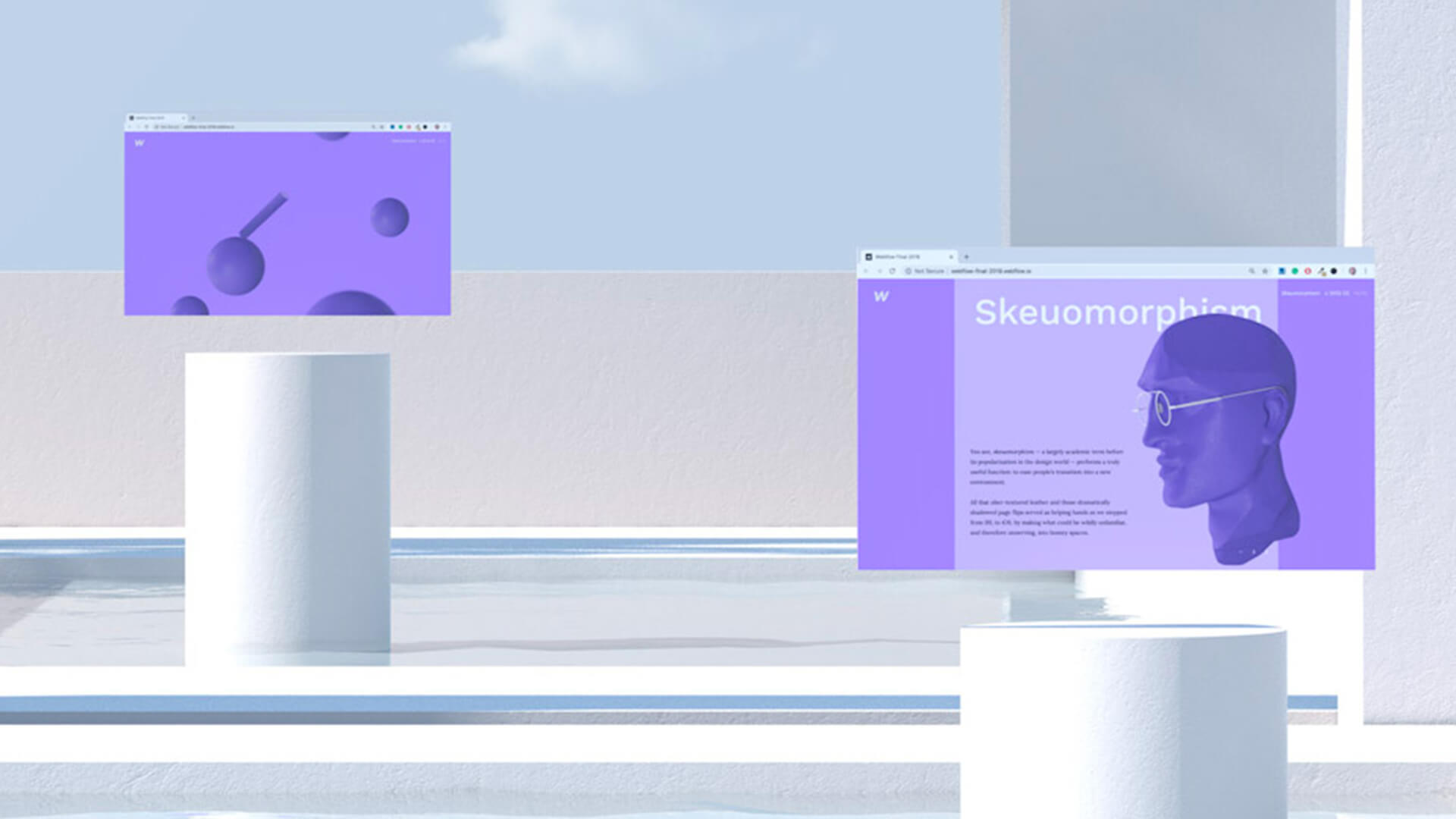
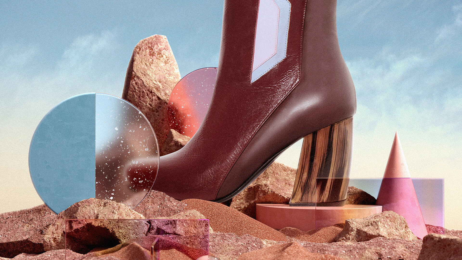
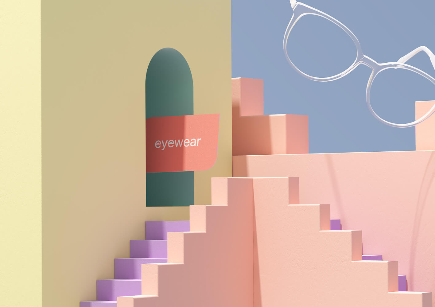
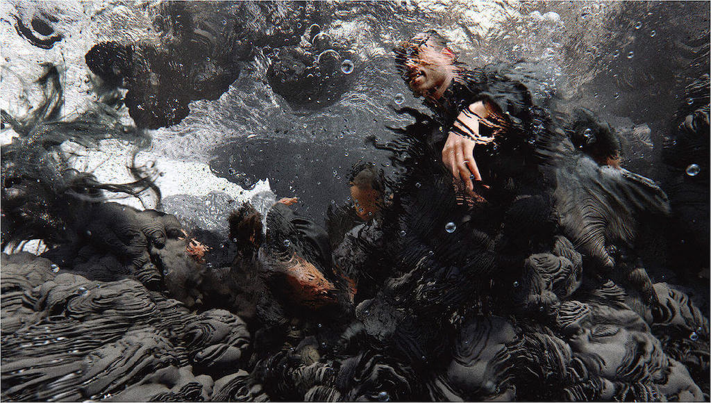
Founded with the desire to create a space where collaboration, vision, and creativity is celebrated, Niika is an Australian studio focusing on designing highly bespoke artwork, branding, and websites. As a group of talented and experienced designers, they use their incredible passion for art and design to build outstanding, tactile, and joyful web experiences while utilizing the best technology.
With an ultimate goal to create a space geared towards creating beautiful, engaging, and exciting work, the studio manages to inspire their clients to embrace their sense of wonder and work together to design something truly unique. Amazed by their approach, DesignWanted had the opportunity to interview Niika and find out more about their story, their design process, inspirations, and what is next for the studio.
Gallery
Open full width
Open full width
How did the journey for Niika begin?
Niika:
“All we’ve always wanted to do is make great art. Art that makes our clients look amazing, engages their unique community and spreads their message. That being said, as designers we’ve all had to compromise at one time or another on what we felt was the best design outcome for any number of reasons. This is often one of the harder parts of the job and it sometimes makes it difficult to feel proud of the work you’ve put out into the world.
Being constrained to a brief is part of the job, that’s absolutely a given. But for us, the best relationships with clients are built on mutual trust that we as designers have our client’s best interests at heart. We want what you want! That’s how Niika came into being. We wanted to create a space where collaboration with the client’s vision and trust in the process (and in us as artists) held equal weight. To toot our own horn, we’re a group of talented, experienced designers. We love producing beautiful, engaging design outcomes and we’re great at doing it.
With a bit of time and hard work, we grew a thriving network of like-minded clients. These are businesses that were interested in outlining a communications problem and trusting an experienced team to produce their best work. For us, the environment we’ve built results in the best outcomes for everyone, great business outcomes, beautiful communication, happy clients, and happy designers!”

Why Niika, why focusing on highly bespoke artwork, branding, and websites?
Niika:
“The answer to this question is pretty simple, it’s what we love to do! It really comes down to passion for art, experimentation, whimsy, and building engaging experiences. A completely tailored approach to design and branding gives us more opportunity to do what we love and to do it the right way.
Building tactile, joyful web experiences that utilise the best new technology just gives another outlet for our passions. Our ultimate goal has always been to create a space geared towards creating beautiful engaging, exciting work. At the end of the day wouldn’t you rather work on fun, interesting, challenging, and exciting projects with clients who love the results?”

Your studio’s brand identity has a playful approach that transmits joy. Which are the main values, core concepts or style inclinations that, above all, will always represent Niika and its projects?
Niika:
“Honestly, I think we’re just really comfortable in our own skin, in the weird, unique, playful ideas that make us who we are. Values that align with this way of thinking about art really define our approach to design. We dare to be optimistic and try to inspire our clients to embrace their sense of wonder, stand out, and be strange with us.
That’s not to suggest that we take our client’s existing brand, vision, or history lightly. We’re just looking to explore together, joyful ideas without constraint, so at the end of the day, we can craft something truly unique. We have a true love and passion for design, discovery, and invention and I think those are core values that we will never stray from.”

Some of your clients include Nissan, Universal, Beyond The Valley, Webflow, Landor and Kolour. If you could give one piece of advice, what is the key for a successful design project? How do you create trust with the client and how do you achieve the best results?
Niika:
“Design is so often a conversation between a group of artists and a company with a communication problem. The best conversations between groups with different perspectives are based on open dialogue and the free, uninhibited flow of ideas.
For us a successful design project is all about mutual respect, trust each other, and bringing a positive attitude and energy to the table. Being present in communication and trying to truly understand the intent behind your client’s vision and communication needs are key. It’s important to note this is a two-way street, helping your clients resonate with your optimistic outlook, innate curiosity and respectful expression of ideas are just as important.
Nurture that relationship with your client, and help it grow into a partnership and a collaboration that sees everyone get what they want. As cliché as that sounds, it really is as simple as both parties being open and respectful.”

Being specialized on branding and UX/UI, what would you say is the benefit for any company to have an efficient bespoke website? What is the potential for companies investing in ux/ui design?
Niika:
“More so than any other piece of marketing collateral, a well-constructed website is an extremely flexible tool for communicating with and engaging your community. You can’t log into your brochure, business cards, or highlight reel and adapt your messaging, or spread the news about a piece of work that your team is proud of.
However, being timely and adaptable is a quality of basically any business website, so what is the difference between a good website and a great one? A tailored user journey and automated branding. Taking the time to consider the wants and needs of your different digital audiences, always in our experience results in a site that can be different things to different people.
The best sites develop an elegant system for drip-feeding information to your visitors. Everyone sees only what they need and want to see, and everything else doesn’t get in their way. Each audience has different entry points and a content loop that gives meaningful options for their next click.”

Got a bunch of hot leads than just want to skim your points of difference before contacting you? We’ve got you covered. Catering to cool leads that want to read a lot and compare you to your competition before making a decision? Yep, your site will do that too! Want to educate your audience, make announcements, or create an index of reference content? It’s all right there for users to explore.
A truly impactful website can adapt to the growing and evolving needs of any business, but it can also ensure that you don’t need a design team keeping your timely messaging on brand every step of the way. This might sound like we’re talking ourselves out of a job, but the truth is investing in a website that embodies a great user experience is better for the designer too, releasing a considered product always inspires more pride than the alternative.
All the 1’s and 0’s that make up your digital presence are there to work for you. Don’t just think of it as putting a message online, think of it as a way to automate your ability to market yourself effectively, any time you want.”

You create highly bespoke artwork, are there any designers that you are inspired or influenced by? What other fields and inputs outside of the design world provide inspiration for your work?
Niika:
“As we mentioned earlier, the studio loves to explore ideas of whimsy and wonder, awe and discovery, joy and play. Local, disruptive artists such as Brolga, Janelle Barone, Jason Solo, and Justin Maller are names that spring to mind when we’re talking about influences for the studio. Rajeev Basu and Fran Rossi have also been a massive influence and produce some amazing works in the field.”

As you say, referencing and drawing inspiration from artists in other disciplines is super important and is a big part of how we try to keep our style fresh. It’s important to seek out new music, experience festivals and shows to ponder. We also look to the outside work, to notice nature and textures – and to trust your own gut in terms of creativity with just the right amount of abstract influence.
That all being the case, don’t take our word for it! We think pictures really speak louder than words and would encourage you to check out the fantastic artists we’ve mentioned.”

Having recently worked with webflow, what are the main trends & future directions within website design and what do you think of them?
Niika:
“To quickly touch on a few hot web design trends, we’re seeing a lot of app-like experiences. Page transitions, complex animations (especially scroll-based animations), and integration of technologies like WebGL to create depth and interactive 3d models.
Scroll animations and page transitions are especially interesting to us, they can make a website feel so much more tactile which almost gives you another sense to play with. Another really interesting technology for web designers is variable fonts, which allow dynamic changes to things like kerning, character width, and weight.
A lot of this stuff is super exciting! That all being said, trends on the web move fast and fall into two main categories: trends motivated by exciting new changes in technology, and trends motivated by creative application of technology for a communication outcome.”

For us, it’s important when considering a new trend is to make sure it enhances the design without confusing or disorientating the user. Chrome has even embraced new technology called ‘prefers-reduced-motion’ that forces slower animation on mobile devices to prevent nauseating users.
This ties into another thing that’s really come to the front of people’s minds in the last few years, accessibility for web. It’s a great thing that businesses and designers are all wanting to make the web a place for everyone, and it’s important to note that some web trends that involve unique or cutting-edge technology are often by design less accessible. Watching our field grow and evolve is always inspiring, but making sure these changes serve your communication goals and end-user is just important.”

Being an award-winning creative agency, what is the next step for you?
Niika:
“This year has been a bit of a whirlwind for everyone, but the one idea we’ve really clung to is that the ability to be responsive and adaptive is what helps people thrive at the moment. Our sprint approach is what we are zeroing in on at the moment as we aim to respond to the ever-changing and fast-paced nature of the industry. We’re working on our systems and processes, to better respond to shortening timeframes with a swift approach that continually reflects the pace of change around us.
That being said, a new chapter for us is also unfolding. In 2019 the brand was acquired by Blueboat, a boutique creative agency with 26 years of experience under their belt. This merger has created some amazing opportunities for us to grow and evolve. We’ve already seen a new perspective by leveraging Blueboat’s experience with backend processes, their approach to business development, and their wisdom when it comes to delivering great outcomes year after year.
We have found that Niika has flourished under these new circumstances and we’re all really excited for the next new chapter. Though as always, we’re focusing on each project as it comes and cherish the opportunity to learn, grow, and produce beautiful work.”


