Smartphones are not all the same
The design world has a renewed interest in tech products, with new players gaining relevance. The scene is no longer dominated solely by the bitten fruit; we now have Nothing, which has a lot to offer in this field.
During my journey as a DesignWanted writer, I’ve encountered numerous companies and products that have piqued my interest, not just professionally but also out of design curiosity. And this is the case of Nothing. I’ve noticed that there are some players approaching design in a fresh, innovative way, each in their own unique manner.
What I mean is that trying to stand out in a market is quite challenging because there’s always a safe zone beckoning, which tends to dampen the drive to differentiate and opt for a safer approach, which is always good for business. Especially in sectors where investments are substantial, playing it safe seems like the prudent choice.
However, not everyone shares this opinion.
The design world is abuzz with talk about Nothing, a company officially based in London but making waves globally.
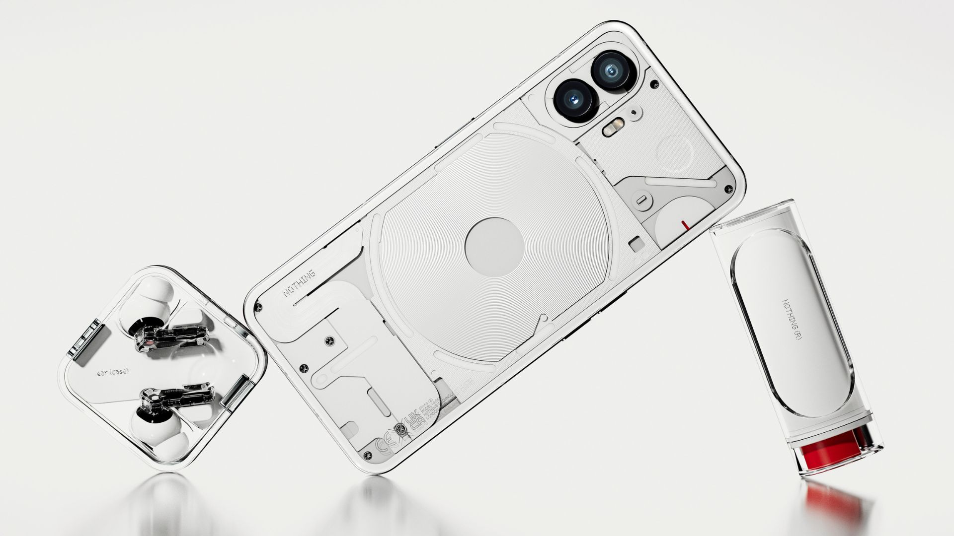
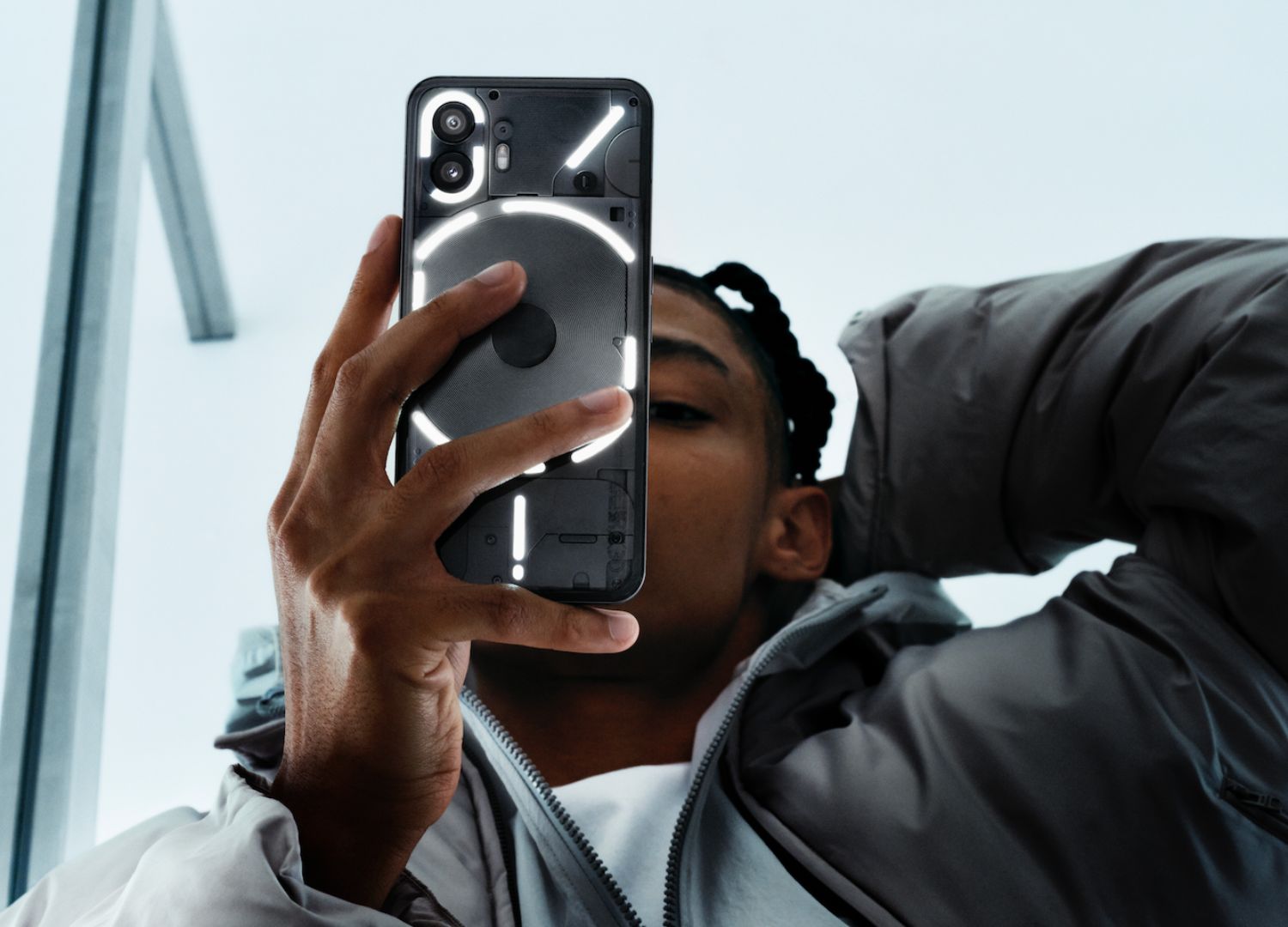
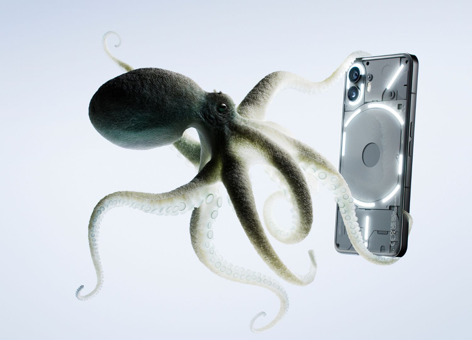
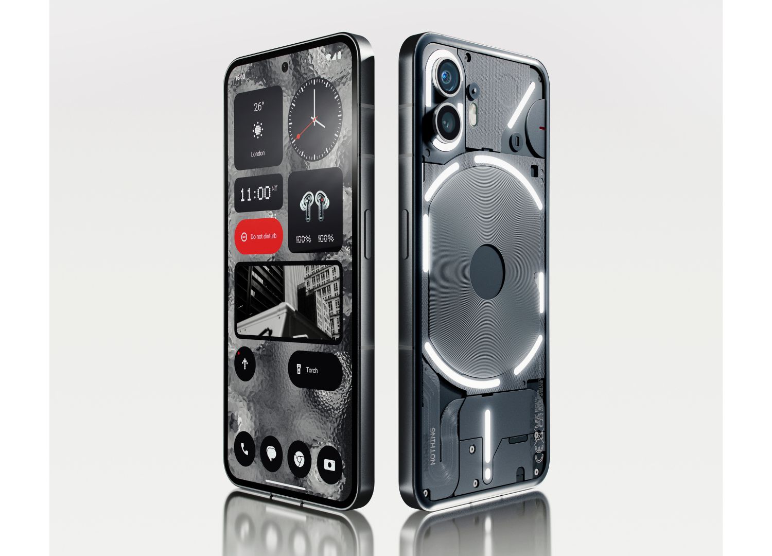
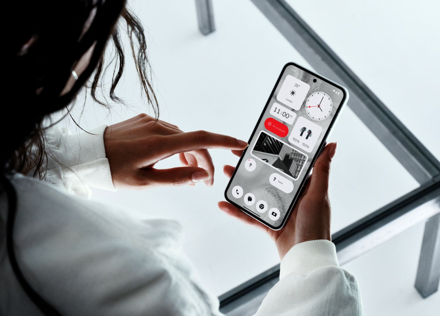
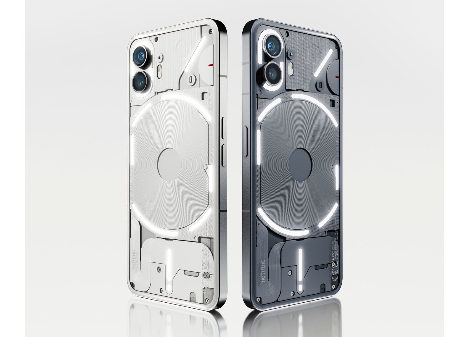
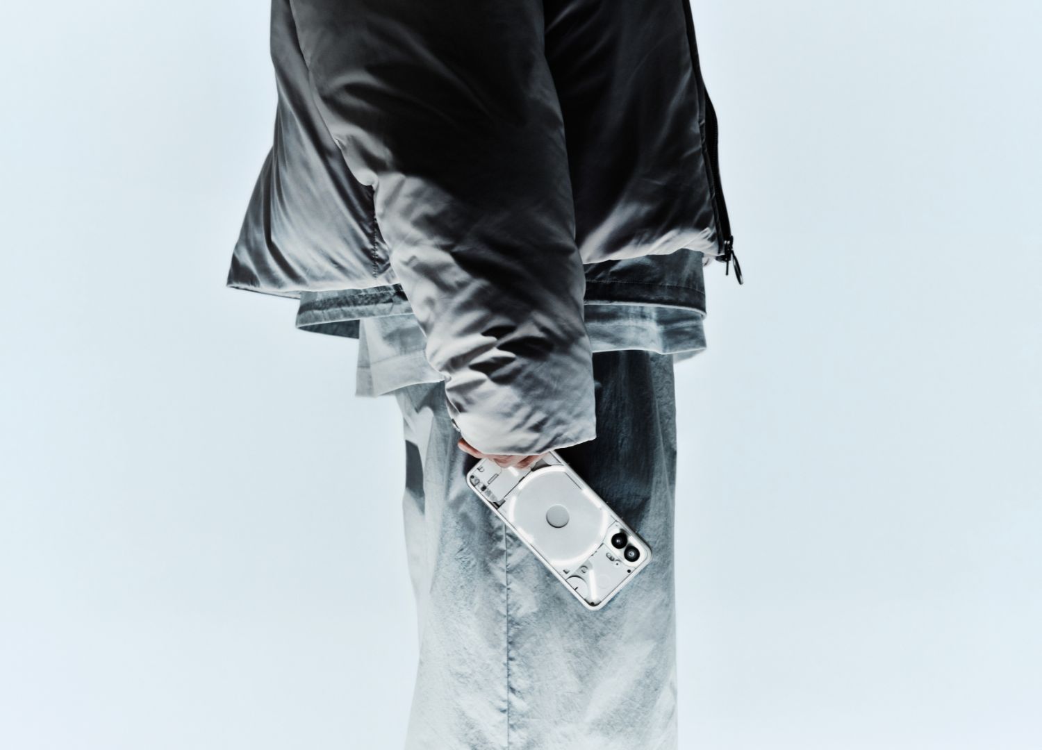
They began with Ear (1), but their footprint expanded significantly after the launch of their smartphone, the Phone (1), which has now been followed by their brand-new product, Phone (2a). Their design is distinguished by the transparency of the case, revealing what’s happening inside the product. While this may vaguely evoke memories of products from the ’90s, such as a GameBoy, it brings something new: instead of exposing all the chips and circuitry, it presents a controlled design of the internal components, giving it a sincere yet defined character that makes the product truly recognizable, even if it’s… transparent.
It’s all very intriguing.
I had the pleasure of having a brief conversation with one of the founders, David Sanmartín, who is deeply passionate about the field and shared insights into the company’s journey to finalize their product. He showcased some steps of the design process, which were meticulously documented, and had such a refined evolution that when narrated, it felt almost like a story. Beginning with design principles like the Bauhaus or Pierre Cardin and culminating in what we see now, passing through prototypes and tests, and ultimately arriving at a product that, as we observe from their catalog, is constantly evolving.
I also had the opportunity to experience one of their products, the Phone (2), the model just beyond the brand-new Phone 2(a), and the sensation is truly that of holding something novel in your hands, starting from the packaging, which unfolds in different steps like peeling a fruit, to the first sight when the screen lights up. While there are many features that capture attention, perhaps the best person to describe it is Adam Bates, the Design Director of the company. I reached out to him with a few questions, and he graciously replied personally.
One of the first things that sets you apart is your font, which simultaneously gives off both an analog and a digital vibe. How did you come to choose it?
Adam Bates:
“The font was actually the result of thinking about stripping typography back to its simplest form; what if a machine designed your logo? The team were experimenting with a handheld printer, the kind used to label boxes in production, and physically started to print the logo.”
What were the goals, and what was your approach in choosing the colors used in the smartphone graphic interface?
Adam Bates:
“Nothing is all about starting again, stripping back, and not taking anything for granted. The OS colors are simple and striking, focussing on functionality and clarity.”
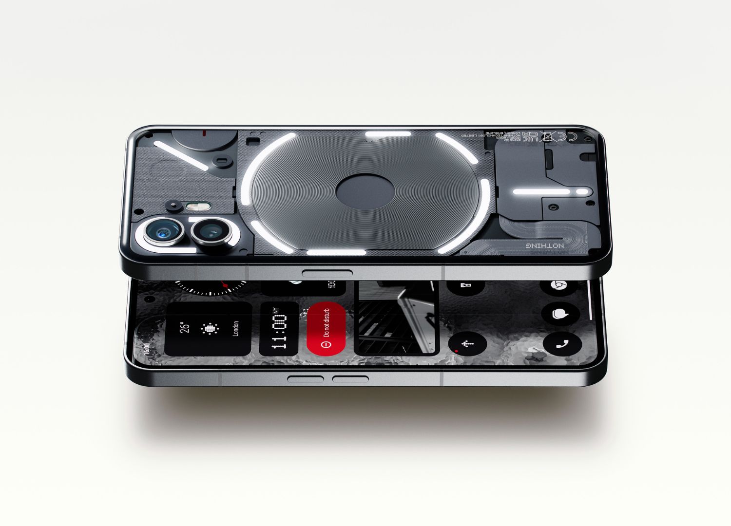
A unique aspect of your smartphones is their transparency, which enhances the tech side and the details of your products. How did you manage the product’s ‘inside’ from a product design perspective?
Adam Bates:
“It is a huge challenge! Where others design a single cosmetic surface, we often have to design 10 or 20, and to add to this, we often expose internal components. So we have to become engineers as any changes we make affect the functionality.”
In my view, the Glyph interface truly revolutionizes the game, distinguishing your Phones in both functionality and visual identity. What is its origin story? How did it come into existence?
Adam Bates:
“The origin of the glyphs was to look at the fundamental utility of a phone, which is to communicate with your loved ones. We felt this had been lost in modern smartphones, among the multitude of notifications, apps etc. We also noticed that the rear of the phone was an untapped opportunity. So we created a new language: the glyph interface, and made it all about communication and top level notifications. Another by-product of this is the users can leave their phone face-down, and spend more time in the present. From there, we had a platform to build upon.”
Nothing offers a variety of products and likely plans to expand the range. When it comes to design, how do you establish a common thread that connects personal devices with items like clothing or food?
Adam Bates:
“It’s all about values, and the collective sensibilities and taste of the Nothing team. Every product, whether it’s apparel or a pair of earbuds, is the result of a series of decisions, and we strive to make each of these with our core values and beliefs. If you do this right, the family resemblance takes care of itself.”
Among everything, which specific feature or detail in a Nothing product are you the proudest of including?
Adam Bates:
“I love the glyphs as they are completely original, and memorable. They are instantly identifiable, yet have depth and much potential for the future.”
About the author
Mario Alessiani, founder and creative director of the Italian namesake design studio, specializes in product, lighting, and furniture design. His clients include companies such as Umbra, Fabbian, and Axolight. Mario also teaches at the University of Camerino, IED Rome and Sichuan Normal University in China. His work has been exhibited at prestigious events like the ADI Design Museum in Milan, Eindhoven Design Week, and Milan Design Week, earning him awards like the IF Design Award and Archiproducts Design Award.
WebsiteInstagramLinkedin