Seoul Design Festival: From showcase to discourse
To grasp the definitive state of the contemporary design ecosystem in Korea, the Seoul Design Festival is the indispensable barometer. As a crucial site for stratified and conscious creation, we have curated four pivotal currents observed at this year’s installment.
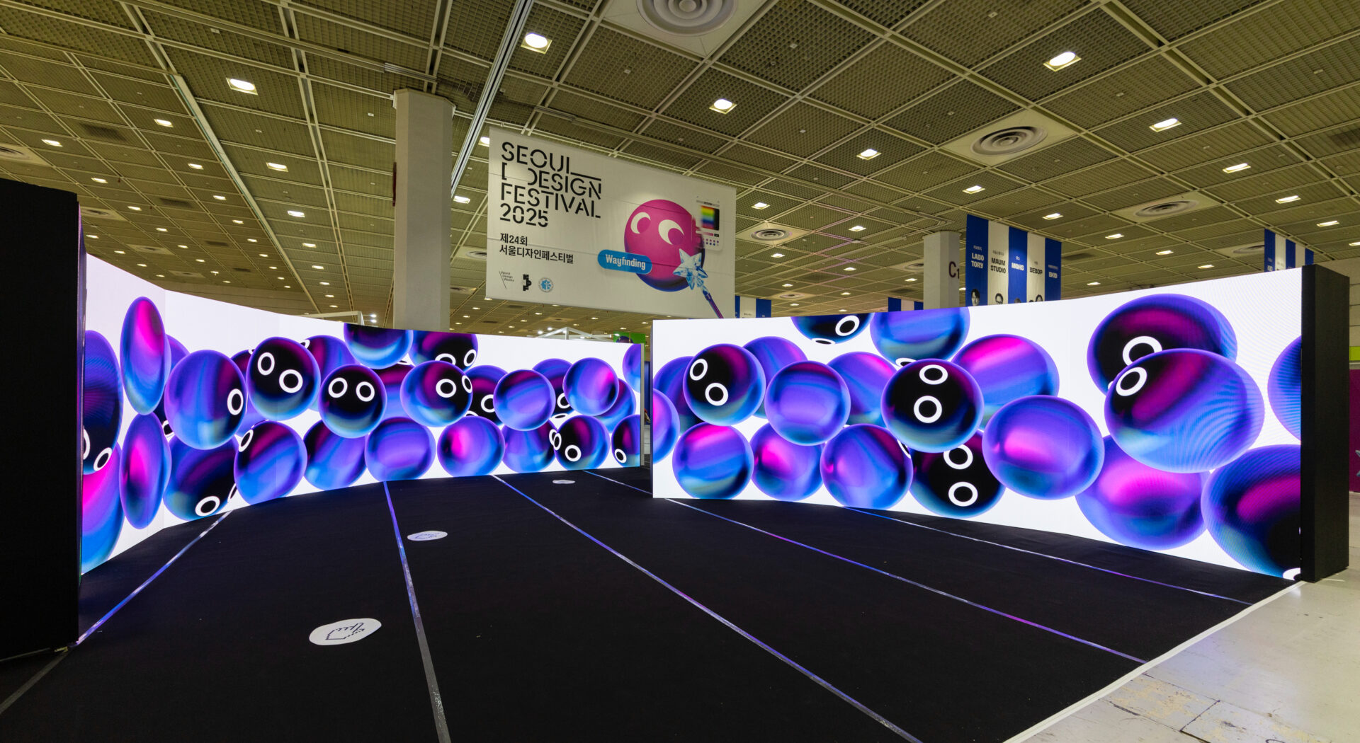
The Seoul Design Festival, established in 2002 and maintaining significant industry stature, is the premier showcase of design culture, hosted by Design House and organised by Monthly Design, the first Korean design publication from 1976. The latest iteration, held from November 12th to 16th at COEX Hall C, featured nearly 1,000 creatives. Its theme, ‘Wayfinding,’ transcended mere visitor flow to serve as a metaphor for the rapidly changing industrial landscape. Mike Choi, the magazine’s editor-in-chief, clarifies the theme’s rationale: “Amidst paradigm shifts—the weakening manufacturing base, the AI era’s advent, and the climate crisis—we sought practical guidance and discourse for the design sector.”
The key characteristic of the Young Designer Promotion was its transformation, with works highlighting industrial materiality and modularity that challenged conventional design frameworks.
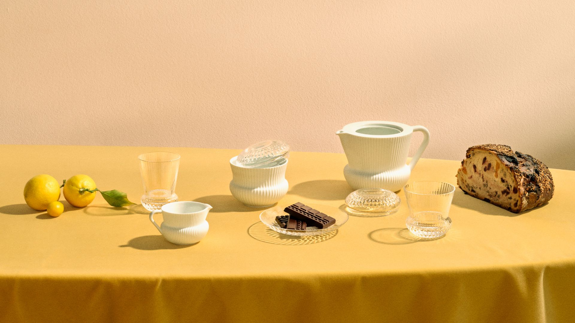
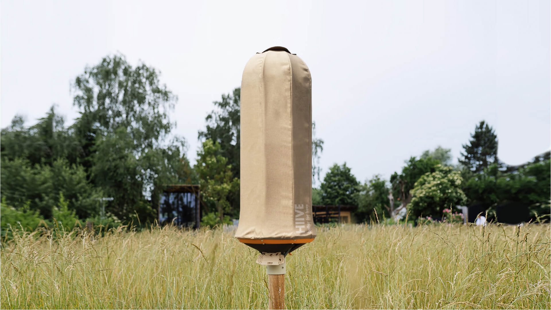
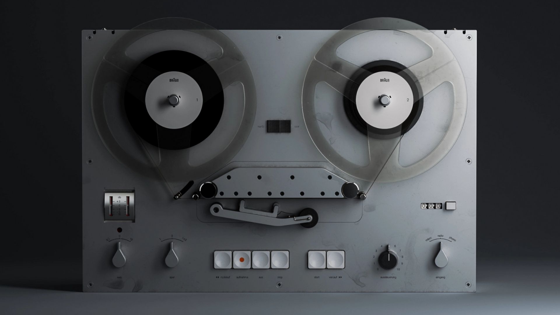
Gallery
Open full width


Open full width
Jin-hyung Choi presented the Structure series, inspired by the bonding principles of covalent carbon bonds. Employing stainless steel and polylactic acid, the component-based system begins with a structural node, around which form is built through coupling, and a function is then attributed based on the resulting form. This performative nature is underpinned by precise handcraft, enabling infinite variations in configuration according to the method of assemblage.
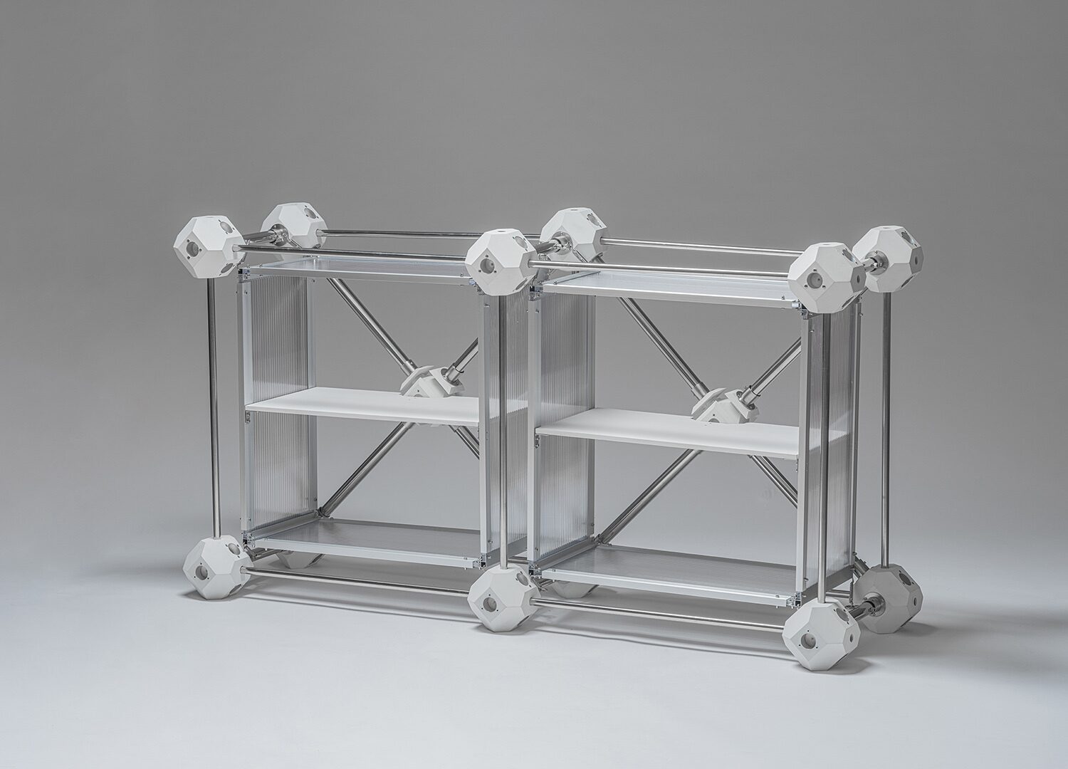
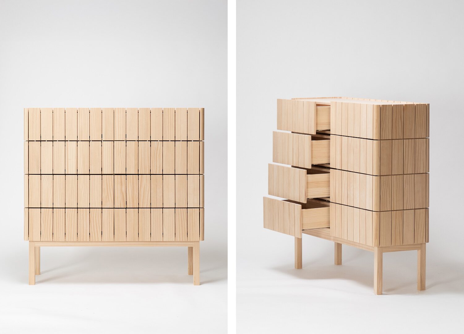
Kang-min Kim introduced a modular shelf with stainless steel plates, postulating that “the new aesthetic standards will break away from the existing logic of production efficiency and prioritise material properties and form.” A calculated 5-degree incline imparts the shelf’s functionality. Unity, a collection by Ceramist Ji-soo Lee’s atelier suee, is rooted in the concept of connection in knitting. Through the void between lines, she infuses the static ceramic medium with dynamic movement, conferring limitless possibilities. Lee emphasises the challenge: “Connecting all the lines without adhesive in a clay state and firing them into a single structure is formidable. This process becomes a journey to discover the form of relationships.”
Within the creative sphere marked by the constant pursuit of innovation, the next generation seeking a novel formative vocabulary is naturally foregrounded. Heung-ryel Lee’s Fake Plastic World demonstrated the ambivalence between furniture functionality and amorphous aesthetics, evoking visual and tactile dissonance. Focusing on material experimentation, Lee wrapped discarded items in flexible textiles, consequently concealing original materiality and leaving only residual silhouettes. These creations blurred conceptual binaries—waste versus art and authenticity versus illusion—thereby prompting a re-evaluation of intrinsic worth within the consumption-disposal cycle.

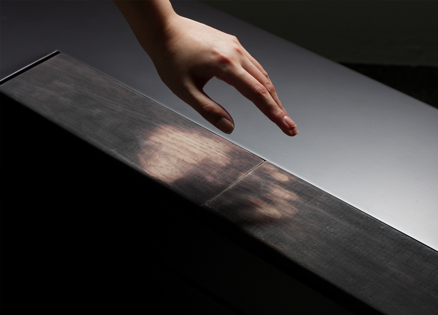
Forms of Attachment—FOA’s experimental furniture series—visualises the emotional bond people build with everyday objects, a collaboration created by the team: Dong-hwan Yu (Director), Dae-hoon Hwang (Visual & Art Designer), Yun-a Jang (Product Designer), and Ji-hoo Park (Production Manager). Combining thermochromic pigments with red oak enabled the pieces to react to the user’s body temperature instantly, instilling the inert objects with interactive capabilities. The slot-replacement system, which accounted for the pigment’s lifespan, offered a clever solution. “Applying thermochromic substances to furniture was demanding, but inaugurating an unexplored area was motivating,” they note.
Studio RIEUL, led by Jun-young Cheon and Seong-jin Jo, harnesses ‘digital craft’ as its core, creating sculptures of light through 3D printing technology. “When our table lamp launched, virtually no local 3D-printed luminaries existed. Utilising PLA and recycled PET, we maximised its scope beyond simple mockups to create final offerings.” This included a table lamp series featuring an adjusted Fuzzy Skin texture that effectively mimics Hanji, a traditional Korean paper. Furthermore, by leveraging 3D printing’s rapid, on-demand manufacturing capabilities, they introduce a new lighting piece every month for the Monthly Lighting Project.

Led by architecturally trained designers Hun-kyung Kim and Ji-ung Yoo, Plank and Point proposes furnishings that bring order and rhythm to spaces through the juxtaposition of planks and points, drawing from wooden fences. The PP series, made with radiata pine, redefines the role of wood furniture as a calming backdrop for a setting. Specifically, the atelier upholds its longevity-focused design philosophy by intentionally increasing the number of loose joints and creating gaps between components to accommodate the material’s inherent contraction and expansion.
Busan-based upcycling studio Paper Concrete gives unrecyclable paper waste a second life. Founder Dae-geun Kim invested five years in R&D, pioneering a proprietary technique for bulk paper formation using starch exclusively. This resulting composite achieves 0% moisture content through high-pressure compression and hot-air drying, making it ideal for interior finishing materials with proven fire-retardant, acoustic, and thermal insulation properties. Design director Jun-u Ahn affirms, “Our priority is on environmental values, despite the processing simplicity offered by new paper.” He adds, “By showcasing functional and decorative objects, we aim to transform public perception of refuse and integrate sustainable compounds into spaces.”

Brands foregrounding regional identity as a strategic design ethos have emerged as a nascent category. Mike Choi mentions: “Relative to the megacity Seoul, provincial practitioners who have retained their unique character are positioned to become a vital impetus in the era of global city-states.” Featured cases exemplify this ‘hyperlocal’ movement: YDP EDITION translates the layered singularity of Yeongdeungpo-gu into curated living art.
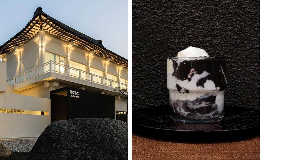
The Taste Cheongyang, drawing deeply on the region’s native abundance of produce, articulates a sustainable gastronomic narrative that reshapes the urban identity. Black Stream House, an artisanal dessert café in Yangpyeong, guided by the distinct artistic vision of its founder, Joo-yeon Lee, collaborated with heyPOP, the site-specific pop-up and spatial exploration platform, to present a dedicated booth. Choi asserts: “This is a festival, not a fair. It requires diverse content for broad engagement, catalysing inter-industry synergy and the establishment of new markets.”
About the author
A widely covered journalist specializing in design and culture, Seoung-joo YOO contributes to influential media outlets in Korea, Japan, Singapore, the UK, France, and Italy, particularly focusing on timeless values for humans and our environment. Driven by a passion for cross-cultural exchange, she fosters collaborations between multidisciplinary creatives across Asia and Europe.
Linkedin