The Flip Flop, an eccentric experience for an optical store in Mumbai
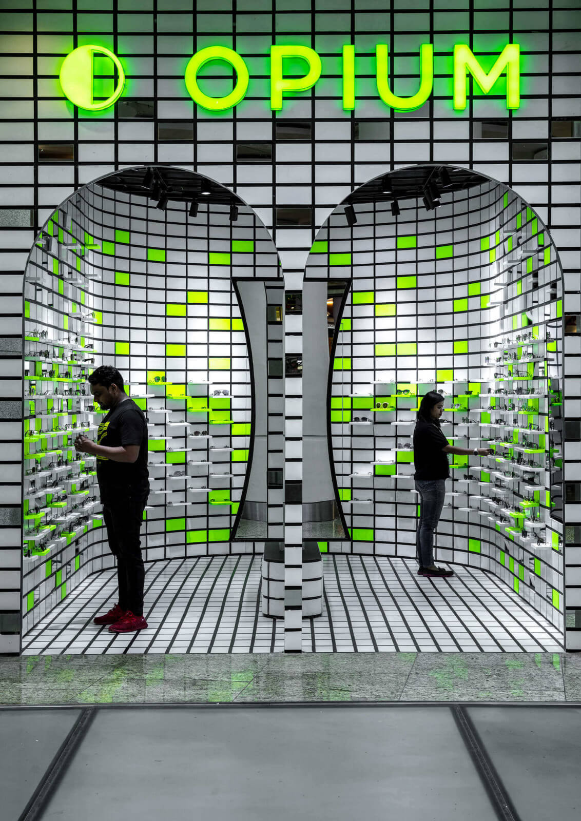
RENESA effectively used colour to achieve a stand-out neon glow for The Flip Flop, within the busy Mumbai Airport for Opium, a premium eyewear brand.

The Flip Flop is a pop-up optical store at the Mumbai Airport designed by RENESA. The design explores the spatial interpretation of Opium’s product identity and iconographic product presentation to encourage interaction from the store’s customers.
Opium is a renowned premium lifestyle eyewear brand that illustrates RENESA’s futuristic design vividly by housing various unique spatial design elements set within a grid of neon green and mirrors.

The minds behind The Flip Flop – RENESA Architecture Design Interiors Studio
RENESA, founded by Sanjay Arora, is an award-winning architectural and interior design firm based in New Delhi, India. Led by both Sanjay and his son Sanchit, RENESA likes to design brands, reinvent spaces and provide a fresh aesthetic to a company’s image.
The studio has won many prestigious awards over the years including the Best Interiors Retail Award, the Trends Awards and the Fenesterbau Frontale India.

Materials & Techniques – Mirror & neon
RENESA sought to achieve a visually striking design that articulates the functional aspects of stacking multiple products in retail spaces. By using neon green, grids, mirrors and playful displays The Flip Flop achieves an interactive element that invites customers to delve into the store.
At the entrance of the pop-up store, two archways are framed by a stark neon brand logo, immediately distinctive and enticing. The neon green is used throughout the interior design and included within the grid pattern that fills the walls and floor of the store.
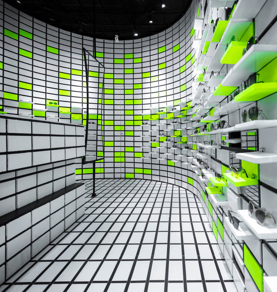
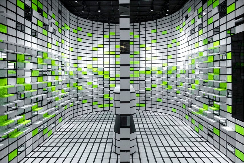
Each pair of glasses is given its own “mini-stage” through flip-flop shelving units, that are exaggerated by a neon green accent. The interactive shelving units provide the interior with a richer sense of depth that allows customers to explore the space and products with interest.

Style & Aesthetics – Animating and illuminating
For passers-by at Mumbai Airport, the dialogue created by the retail store design and the products is one that is both animating and illuminating. The design is centred around product presentation and interaction that allows customers to build a stronger interest and connection with the products.
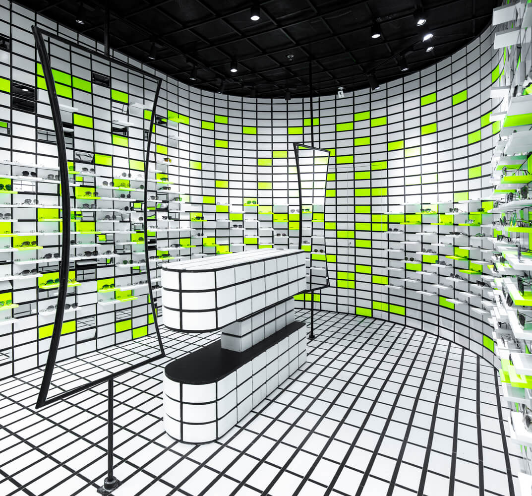
The design process followed a grid of 8x4inch tiles that cover the walls, floors and even the furniture in the centre of the store. The repetition creates an essence of complexity to the space while also serving its functional purpose, resulting in an interior that articulates the language of design and everyday store typologies.
Retail design is undergoing big changes as physical and digital realms merge: check out Puma’s store featuring the interactive Skill Cube.

The concept behind The Flip Flop was to reference how eyewear captures an image by tinting and enhancing it
The whole design concept of The Flip Flop was to create an eyewear store that entertains the way that glasses play with images. RENESA not only utilised neon green and mirrors to achieve this, but the studio also played with the curvature of the store. A sense of movement was created, enhanced by the mirrors on the central cashier desk, that gave such symmetric perspective to the store.

Design memento – Colour blocking and perspective
The Flip Flop is a prime example of how designers can effectively use colour blocking and layouts to pique customers’ interest. The colour blocking design and curved perspective creates an animated and open-plan space that craves attention and interaction.

The writer’s comment – The neon green really glows
The neon glow struck me the most when I first saw The Flip Flop. The way RENESA used neon to add an extension to the space piques interest as soon as I laid eyes on this project. The mirrors combined with the curved store offers a futuristic dynamic to the space that is irresistibly intriguing.


