Not all store entrances are the same – Meet the UNIQLO Entrance Box
Designed by the Milan-based architecture firm Piuarch, the project blends smoothly into its environment, maintaining a continuous interaction with the nearby buildings and spaces.
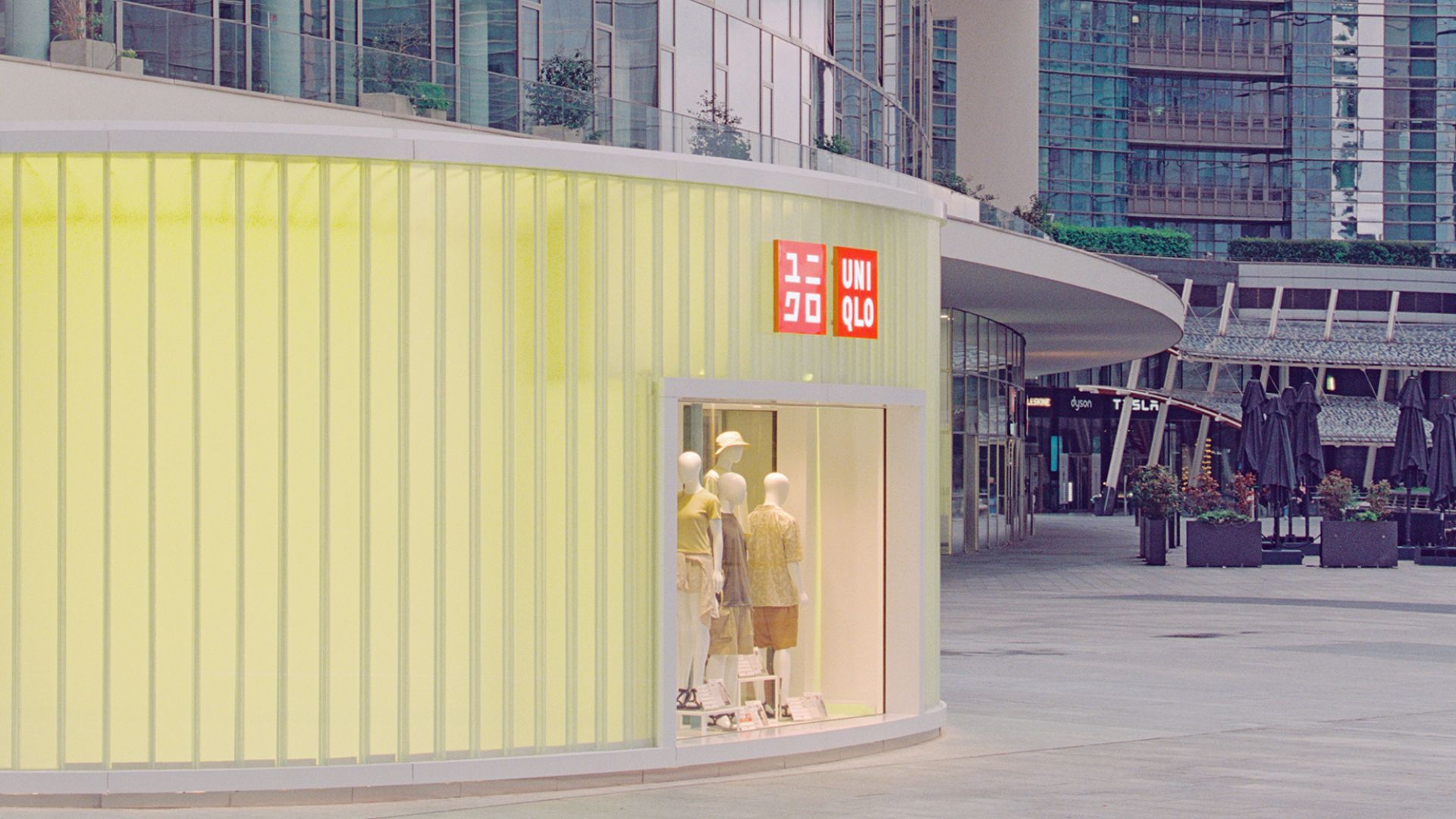
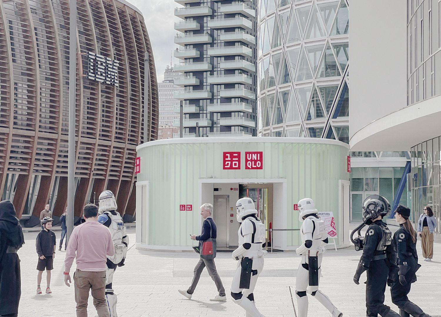
What sets one store apart from another? What are the key factors, not only architecturally but also in terms of communication, that define street-level retail spaces? The UNIQLO Entrance Box serves as an excellent example of a branding strategy that takes into account both the commissioning brand and the space surroundings, situated in Milan’s newly established Gae Aulenti Square, a central hub for diverse urban activities.
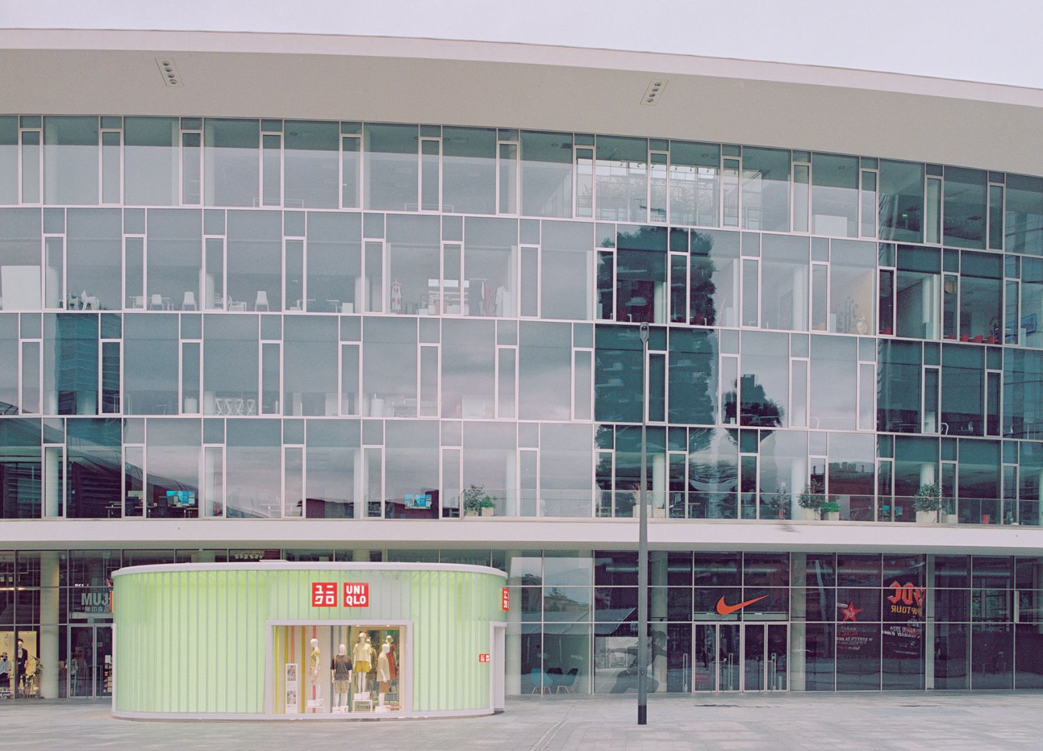
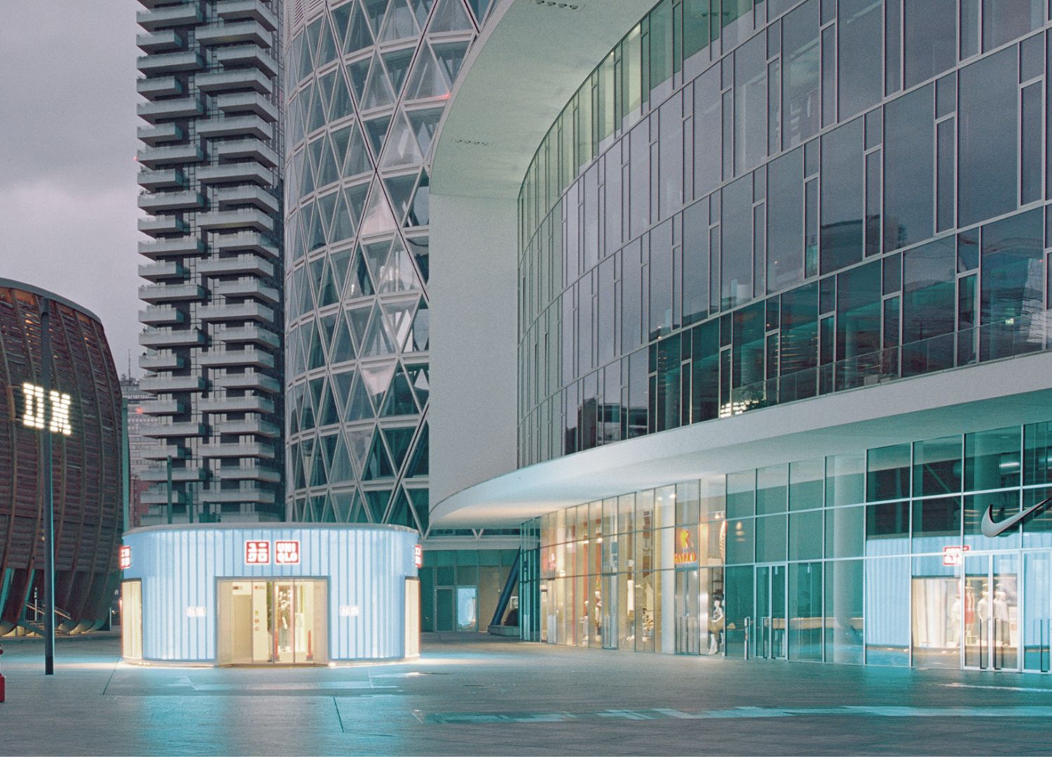
The UNIQLO retail space, located on the basement floor, is accessed from the square via a glass Entrance Box, a design commissioned to Piuarch. The door and display windows are designed to offer a nearly uninterrupted view through the building, preserving the square’s usability. Even the height—4.5 sq m—has been deliberately chosen to align with the transverse axis of adjacent building facades, fostering a vibrant interaction.
The UNIQLO Entrance Box features a ‘double skin’ facade, which enhances the structural lightness and fosters an open dialogue with the external environment through skillfully crafted transparent effects and a balance of solids and voids. The space between the two facades, which vary in depth, allows for the potential use of transparency effects and color integration.
We decided to speak with Gianni Mollo, associate at Piuarch, to delve deeper into the studio’s design philosophy for this modest yet striking project.

What does it entail to design an architectural structure for a brand? What factors should be taken into account, especially in terms of branding?
Gianni Mollo:
“At Studio Piuarch, we have worked with many brands over the years, especially in the world of fashion, and we know how fundamental it is, to give back a coherent spatial image, to delve into the different aspects of their brand identity, the cultural, visual and value references. All this becomes one of the elements that make up the “context” that we have to deal with, the starting point of each project.
When it comes to a point of sale or, as in this case, an entrance that has to attract attention and channel the flow into the store on the -1st floor, there are specific needs to be considered in the design, such as the visibility of the brand and signage, or the importance of the space dedicated to the window. For UNIQLO Entrance Box, the need to make the brand as visible as possible within the square, with a careful study of circulation flow and logo positioning, and the desire to dedicate a very large area to windows, had to be reconciled with the brand’s minimalist character.”

You mentioned encountering some technical challenges during its implementation. What were the primary challenges, and how did you overcome them?
Gianni Mollo:
“The greatest challenge was undoubtedly to minimize the thickness and prominence of the structural and load-bearing elements of the volume, with the intention of concealing them as much as possible. The work on the internal and external surfaces, the two ‘skins’ that make up the entrance, was also complex: in fact, they are designed with slightly different shapes to create an effect of depth and changing lighting depending on the point of view.”
The UNIQLO Entrance Box has an oval shape. Why was this design chosen instead of a more traditional, square or rectangular shape?
Gianni Mollo:
“The organic shape chosen for the volume is in harmony with the existing buildings in the square, in particular the adjacent Porta Nuova building with its sinuous shape, also designed by Piuarch, and the IBM Studios by De Lucchi.

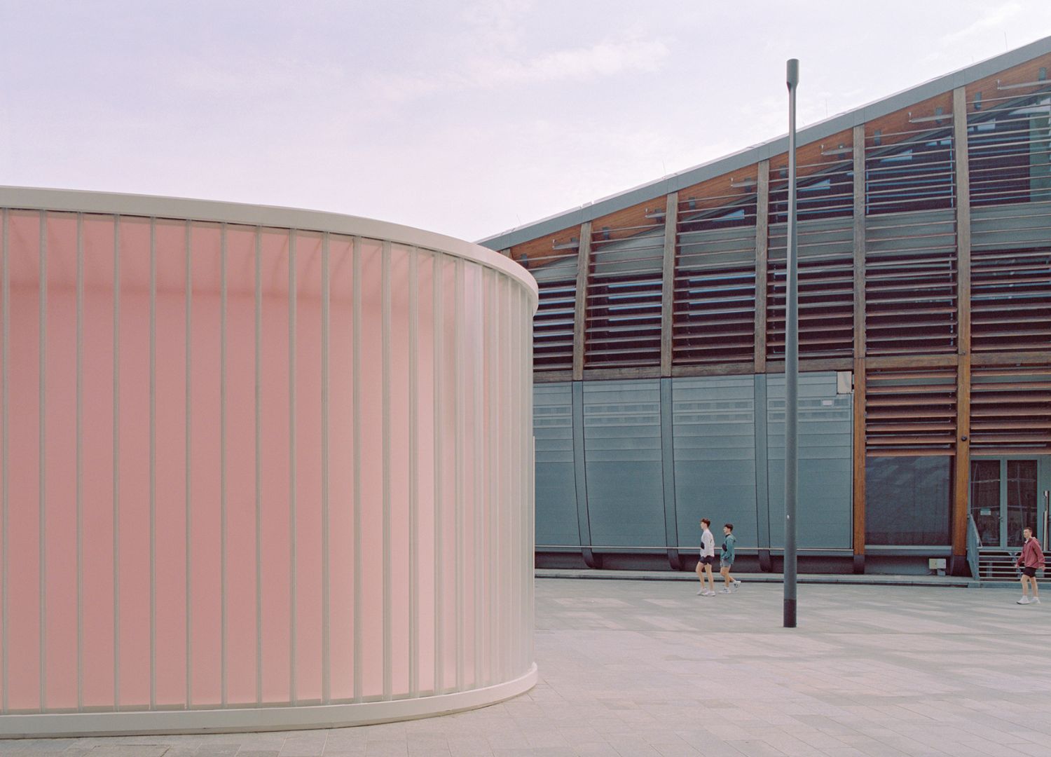
Even from a more technical point of view, this choice was fundamental because, compared with a square or rectangular volume, it allows as much surface as possible to be used without interfering with the existing buildings. Finally, this shape allows the building to fit into its surroundings without hindering the flow of pedestrians, but rather facilitating it.”
About the author

A marketer in love with Design. Founder & CEO of DesignWanted. International speaker. Professor at Istituto Marangoni - Design School (Milan).
Linkedin