Travel back in time to the Middle Ages with these cleverly reimagined logos
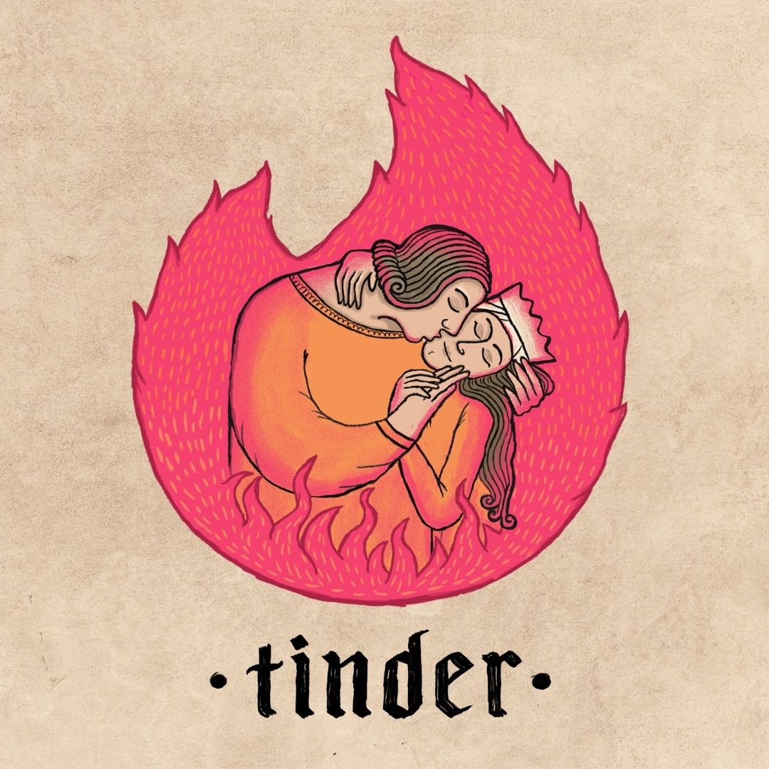
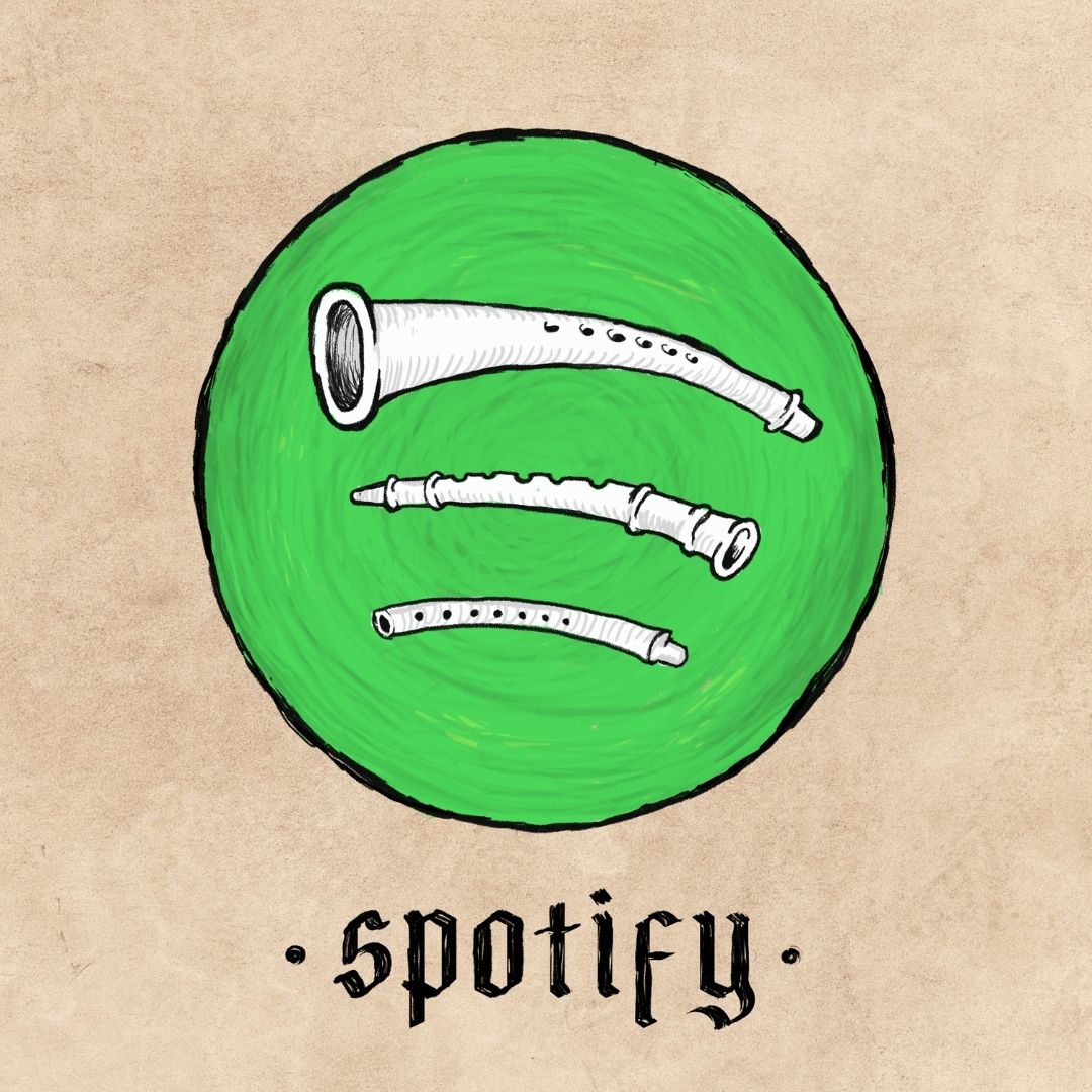
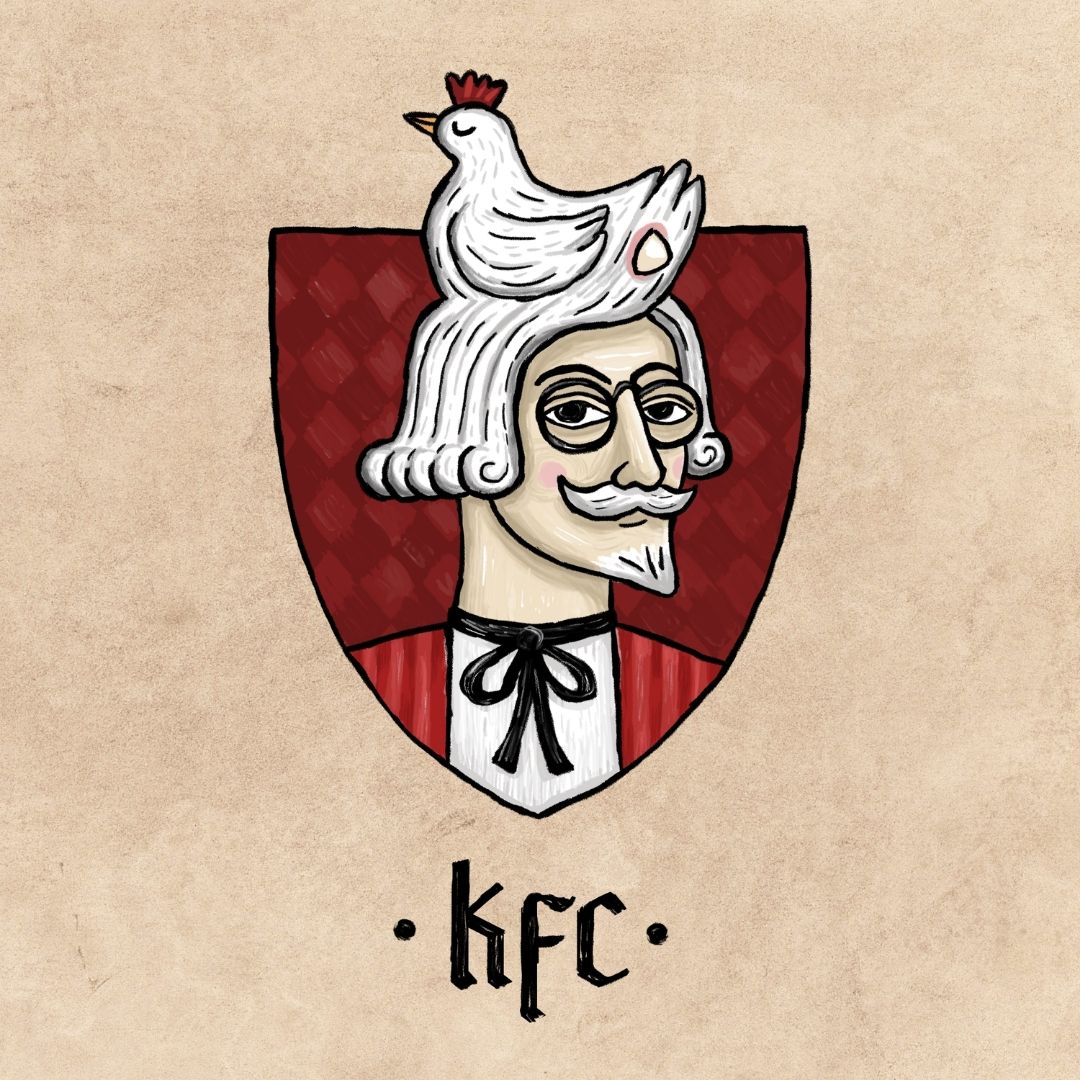
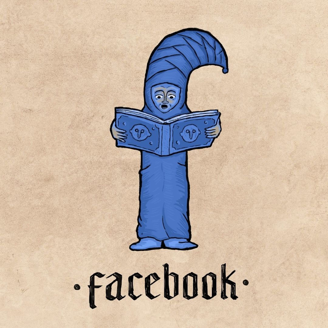
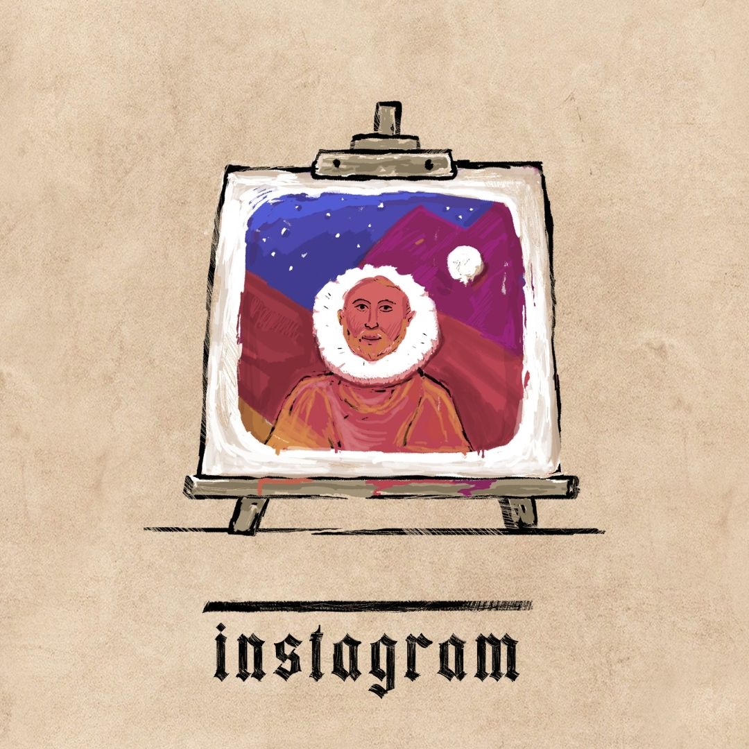
Through an exploration, Medieval Branding – Ilya Stallone transforms modern day logos with an antiquated yet witty style and humorous composition choices.

Fusing the (far) past and the present through ‘Medieval Branding’, an exploration – Russia-based Ilya Stallone brilliantly re-creates and transforms modern day logos with an antiquated yet witty style and humorous composition choices.
Cleverly combining his eclectic work as a graphic designer with his passion for history, it all started with one question – what would today’s most iconic logos look like if we lived in the Middle Ages? “The inspiration for this quirky series of one-of-a-kind illustrations came to me while touring several castles in Belarus” says Stallone.
Gallery
Open full width
Open full width
Using art to travel in time – from the clothing brand Lacoste to the dating app Tinder, each innovative logo offers a glimpse and brings it back to when wheels were wooden, glass was beautifully stained as well as typography existed gothically.
In Stallone’s reimagining of the Burger King logo, for instance – he skillfully places two classic-looking kings between the hamburger buns. Similarly, for the software company Windows he further features – a vintage stained glass window that undeniably looks like it belongs in a Medieval church.

Stallone thoughtfully crafted each conceptual eye-catching design and while entirely different from the modern day logo – it’s still unmistakably from each brand.


