A design-driven device that has been making waves in the music world
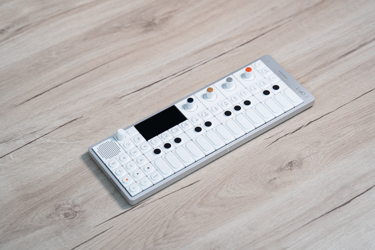
Taking a closer look at the OP—1. It’s clear that teenage engineering is not only appreciated for its engineering prowess, but also for its remarkable design sensibilities

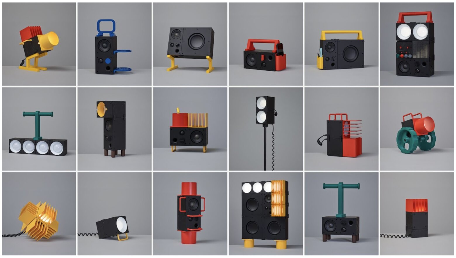
teenage engineering is a collective of engineers and programmers based in Stockholm, and you might have come across their work through their collaboration with IKEA for the FREKVENS collection. This collection offers a range of modular products designed to enhance both music and lighting experiences, with the goal of facilitating memorable parties.
My Instagram feed was flooded with posts from designers and influencers showcasing these tools, highlighting their exceptional performance and, most notably, their minimalist design philosophy. At first, I admired these posts from afar, but it wasn’t long before a particular product from teenage engineering began to dominate my social media: the OP—1.
As an electric guitar player with an affinity for lo-fi music, I often mingle with musicians who share a similar aesthetic. One of them once mentioned that Justin Vernon from Bon Iver had praised the OP-1 as follows: “I would say that it is the most important instrument that has come into my life since I picked up a guitar when I was 12 years old” (source: Thomann blog page).
Intrigued, I stumbled upon a YouTube video by Sintes con Leo that explained how this product adheres to Dieter Rams’ ten principles of good design.
The buzz around the OP—1 was overwhelming, so I decided to reach out to teenage engineering to experience it firsthand, particularly from a designer’s perspective.
Right from the moment I received the box, I knew I was dealing with something extraordinary. The packaging, made of pressed paper and secured with rubber bands, was unexpected but immediately transported me to a unique frame of mind. It was evident that this product was not just another musical instrument; it represented a revolutionary design approach.


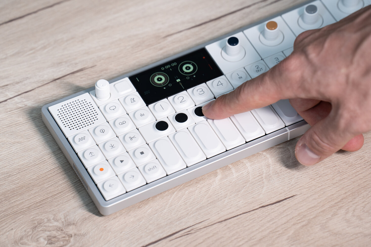
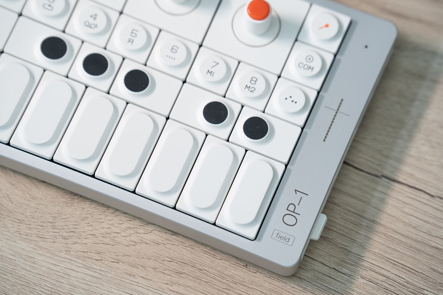
Upon opening the box, the magic truly began. One notable feature is the keyboard, where white buttons and black circles replace traditional piano keys, arranged in an innovative manner that hints at a synthesizer’s functionality. This layout not only facilitates musical expression but also embraces a concise and visually appealing design approach.
The world of music is not unlike the realm of wine connoisseurs. Just as wine enthusiasts adhere to a set of unwritten rules, like the choice of a dark glass bottle, cork, wooden packaging, and large glasses, musicians, especially those like me who favor a vintage approach, can be equally resistant to change. We clutch onto old fuzz pedals to produce distortion on our trusty valve-state amplifiers. Altering our musical approach is challenging because it’s deeply tied to the emotions we aim to evoke, particularly in the realm of amateur musicians.
Now, imagine attempting to revolutionize the way music is created and experienced, all while challenging established mindsets. This task extends to user experience (UX) design, where we’re accustomed to certain visual representations, especially when it comes to frequencies.
Even in the realm of sound simulation, the inclination is to mimic what has come before. If you’re simulating a mixer, your laptop screen typically displays a graphic representation of a traditional mixer for sound manipulation.
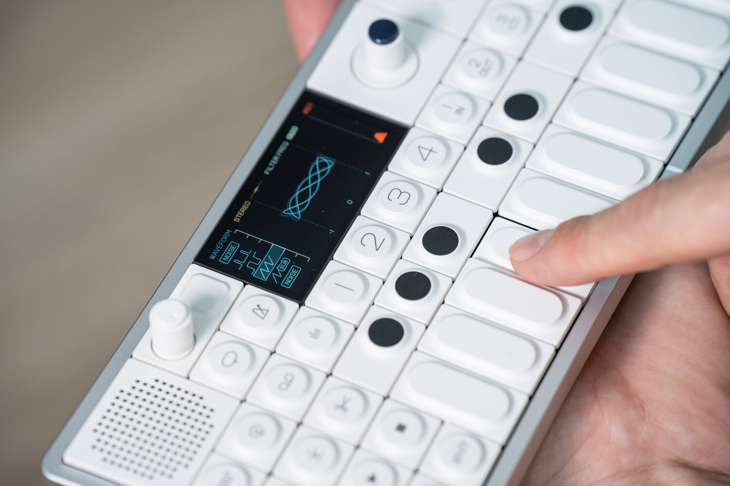
Here’s where the OP—1 shatters these conventions, and this is what truly excited me about the product. Let’s appreciate the audacity of this approach. To visually represent your actions and the sounds you create, the OP—1 employs imagery that immerses you in the mood of the music.
Your interactions and sound adjustments are seamlessly integrated into these visuals, whether it’s a drawing of a cow, Karl Marx, or a high-speed car race. It’s difficult to convey, but the mere presence of this object before me helped me grasp why it had generated so much enthusiasm.

I cannot fathom the brainstorming process that led to this unconventional solution, but it’s undoubtedly a significant innovation. Despite its seemingly playful or straightforward nature, it signifies a genuine commitment to innovation within the entire design team.
While I’m not proficient with synthesizers, I simply visited their Instagram page and watched a short video to grasp how to use it effectively—within seconds, it became clear. The icons for synthesizer, recording, drum machine, and mixer are intuitively designed, making them incredibly user-friendly. teenage engineering’s aptitude for crafting intuitive product interfaces shines through brilliantly.
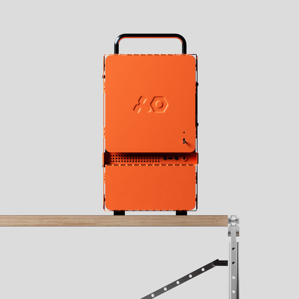
teenage engineering consistently demonstrates a penchant for unexpected technological solutions in their products, such as the “computer—1,” a flat-pack computer case that users can assemble themselves.
This kind of innovation is reminiscent of my younger days when I worked for a company producing computer cases. At the time, I wished for an idea like this, which teenage engineering brought to life.
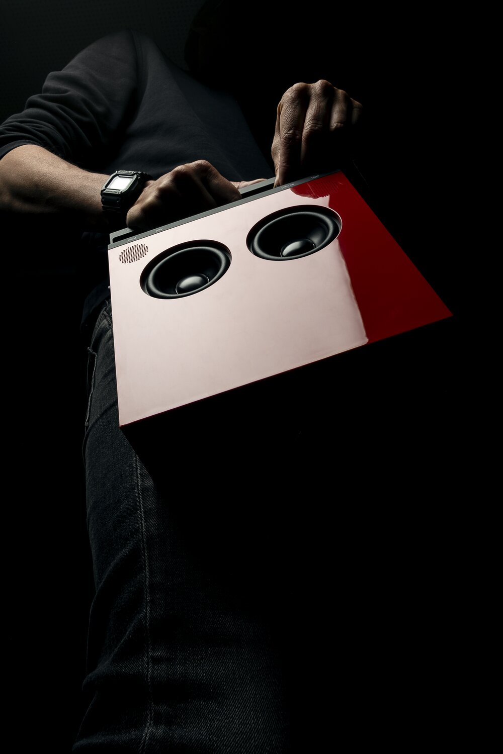
Their ingenuity doesn’t stop there; they’ve ventured into more mainstream markets with products like the OB—4 speaker, showcasing their ability to blend technical excellence with mass-market appeal.
As if that weren’t enough, they’ve recently partnered with Nothing, a company known for its “Nothing Phone” that offers an alternative to traditional smartphones. teenage engineering’s dedication to innovation ensures that we’ll continue to hear about their groundbreaking work for years to come.
